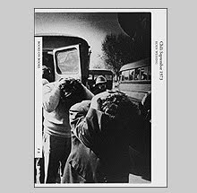
Lee Friedlander Photographs Frederick Law Olmsted Landscapes
Lee Friedlander is often cited as
Lee Friedlander: Photographs Frederick Law Olmsted Landscapes just published from DAP continues his desire to commune with greatness as this book celebrates the 150th anniversary of Olmsted’s design for
Using a commission from the Centre for Architecture in
This project in particular is interesting because it came at a time when Lee was experimenting with different camera formats and frame ratios. Within the span of the 89 images in Frederick Law Olmsted Landscapes he shifts from his Leica, to a Noblex pivoting lens panoramic camera, to his Hasselblad Superwide, and the results are noticeable beyond the obvious frame shape.
For the past two decades, Lee’s world - as he describes it - has become more chaotic and claustrophobic. Where as before he would occasionally use thickets and bushes to obscure his subjects, of late he has fought his way into them; looking out from their prickly interior. Jagged lines and straw-like hash marks of undergrowth break background architecture and formations into mirages that the eye has to fight to see. His book The Desert Seen was a starting point towards a new aggressive attitude towards the viewer‘s eyes with its representation of the high-key Arizona midday sun made even brighter by Lee’s fill-flash. It makes one’s eyes vibrate across the page with such an intensity eye strain seems to be a distinct possibility if the entire book is attempted in one sitting. Lee seems to allude to this aggressive stance in his introduction, “I think of these desert pictures together as one long sentence, not especially one written by Proust but maybe one that resembles one written by Patrick White, or, if I may presume even further, like a long solo, like one played by Paul Gonzalez with Duke Ellington’s Band, doing “Diminuendo and Crescendo in Blue,” the Newport 1956 version. More probably, it’s just like a long scratch of a fingernail on a blackboard.”
Little of the work in this new book is as aggressive on the eyes as described above but Lee does stray far from the paved walkways that Olmsted offers and seems to prefer his rambles into the dense underbrush.
Returning to the subject of the camera choices, what is interesting to me is that there is a distinct sense of Lee trying to figure out the panoramic camera but to little avail. When I had first seen this work in Viewing Olmsted, the catalog that was originally published on the occasion of an exhibition that also featured the photographers Geoffrey James and Bob Burley, I had the distinct impression that Lee’s contribution was somewhat unrecognizable as Lee Friedlander. As much as he fought at taming the sweeping gesture of that panoramic camera, most of the world gets pushed away due to the pivoting wide-angle lens instead of looming in and entangling the viewer. In most instances, those photographs feel safer and - even though they are beautifully made - they lack the intense quality that I embrace in his other work. The punctum in the Leica and Hasselblad work is a potential sharp stick in the eye which the Noblex mostly pushes safely out of the way.
In seeing this extended edit of this work, one other aspect that becomes more apparent is that Friedlander has achieved in describing parks that are devoid of any human presence. In only one photograph, dating back to 1977, is the public that Olmsted was so driven to create these oases for present. In the rest, Friedlander has the parks all to himself to get lost and pursue his own complicated designs. As Lee writes, “We photographers don’t really make anything: we peck at the world and try to find something curious or wild or beautiful that might fit into what the medium of photography can hold.”
The book is beautifully realized with the book-making “dream team” of Katy Homans on the design and typesetting, Thomas Palmer doing the separations, and Meridian Printing, under the supervision of Daniel Frank, putting the ink to paper. The lush tri-tone reproductions are nearly perfect and the ochre book cloth and large reproduction tipped into the cover lend an appropriate tone of classicism to the book’s exterior.
An accompanying exhibition at The Metropolitan Museum of Art called Lee Friedlander: A Ramble in Olmsted Parks is on display until May 11, 2008.
Buy online at DAP
Book Available Here (Lee Friedlander Photographs)
Book Available Here (Viewing Olmsted)


