The Americans by Robert Frank 50th Anniversary

It is rare for a photographer that came of age in the 1960’s and 70’s to not cite Robert Frank’s The Americans and Walker Evans’ American Photographs as the two books that inspired them to take up a camera and explore the world. It is lore that gets repeated so often it almost seems disingenuous in the retelling. I have often thought that it isn’t possible that so many people could be so instantly enamored since, as much as it may be embarrassing to admit, both of those books took a while for me to warm up to them and see their true greatness. I’ve come around, probably in the same way that an early critic of the first edition of The Americans had when he described Frank as one who “produced pictures that look as if a kid had taken them while eating a Popsicle and then had them developed and printed at the corner drugstore.” That critic failed to specify which flavor of Popsicle would have fueled such a remarkable feat. If he had, maybe photographers would have flocked to have given it a taste.
The Americans is a book that has taken many forms. The first French edition from Delpire sits short texts opposite the photographs. The first American edition from Grove dropped those texts and fronts the book with Kerouac’s now famous introduction. Later editions from Aperture, Pantheon and SCALO followed this American model but varied their trim sizes, and in a couple occasions even substituted an alternate version of an image. Page numbers were introduced, slight variance in the cropping of the photos can be noticed, the design changes, and most tellingly, a triptych appeared almost as a coda / signature after the last photograph. Frank’s willingness to reshape his masterpiece seems fitting to his persona of the restless poet who, if forced to look back, will tinker with his last version to fit his newest frame of mind. In keeping with this tradition, Robert Frank and Gerhard Steidl have created a new, refreshed 50th anniversary version of arguably the most important and inspiring photography book ever published.
The first aspect one notices is with the size. Frank reverts the trim size back to the original Grove edition of 7.25 inches tall by 8.25 inches wide. For me, this is the size it should have stayed as it fits so perfectly in the hand unlike the larger editions. (I think of the super-size Aperture edition the same way I think of a Leica M5 as compared to an M3).
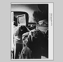
The other major difference will make some viewers obsessively familiar with the other editions scratch their heads wondering why the images look slightly different. This is because Frank decided to grace this new edition with uncropped versions scanned from the original prints. Frank, like many photographers, was prone to cleaning up the edges of his frames or cropping the image to call attention to a specific subject but here most are shown in their purest state. Comparing this new edition to my 1986 Pantheon, the differences become obvious and in my opinion, they emphasize Frank’s prowess at putting his frame around the world. In the image of the public bench in
Upon close scrutiny between these two editions, even with the claims of uncropped versions, one notices that sometimes the Pantheon edition actually has more “room” to an edge or the other than this newer version. Nothing dramatic but enough to prompt obsessive viewers to closely compare and contrast editions.
The only photograph that was cropped in the original that remains so is Movie Premier,
Other changes that make this new edition more pleasurable are: the dropping of the page numbers, reverting of the cover typography to the sans-serif font, dropping of the end triptych, and adding a second half-title page just preceding the photos instead of a page announcing “Photographs.”
This new edition was printed in tri-tone and the tonalities are closer to the way the images looked in the gravure editions; smoother and more pleasing to the eye. All of the images read with clarity save for one; the
I applaud the shift back to the original size and tone of the first American edition as this was essentially how older generations of photographers experienced this work. The book was small and stocky. The photographs rich and silvery gray on the page. The layout clear and unpolluted.
It was the book that launched a thousand road trips. Reinvigorated examination of self and state. Perplexed some with its complexity shrouded in a rough, visual language punctuated with obscenity. And in the extreme, it changed how future generations understood the workings of their medium. It still speaks volumes and on May 15th, 50 years to the day of its first printing, a new edition of The Americans will be made available to continue a dialog with this sad poem that Robert Frank and his little camera sucked "right out of
![]()