Monday, April 30, 2007

John Szarkowski and The Photographer's Eye


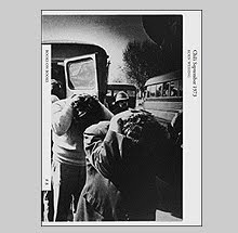
Since a few posts back where I wrote of Stephen Shore’s The Nature of Photographs it has come to my attention that the Museum of Modern Art has reprinted John Szarkowski’s beautiful book on photographic perception The Photographer’s Eye.

The book, for those not familiar, breaks down our “understanding” of photographs into: The Thing Itself, The Detail, The Frame, Time and Vantage Point. Szarkowski uses a wealth of known and unknown images to illustrate each idea. Stephen Shore cites the lessons of The Photographer’s Eye in the shaping his own book and thus they make nice companions.

I don’t have much to say about this title beyond it should be required reading for the experienced and inexperienced. This reprint will provide access to another generation of photographers to one of his earliest and most important works.
It is published both in paperback and hardcover and in editions translated into other languages.

Book Available Here

Cherry Blossom Time in Japan: The Complete Works


Lee Friedlander is undoubtedly one of the greatest and most prolific photographers of the twentieth century. For more than forty years he has produced work that covers all genres of photography and he has left his own thumbprint on each one. Self portraits, landscapes, nudes, portraits, family photographs, architecture, music, streets, monuments, still life, workers, typography, the media. Have I forgotten any? The only genre not in his repertoire that I can think of is war. That would be something to see, Lee Friedlander in Iraq.

As we know Lee is interested in making books. He has published around 30 titles since 1970. In the past six years he has been averaging at least two a year. It has been a little hard on the wallet to keep up with him. Seems like in the past if Lee published a book it would wind up on my shelf, but in the past years I’ve been more selective. Several have not made it. I never bought Stems or Staglieno or Kitaj or Apples and Olives or the book of square self portraits published by the Fraenkel Gallery in 2000. Several others that I have bought wound up being very lonely and neglected.

This past year the Fraenkel Gallery published Cherry Blossom Time in Japan: The Complete Works.

This is a book that is hard to ignore with its hyper neon color scheme on the cover boards. The book’s design is interesting in itself. Lee’s books seem to be very design conscious lately in a good way. They try new forms in which to house the pictures and Cherry Blosson Time does this nicely. It is essentially split into two books. A vertical book and a horizontal one. A colophon and plate list in the center of the book serves as a dividing line. The back cover board is the “front cover” for the vertical book and vice versa for the horizontal book. It is an interesting solution to the problem in book design of giving the same “real estate” on the page to both horizontal and vertical 35mm images. Often a publisher will compromise by just designing a square book which in most cases comes off as traditional or having a conservative feel.

Another non-photographic aspect of this book is that it includes almost no text. Other than the colophon and plate list, there is one short quote by Friedlander and a poem by Waka of Narihira (825 – 880). There is something to be said for a photography book that just houses images and excludes dissertations on why the work is necessary or “valid.”

But all of what I’ve written above has nothing to do with the photographs.

It was on four trips to Japan during cherry blossom time that these 73 images were made, the last of which in 1984. Lee’s work has shifted since then. His world of today is more chaotic and claustrophobic and although he “orders” it in a way that makes it essentially palatable, these pictures seem to come from a calmer place.

This work is often compared to Japanese scrolls and I could regurgitate the same but I think, at this point in our collective consciousness, when we see light and bamboo and Koi fish in anything, we think “scroll.” One thing that Lee does that corresponds to the qualities of a “scroll” is that he often confuses us as to spacial relatioships and, at times, what is up and what is down. Scrolls, when turned from holder to holder, create an infinite variation of “croppings” to the image. As the scroll moves, often the boundries of land to sky and continuum of land is confused. We also have such moments looking through these photographs (though oddly enough more so in the horizontal images and rarely in the verticals).

The book has a similar feel of a “Friedlander edit.” Meaning, there are many images that work in similar formal ways that are included anyway. That usually makes me “not see” the images after a while, but that isn’t the case here. Desert Seen (or in my case “unseen”) is a good example of a book where my mind shuts down after the midpoint. These images continue to carry me and my interest through both sides of the book.

The printing is a Thomas Palmer (separations) and Meridan printing combination. The images read beautifully on the page. The paper stock is a very nice choice. More so than some of his other titles of late, this is one that will not be neglected on the shelf.

I imagine I will continue to take pleasure in letting Lee provide me my daily moment of Zen.

Book Available Here

Thursday, April 26, 2007

The Books of Fouad Elkoury


Exactly one year ago, I was in Paris scouring the shelves of all of the Mona Lisait bookstores looking for photo and art books that never make it to the States. Three of the more interesting titles I found were by the photographer Fouad Elkoury. Although I wasn’t familiar with his work I did remember his name from Beirut City Centre (Editions du Sycomore 1992) among Gabriele Basilico, RenĂ© Burri, Raymond Depardon, Robert Frank and Josef Koudelka. He has six books of his photographic work and one book of writing on photography all of which are from French publishers.

The first I found was called Palestine l’envers du miroir published by Hazan in 1996. Since the text is in French (in all of the books), I have only had the pictures to enjoy. This title is described on his website as: “A photographic and textual road diary documenting life in Palestinian cities. The work was carried out just after the Oslo agreements, when hope towards a solution of the Arab-Israeli conflict was prevailing.” You clearly get a sense of this being a personal road trip and personal observations from tone of the photographs.
Using various formats he describes the streets, refuge camps and the landscape that he guides us through. The text is a series of diary entries that I guess (not being able to read French) speak in some way to the politics of the region.


In Liban Provisoire (Hazan 1998) he drops us off in Lebanon where life plays out before us in normal routine. We are then thrust into the siege 1982. Beirut is cut off and shelled by the Israeli Defense Forces.

Elkoury sends us wandering through the devastated city. Nothing in the landscape seems untouched by gunfire and shells. The buildings left standing seem to defy gravity and are so pockmarked, it is seems impossible that anything could have lived through the fighting. Slowly we see people starting again to go about their business. Businesses reemerge. Someone with a perverse sense of humor opens an amusement center called “Snipers.” In the end, Elkoury gives us a way out of the rubble with a little hope. The last pictures show people laughing among the ruins.


The vantage point is not as a “camera seeing” but the distinct vantage point of human sight. Elkoury’s camera is a shell shocked witness twisting and turning to take it all in.


Sombres (Marval 2002) seems the most experimental of the three books. There is no text until a brief monologue at the end (in French of course) so there is no guide through text like in Palestine l'envers du mirior. Here he is creating a photographic road trip of disjointed images paired and sequenced to create implied poetry. References to September 11th and cancer (his?) are in the mix. He creates grids, pairings, triptychs that lead us through a landscape full of memory and present concern.

All three of the books are nicely produced with an individual feel to their content and form.

The Killing Fields


S-21 was a secret prison operated by the Pol Pot regime in Phnom Penh from mid-1975 until 1978. Cambodians accused of treason were brought to S-21 where they were photographed upon arrival. They were then tortured until they confessed to the crime their captors charged them with, and then executed.

Of the 14,200 people imprisoned at S-21, only 7 are know to have survived.

In 1997, a Cambodian named Nhem Ein revealed that he and five assistants were the photographers responsible for documenting the prisoners. The year before, Twin Palms published The Killing Fields which is a collection of the photos made at S-21.

The negatives were found on site by Doug Niven and Chris Riley in a filing cabinet. They cleaned, cataloged and printed the approximately 6,000 negatives. And in The Killing Fields we are privy to a selection of 78 of them.

The negatives show signs of wear. The emulsion has chipped and flaked off leaving voids of black in the print. Some of the deterioration looks oddly decorative. Other deterioration foreshadows the violence to come.

Some of the prisoners face the camera with the look of confusion. Some look with what we may translate as the knowing gaze of what is to come. A few even cannot resist that apparent universal instinct to smile before a camera. It is a direct gaze which we are confronted with time and time again in these photographs that is most disturbing. Almost all look straight into the lens and into our eyes. We look at them with a perverse curiosity since we know their fate and cannot do more. We may ask what it would be like to be in their shoes at that moment.

This is a brutal book. Partly because of the beauty found in these portraits and partly because of the way we read how each face is of an individual due to viewing them one after another in book form. Here we are looking at people who have been unknowingly given a death sentence and perhaps have as much as a few days or as little as a few hours left to live. We also know as viewers that most will suffer torture before dying. They are possibly being put to death simply because their captors see what we can see, that they are individuals. As we proceed through the book our thoughts of their innocence becomes more solid page by page.

We see them as innocent because we know how that regime worked but innocence or quilt cannot be seen in photographs. What is stupefying is that somehow, others saw these people as guilty and had no problem with torturing and executing them. Perhaps they were even happy to do so.

Is it the photograph that causes this disconnect? Would we feel differently if we were present looking through the viewfinder? Would we see something that the photograph changed or didn’t reveal? I would like to think not. I would like to think that the disconnect is a moral one. An ethical one. What I do know is that this book causes me to feel a lot for complete strangers. It is compassion that crosses half the distance of the world and 30 years of time. These photographs make me love and despise humanity in the same moment.

This book is an emotionally powerful yet impotent gravemarker.


Court House: A Photographic Document


This is a book that I found many years ago that is somewhat interesting. Edited by architectural photographer Richard Pare, Court House: A Photographic Document is a collection of architectural studies of court houses all over the Unites States. Published by Horizon in 1978, it was conceived as a part of the United States bicentennial celebration and sponsored by the Joseph E. Seagram and Sons Company. The Seagram Collection of art has a rather large collection of American photography and a good one at that. The book features photographs of exteriors, interiors and details of the nation’s halls of justice in an attempt to describe the character of specific American architecture.

A quote from William Faulkner’s Requiem for a Nun starts off the book: “Because there was no town until there was a court house, and no court house until…the floorless lean-to rabbit-hutch housing the iron chest was reft from the log flank of the jail and transmogrified into a by-neo-Greek-out-of-Georgian-England edifice set in the center of what in time would be the town square…”

The book contains hundreds of photographs and is quite nicely produced. The reproductions are good both in black and white and color. The design is functional at best.

What caught my eye originally about this book was the list of photographers that contributed to this project: Lewis Baltz, William Clift, Richard Pare, Stephen Shore, Laura Volkerding, Nicholas Nixon, Tod Papageorge, Geoff Winningham, Frank Gohlke, Jim Dow and others. This, to me, was an impressive list of artists to gather for one project.

What is the most interesting aspect of this title is that in looking over the book I was amazed at how most all of the photographs seem to be from one voice. Even between the color photographs (Stephen Shore and Geoff Winningham are the only color photographers here) and the black and white, there is not as much of a variance as you might think. Here you have a large group of photographers whose work if your mental images serve you correctly look vastly different from one another and here they echo and harmonize. Of course not all look alike, if you examine and pay attention you see subtle differences, but the similarity is uncanny.

The book does contain some of the finest photographers making a lot of wonderful images. So much so, that who would think that a book of hundreds of photographs of court houses could, in some miraculous way, have been made interesting?

Todd Hido's Between The Two


Todd Hido came to my attention after his first book House Hunting (Nazraeli Press) was published in 2001. This beautifully made oversized book of houses and suburban neighborhoods photographed at night contains only 26 photographs and it passes through your hands without overstaying its welcome. I found it to be a kind of perfect little, big book.

The pictures describe both the interior and exterior worlds as something less than comforting. The “natural” artificial light and crisp detail of his large format camera make his frames look like hyper artificial scenes. We know this place is “real” but the quality of description belies that fact. The places are a little sinister and a little ordinary at the same time. His choosing to photograph on evenings or early mornings when the fog has rolled in provides an added seductive veil over the dwellings and streets.

The photographs in House Hunting do not simply fall into the tired old genre of night photography. The problem with most night photography is that the photographers get too seduced by the gimmick alone and fail to actually make pictures that transcend the technical process. Todd made photographs that were complete and meaningful first and the qualities of the technical is an added bonus.

Hido followed up with another good effort Outskirts (Nazraeli 2002). This book wasn’t vastly different than House Hunting and actually seemed more of a companion by following an identical design and tone of the content. He then published Roaming in 2004 also with Nazraeli Press.

Roaming was a slight departure except we are now “roaming” in more rural areas and viewing the landscape through rain smeared car windshields. The color palette of this title took a turn for the bland and bleak. Most of the book for me has an association to sitting in a cold car with damp shoes and socks. A bit miserable of an experience but the photographs can be beautiful.

Now, Nazraeli has published Hido’s fourth book Between the Two. This release is the largest yet with a whopping 35 images (his other books average about 25 images). The book opens with a familiar Todd Hido rainy streetscape made at night but this time (drum roll please) it’s in black and white. He follows this up with an interior black and white photograph of a room with a bleached blond woman sitting naked on the floor.

The book’s sequence follows the exterior photographs with interior images of rooms where women, most nude or scantily clad, lay about on beds or chairs. The women are “dressed” and made up to look suspiciously like call girls. There are only three of these portraits that do not look like they are self consciously leading the viewer to that conclusion. I’m pretty sure it isn’t just me.

He photographed them, for the most part, as if they are objects left behind. A similar tone is present in the interior photographs that appeared in the first two books. Being that they look like call girls, with the exception of a few, they look like they are the ones with the power over the situation. Their implied knowledge of carnality leaves us at a slight disadvantage.

The problem for me is that although populating his photographs may have been a natural, if not obvious, next step for Hido, he seems to have lacked the interest here to make images of these women that are equal to his other work. For me, there are only six of the twenty three images of women that are worthy of inclusion. They simply are weak photographs. Beyond that, I’m also not sold on the implied narrative that the sequencing attempts.

One may wonder about the interior life of the house. One aspect I liked in House Hunting and Outskirts was the houses and buildings are often illuminated from the inside as well as out. It makes the viewer realize that these structures are active in people’s lives. The problem here is that now that I have been given a glimpse to that interior life, it’s a disappointment. Not only in the form of the pictures but in the implied content. These evening or afternoon trysts do not engage me. With the exception of my edit of the six that think are worthy, I’m not interested in the interior lives of these women (the other interior Hido is obvious about stressing).

This book seems to be an attempt to force two bodies of work together. One body of work that we know already except this is just a weak edit of leftovers from his first two books and another body of work that are poorly made bland portraits that fit someone’s idea of a strong inner emotion.

I bought the book but I’m not buying any value in the work.

Boris Mikhailov's Crimean Snobbism and Suzi Et Cetera


Boris Mikhailov has been presenting us with a different view of Soviet and Russian life that spans 40 years. Originally employed as an engineer he started taking pictures as a hobby in 1965. After he took a few nudes of his wife and made the mistake of developing them at work, he was fired and took up photography full time. He continued to make imagery that would be problematic to the "official" image exported from the Soviet Union.

He has published many books on subjects which encompass both the comedic and tragic aspects of life. And lately, books are being published on the heels of one another as if a dam has burst. Just in the past 5 months there are three new titles, Yesterday’s Sandwich (Phaidon 2006) Crimean Snobbism (Rathole 2006) and Suzi Et Cetera (Walther Konig 2007).

Suzi Et Cetera is 99 images in a paperback edition published by Walther Konig. The photographs in this odd little book were made in Mikhailov’s home town of Charkow, Ukraine in the early eighties. All described with a patina of color shifting and dusty, scratchy film.

This small book reads like a perverse fever dream of a photo album. Mikhailov gives us a glimpse of a system breaking down into a surrealist state and along the way it is unleashing a tide of sexual gluttony. He gives us photographs of nudes that look as if they fell from someone’s collection of amateur porn and they relay a mixture of excitement and shame. Soviet traditions, along with statuary of Lenin and young "pioneers,” are no longer capable of exciting pride in the young and are largely ignored except by the photographer and the elderly. The landscape and evidence of the “official” party line is slowly dissolving into history.

Added to all of this is the familiar wink and nod of Mikhailov’s artistic self consciousness.

Book Available Here


Crimean Snobbism is a little more elegant than Suzi Et Cetera. Published by Rathole in Japan, this small hardcover book is full of sepia toned images of Mikhailov and friends at the Crimean beach in the summer of 1982. It is nicely designed (complete with a dustjacket of textured paper) and doesn’t feel disposable like Suzi Et Cetera.

This work has a similar feel to the Salt Lake work published by Steidl in 2002. Mikhailov presents us with what seems to be an afternoon at the beach. He and his friends lounge in the sun and relax and then the afternoon digresses into self conscious “art making.” They mock their surroundings by striking poses next to shrubbery and mock their relationships by acting as if they fell from movie screens. The photography has the casualness that we associate with his past work. Because of that casualness (and the sepia tone), we have the sense of this serving as memory, literally in the head, rather than strictly as photographs.

I enjoy this book but I may be at a loss as to explain why I like it so much. Perhaps it is the light tone and the sense of the fun that is being had. The subtext is that they are separate from their surroundings and the people who use that same beach for their relaxation. They are being snobs in their play making. They are also making fun of themselves. They are free and unafraid of looking ridiculous.
Perhaps that was something necessary for Soviets in 1982.

Monday, April 23, 2007

David Goldblatt Photographs by Contrasto


David Goldblatt has won the Hasselblad Award for 2006. Goldblatt, a white South African, has been photographing his home country since the 1950’s. He has documented the struggles and changes in his country as it stood under the social and political system of apartheid through to the present day.

Goldblatt’s approach to photography and documentation is not to clobber you over the head with events or photojournalistic evidence of injustice. Instead, his cool gaze and obsessive documentation of everyday life in South Africa slip in their politics under the radar.

Contrasto has recently published a monograph entitled David Goldblatt Photographs. This book, which was published in conjunction with an exhibition at Arles photography festival in France in 2006, presents us with eight distinct bodies of work in over 135 black and white and color photographs

Goldblatt is the author of eight books. Each chapter of David Goldblatt Photographs is dedicated to a different body of work that originally appeared as a book. As a photographer, Goldblatt approaches each new project as if starting from a different angle and line of thinking both in subject matter and the photographic material he utilizes.

In The Transported of KwaNdebele: A South African Odyssey, Goldblatt photographed on buses with black workers who, due to apartheid laws, were often forced to spend eight hours a day traveling to and from work. In In Boksburg, He shows us small town life in a middle class white community. In his book Particulars, he concentrates on close-ups of hands and feet and clothing. He remarks this work came out of his days as a men’s outfitter where “the outfitting skills have rusted but the awareness of the body, of its proportions, size and build and what is declared in stance, clothing and ornamentation, has become sharper and broader…”

In South Africa: The Structure of Things Then, we are presented with descriptions of how colonial and apartheid values are reflected in the architecture of South Africa. His latest work is in color using a large format camera. Intersections is comprised of portraits and landscapes that reflect the societal, political and economic changes since apartheids demise. All of these individual projects intersect to provide the most complete visual record of South Africa and its people from the last half century.

David Goldblatt Photographs is elegantly designed and the reproductions are very well done. There is an interesting lengthy essay on the books of David Goldblatt by Rory Bester. In the back of the book there is a chronology of his life which is written in his own words which makes for a fascinating read. All in all this is a very handsome title which I highly recommend for those unfamiliar with his work. This book is a wonderful introduction to one of the most important photographers working today.

Appropriately, there have been a couple retrospective type books about David Goldblatt’s work that have appeared in recent years. One of which is David Goldblatt: Fifty-One Years which was created for the Museu d’Art Contemporani de Barcelona in 2001. This book, with over 100 images, covers all of the projects as well but provides an interview with Goldblatt and several in-depth essays by J.M.Coetzee, Chris Killip, Nadine Gordimer and others. I prefer this book to the Contrasto title only because of the texts. The reproductions here are functional but not great. This title unfortunately is now rather hard to come by and is very pricey if you can find it.

One very good book of his that can be found very cheap is his fourth book called Lifetimes: Under Apartheid. I purchased a hardcover, shrink wrapped copy last year for around $10.00 off of an Amazon listing. South Africa: The Structure of Things Then is also listed very inexpensively.

Lastly, there is a publication celebrating his winning of the Hasselblad Award that is supposed to be out but I have not seen it. I hope that they bring something new to the table from this great photographer. Though, with work this compelling, I’m not sure they could fail.

Book Available Here

Passing Through Eden by Tod Papageorge


Pace MacGill Gallery is currently exhibiting Passing Through Eden: Photographs of Central Park by Tod Papageorge (April 3 – May 12). I had seen the show last week but made a point of seeing it again (it is worth seeing twice). This time I was pleasantly surprised to find the book was finally available for sale. This is a title I had heard was being published and have been anticipating its release for almost a year.

I’m happy to say it has been worth the wait.

Tod Papageorge has been photographing for the past 35 years but he is mostly “known” as an educator and a writer. He penned the introduction to Garry Winogrand’s book Public Relations and has written extensive essays on Walker Evans, Robert Frank and Robert Adams. He has taught at Yale School of Art since 1979.

With all of these accolades, ironically, it is rare to actually see his photography. Aperture and a magazine called Big Picture published some of the Central Park photographs in the early eighties and a small handful of other work has shown up in various catalogs over the years. Until now, there has not been a book dedicated to his work.

Published by Steidl, Passing Through Eden is a hefty book both in its large trim size and amount of images. Gerhard Steidl has once again done a nice job with the reproductions. They achieve the extended tonal range and luminosity that Papageorge’s medium format negatives provide. A well written essay at the end by Papageorge called “Words For Pictures” discusses not only how the “project” evolved but also how his life has been shaped by photography and poetry.

Papageorge has been photographing in New York’s Central Park since 1966. These images cover 26 years worth of wandering in which Papageorge finds his subjects lounging in the grass and on resting on park benches absorbing ethereal sunlight.

The book’s sequence is designed to metaphorically represent the first chapters of the Book of Genesis (Eden is in the title after all) and one can more or less “read” the sequence as such. Through the 105 photographs we follow the Creation, Man in the Garden of Eden, and Papageorge seems to take pleasure in dwelling on Man’s disobedience to God. Papageorge serves up images of sexuality and lust that are amplified due to the descriptive power of his medium format cameras. Flesh is rendered so seductively on sunbathers that he seems to be tempting our willpower even though we know the penalty. In one image, a slight twist, “Adam” has two “Eves.”

In reference to the banishment from Eden, Papageorge turns a small sequence of four images on their head. Literally reproducing them upside down. They are images of couples laying in dark grass that seems to be absorbing all light and reflecting very little. Seen inverted, the people are tossed around in a weightless and disorienting world. I understand the purpose of this and commend Papageorge for breaking the boundries of design and taking risks, though I’m not sure such an extreme was necessary. With the exception of the last picture in this sequence, it’s my opinion that these could probably have been left out of the book entirely.

It is remarkable though that for its length and amount of pictures, the book doesn’t feel heavy with superfluous photographs. For me, most photo books published have about 30 percent too many images and they tend to suffer greatly for them. I think this book could have lost at most 12 to 15 images. But seeing that it represents 26 years of work and we have been given so little opportunity to see what he’s been up to, I can forgive his trespasses.

Book Available Here

Original Sources: Art and Archives at the CCP


In keeping with the history of photography from my last posting I thought I would write about a book that I found by chance in a stack of remainders. It is called Original Sources: Art and Archives at the Center for Creative Photography. It was published by the CCP in 2002. For those of you who aren’t familiar with the Center it is a part of the University of Arizona in Tuscon and was started by Dr. John P. Schaefer and Ansel Adams in 1975. It serves as an exhibition space, has teaching programs and seminars and allows anyone access to its vast archive of photographic work and photographic ephemera by appointment.

The CCP became the repository for the archives of Garry Winogrand (30,000 prints, 30,500 color transparencies, contact sheets, negatives, personal papers, home movies) Edward Weston (2260 fine prints, negatives, manuscripts for “Daybooks”) Aaron Siskind (904 fine prints, correspondence with other photographers) W. Eugene Smith (3500 prints, writings, tape recordings of jazz, darkroom equipment) and many others.

Original Sources opens up the archive to the reader. Containing 55 short essays of individual photographers or genres of photography in alphabetical order, the book is illustrated with photos of the material as it appears as objects. The essays read a bit like encyclopedia entries and tend to cover well tred territory dealing mostly with the career arc of the photographers. What is refreshing, is that the edit includes many photographers that weren’t familiar to me.

Throughout the book, it is the objects reproduced that get the most attention and interest. We get to see reproductions of a letter from Beaumont Newhall to Edward Weston discussing the death of Alfred Steiglitz in July of 1946. A contact sheet (see small detail above) from a roll of film shot by Garry Winogrand at the El Morocco Club in NYC. A small notebook with photographs by Todd Webb made while he was serving in New Guinea during World War II. A 1954 architectural floorplan of Helen Gee’s Limelight Gallery. And many others.

What I also found interesting is that the last third of the book lists each photographer and details what the archive holds of their materials. After the descriptions for the larger holdings it also tells how many linear feet of shelf space that part of the archive takes up. Garry Winogrand 144 feet, Paul Strand 30.5 feet, Edward Weston 75 feet, W. Eugene Smith 300 feet.

This book can be found through the CCP (money going to a good cause) or buy it through Amazon. It is listed as starting at .95 cents. Apparently many book sellers think this book is taking up too many linear feet of shelf space.

Photojournalism in print


In recent years there have been two books published of photojournalism as it has appeared in print throughout history. I’m speaking of Mary Panzer’s book Things As They Are: Photojournalism in Context Since 1955 now out in paperback and the book Kiosk: A History of Photojournalism which is the catalog from an exhibition that was at the Reina Sophia Museum in Spain. Both of these volumes do a handsome job presenting actual spreads from magazines and newspapers of photojournalistic features and serve as nice companions to one another.

Things As They Are, published by Aperture and World Press Photo, shows a chronology of published “stories” from 1955 until present day. It features work you might expect like the W. Eugene Smith Pittsburgh essay from Popular Photography (1959) but also more obscure like an essay on the study of the soles of feet by photographers Myrzik & Jarisch from 2004. An interesting aspect of the book is how it traces the changes in photojournalism alongside advances in technology. By reproducing the full spreads we are able to see how the text and the page layout worked with the images. With 125 featured stories, there is a wide variety of work and photographers.

Kiosk: A History of Photojournalism (Steidl 2001) compiles printed material from as early as 1839 (illustrated journals) through 1973. Being that it starts from the inception of photography, most of the material here is obscure and would probably be new to most readers. As in the Panzer book, there are a lot of features dealing with war. In Panzer it is Vietnam that gets the most attention. In Kiosk, it is the World Wars. What I liked a bit better about Things As They Are is that each story featured has a new text dedicated to it. In Kiosk, there are only texts at the start of each chapter and the featured spreads are only accompanied by basic information like which publication it appeared and when. It serves more like an index of the material and some of the reproductions are too small for each feature to be studied.

Now, taking nothing away from how interesting and informative these books are, I have a basic problem with the idea of photojournalism. It has to do with the way that I have come to understand this medium and my inherent distrust in the truth-telling or storytelling capabilities of photographs. This was a thought that continuously occurred to me while reading both of these books.

My understanding is that photographs do the following:

They describe a selected group of facts (actually they describe the light reflected from that group of facts if you want to be specific) and they remove those described facts from their original context. In other words, the information in any photograph has been re-contextualized and as such, it is processed by the viewer in a much different manner than if the viewer was an actual witness to the original situation. This sounds obvious enough. But the person who was witness could tell you what happened. Photographs alone cannot.

Photojournalism is described as a medium in which a story (most often a news or issue related story) is told primarily through photographs. It serves to inform the viewer in a truthful manner. Photographs are often used alongside the writing of history.

It’s a popular thought that photographs tell the truth. Photographs do not lie. Actually, cameras are very slick liars. They present you with the illusion of literal description but they lack the original context which is most informative and important in storytelling (or truth-telling).

Now, I know that photojournalism is almost always accompanied by text or at least captions. My problem with the “truthfulness” of photography is that all the journalistic integrity of the who, what, when, where and why of the situation, is provided in the caption.

When I see the cover of the New York Times, I look at the photograph featured there for about 3-4 seconds. My eyes then eventually have to read the caption to tell me what I’m looking at. Without the captions, we have little idea of what we are seeing. It is there in that text that the context is re-established.

The reliance of text is what makes photographs suspect.

There is another problem. As photographers, like most professionals, we learn and hone our instincts of the medium. Those that work in the field, go out to “tell a story” or describe a situation as clearly and accurately as possible. Part of this process happens out in the field and another part happens in the editing. Photographers speak of “getting the shot” that will convey what is being reported to the collective understanding of the viewers. Often this can be a kind photographic equivalent of the lowest common denominator.

At a funeral, maybe the “shot” that will be collectively understood is made when the widow reaches out and touches the headstone while weeping. We have seen many variations of this exact image. Photographers know the “success” of such images in conveying a strong gesture and hence, an emotion. So that moment gets filed away in the photographer’s head and serves as something to possibly look for in future situations. This is done repeatedly as they devour imagery. There is a point when the instinct to make good photographs takes over and the real facts are slightly distorted. Remember, the photographer is dictating what will be recorded and afterwards, through editing, what will be seen and captioned. So your potential information and visual reference points are at their discretion. And often their discretion is determined by their desire to be a great photographer and succeed. If an editor has the final say on which photographs are used, they as well are looking for the most dynamic images that fit their understanding of the piece and excite the readership into buying the product in which it’s featured.

I believe that for the most part, photographers (and editors) strive to be truthful and they are often oblivious to where the impulse to make photographs originate but we cannot take the ego completely out of the equation. Photography, especially photojournalism, is a very competitive arena and making “the best” photograph is a way of succeeding.

Magazines changed greatly and in reading these two books that is strongly reflected. Now, a viewer is lucky to have one photograph as an illustration or visual reference point for the written text. In years past, we saw full photo essays that featured 10 or 15 images. Although I believe that viewers still couldn’t make out the facts of a story even with 10 to 15 images given the images alone, I think that when we see many images, our assumptions of understanding narrow to the point of a potential better understanding.

For me, photojournalism is meant to provide nothing more than visual reference points in history. I believe that that is all it can do. In my mind, since the photographs themselves are unreliable, the captions that serve these visual reference points are the same as writing history. And as Stendhal wrote, “The first qualification for a historian is to have no ability to invent.”

Unfortunately, that completely cancels out all photography.

Book Available Here

Book Available Here (Paperback Edition)

Book Available Here

Friday, April 20, 2007

Chris Killip's Pirelli Work


When Chris Killip introduced us to his subjects before, it was in two books: The Isle of Man and In Flagrante. Both of these works described aspects of the working class in England. In The Isle of Man, his subjects come across with an aura of slight romanticism similar to what Paul Strand lent to some of his subjects. Killip seems to be giving us something to hold onto of a passing time and community.

For the romanticism of Isle of Man, In Flagrante is devoid of the romantic. Killip shows us the effects of people ignored by government. Where in Isle of Man, his characters inhabit an almost idyllic 19th century farm life, the characters in In Flagrante are hardened and unemployed. This is Thatcher’s England of over four million jobless. Killip is relentless in showing us people passing time and all the while, you feel the tension of their plight.

Where appropriately there isn’t a single picture of someone "at work" in In Flagrante, Chris Killip’s new book Pirelli Work is all work. If Pirelli Work is to serve as a continuation of where In Flagrante left off, the economic situation has changed for our cast of characters. They have gone off the dole and are now gainfully employed.

Originally commissioned in 1989 by the Pirelli Tire Company (UK) to produce a series of photographs of their workforce, Killip spent approximately six months photographing freely in the factory. Working with an assistant and artificial lighting, Killip photographed the workers unposed among their machines. Unlike the Isle of Man images of work, these are photographs are far from romantic. The work is hard and dirty but to the workers it is necessary and it is dignified.

The factory floor in which they work is a dark and chaotic mash of dangerous looking machinery but the heads and hands that appear amongst the moving parts are the masters. One doesn’t feel vulnerable when looking at these images like those of Lee Friedlander’s factory photographs. In Friedlander’s pictures, the machines cause injury and fear during their operation. Here the workers operate them with confidence and power.

There is an oppressive tone to the book though, the dark surroundings of the factory floor weigh heavily on the images. It seems that if it weren’t for Killip’s artificial light, these workers would be toiling in pitch darkness. I found myself wishing for a worker to take a smoke break so we could experience sunlight even for a brief moment. Instead, we continue on working. It is a factory run 24 hours a day after all.

The male workforce (there is only one woman present) does not seem temporary or transitional. One could imagine that these men will continue to make tires in this same factory until retirement. Perhaps what gives me this sense is that there is only one image of a man who seems to be under thirty, the rest are older. They are of the age where they remember the mass unemployment of the eighties and they know the importance of continually working and getting a paycheck.

The last image in the series is of an office meeting (Plant managers? Company owners?) taken through the office’s windows. Essentially it is shot the way the workers on the floor would see the managerial staff. Separate from their world. The difference is, the men in the meeting don’t seem to be doing anything. They actually look a bit foolish in their aquarium. That is something that can’t be said of those on the plant floor. Perhaps I’m reading a political statement where one isn’t meant but with the anger that streamed from In Flagrante, I can’t imagine that all is well here.

At the end of the book is an essay by Clive Dilnot in which he writes about Killip’s approach to to the project, work itself, the politics of photography and photographing work. He really seems to cover the bases in this essay but I find it a very difficult read. I’ve read it three or four times over and have trouble at points bending my mind around his words. Perhaps it is a matter of writing style or most probably my education, regardless, for me it is the photographs that are important and they speak for themselves.

Book Available Here

Wednesday, April 18, 2007

Stephen Shore and The Nature of Photographs


Phaidon has just published a revised and expanded edition of Stephen Shore’s The Nature of Photographs: A Primer. This is a welcome reprint as the book is an informative read for both the student and the experienced photographer. The original edition, released in 1998, has been devoured by the pricey first edition book rage since its author is Stephen Shore.

The book apparently grew out of a class that Shore has been teaching at Bard College in New York. He mentions teaching the course in the early years using John Szarkowski’s The Photographer’s Eye as the text which is another must read about photographic perception. Like Szarkowski’s book, The Nature of Photographs uses short well written texts to plant the ideas in the readers mind and then illustrates the points with a wide range of photographs.

Shore writes about perception using three levels: The Physical level, The Depictive Level and The Mental Level. The basic aim of the book is to bring awareness of what happens when you turn the three dimensions of the real world into the two dimensional world of the photograph. Essentially, it is a manual for understanding the transitions in photography. The first transition is in making an image. A photographer stands in front of a subject and makes several decisions: Where to stand, what to include, how to utilize focus and finally, how to use time to record the image. Then after the print (the physical level) is made, he describes the transition from the print to the deeper mental level and how we perceive “reading” photographs.

The last chapter which is called Mental Modelling I found most interesting. Here is an excerpt:

“Earlier I suggested that you become aware of the space between you and the page in this book. That caused an alteration of your mental model. You can add to this awareness by being mindful, right now, of yourself sitting in your chair, its back pressing against your spine. To this you can add an awareness of the sounds in your room. And all the while, as your awareness is shifting and your mental model is metamorphosing, you are reading this book, seeing these words – these words, which are only ink on paper, the ink depicting a series of funny little symbols whose meaning is conveyed on the mental level. And all the while, as your framework of understanding shifts, you continue to read and to contemplate the nature of photographs.”

While you were reading that excerpt you probably found yourself taking the instructions from Shore and altering your perception on a conscious level. This is what this book does best. The short bursts of text fall next to images that both illustrate his point but also serve as images to “practice on” and see your perception working. These lessons of observation are invaluable to photographers (I would extend their importance to anyone alive in this world of images) so keep a copy of this book near by and exercise your mind.

Book Available Here

Harry Callahan Nature


Pace Macgill Gallery has published two small catalogs from recent exhibitions.

The first was Harry Callahan Nature which was on exhibit from November 30, 2006 to January 6, 2007.

The catalog from that show is a small hardcover book with a reproduction tipped into the cover and thirteen images inside. Printed in Germany with Gerhard Steidl the reproductions are first rate. Elegant design and nice quality paper stock make this sit nicely in the hand. The images in the show were contact prints so very small and intimate. I thought actually too small in the show. Luckily the book reproduces the images a bit larger in most cases, making the images a bit more legible and yet still intimate. On the facing page of most of the images there are various quotes from Callahan himself, John Szarkowski and Sarah Greenough. I haven’t seen this listed anywhere to buy except at the gallery and at $25.00, I thought it was a steal.

Paul Strand: Towards a Deeper Understanding


The other catalog recently published is Paul Strand At Work: Towards a Deeper Understanding which was on view from February 22 to March 31, 2007.

This catalog is a bit more like a fully realized book. I should admit, at the risk of sounding foolish, that Paul Strand has never really gotten my full attention. I know the work fairly well but haven’t (until now) really looked and enjoyed it. I actually used to find his work, dare I say, a bit boring. This exhibition really brought me around and the book is now one of my favorites.

The catalog is hardcover and it is the same trim size as the Harry Callahan Nature book but it has almost twice as many images. Like the Callahan, the materials and reproductions are top notch. A reproduction is tipped into the cover. Gerhard Steidl was able to match the deep print quality that Strand’s prints have. An essay in the beginning of the book by Andrew Szegedy-Maszak talks of Strand’s understanding of photography and his process of picture making.

The book is divided into three sections: Portraits, Architecture and Landscape. What was wonderful about both the exhibition and the book is that the work seems to be a portrait of a specific place. One place. We experience the people in the portraits section and for the most part they seem to wear their histories on their clothing and skin. We then see the architecture which feels very utilitarian until a photograph of a doorway in which a decorative pedestal and urn shaped motif suggests a life more extravagant. Strand then directs our attention to the landscape and the ways it is “controlled.” First by farmers (easily imagined that the people we first experienced in the portrait section are the stewards) or as well, how nature itself “controls” the landscape in its own manner.

Together we have a portrait of a place and its residents. Then we read the captions and discover that the images are made on three different continents. The viewer has been led down a path and left freely to develop their own connections between the photographs.

My congratulations go out to the editors of this book and exhibition that they could convey so much within the space of twenty-five photographs.

Walker Evans and Peter Sekaer and America


By now, discussions of Walker Evans’ high watermark of a book American Photographs are dime a dozen. For those who don’t know, I will refer you to John Hill’s wonderful new book Walker Evans: Lyric Documentary and leave it at that.

What I did not know about until recently was that during Walker’s travels through the South in 1936 he was accompanied by a man named Peter Sekaer. Sekaer, had met Evans a few years earlier through the painter/photographer Ben Shahn.

In 1935, Sekaer began assisting Walker by printing and mounting the photographs of African sculpture that Evans had been commissioned to make for the Museum of Modern Art. It was during this time Evans was hired on to photograph around the country for the Resettlement Administration. Many of the images he would make on those trips wound up in American Photographs.

After the African MOMA project was finished, Sekaer, wanting experience as a photographer to build up his resume, accompanied Walker on RA assignments. For approximately two months, the two visited over 29 cities and logged over 4,000 miles of travel.

Pete Sekaer American Pictures, a small catalog published in 1999 by the Howard Greenberg Gallery and the Addison Gallery of Art, describes this fascinating time in American photography.

Since Evans and Sekaer were traveling together, they wound up photographing some of the same buildings and landscapes. In fact, Sekaer admits that at times the two would be a bit competitive for the best vantage point (photography after all is a matter of finding where you need to stand) but being that Sekaer was not actually employed on the trips, he would give way for Walker when challenged. If one looks closely, in some of Sekaer’s photographs, they will discover a man with an 8 X 10 camera that looks suspiciously like Walker Evans.

Among Sekaer’s photographs one discovers alternate vantage points from the more known Evans photographs. Interesting case in point, the situation described in the well known photograph by Evans below shows up in a version by Sekaer who was apparently down the street to the right. The men in the photograph are actually looking at Sekaer and his camera. I essence, Sekaer was at times, the distracting foil for Evans.


Sekaer apparently archived his photos in ledger type books where he would glue individual images cut from contact sheets and annotate them with the vital information. Scanning these pages one occasionally finds an image with the notation of “WE,” seemingly to indicate that the image is actually Walker’s. It wouldn’t be far fetched to imagine that in some situations, Walker might have said, “Quick, Pete…let me borrow your Rolli for this.”

What Sekaer’s work provides besides some wonderful photography is a new context for those situations described in a few of the works in American Photographs. I would hope that a larger book and study of Peter Sekaer’s work will materialize at some point. They provide an insight to a time in American photography too fascinating to be ignored.

Book Available Here


Tuesday, April 17, 2007

New book on Josef Koudelka from Aperture


When asked to cite a photographer whose work and books interest me the most I usually mention Josef Koudelka and Robert Frank. The urge to say both names at once is strong. More often though I will pull one of Josef's books off the shelf than Mr. Frank's. Still it's a close call.

Aperture has just published a retrospective book of Josef's work called simply Koudelka. As usual, anything new published on Josef will be added to my shelf and this title was no exception. It is beautifully produced and houses 158 images. The reproductions are well done and the design allows them to be seen clearly. The paper stock is nice and thick. For anyone not familiar with his work, this title would serve as the best introduction.

Being a retrospective book it covers his whole career divided into chapters: the early work including panoramics (I believe cropped medium format images unlike the actual long frame cameras he would utilize later) through experiments (high contrast works) and theater work and continues with chapters on Gypsies, Prague, Exiles and Chaos. The later chapters contain the recognizable images for those familiar with his other books.

My only problem with the book is the lack of images that I haven't seen before. I might dismiss this criticism because the book is serving as a retrospective but I can't help wanting more from an artist of his caliber when something this substantial is created.

It is known that he is very controlling (as perhaps one should be) of his archive. Several years ago he stopped his dealers from selling his prints. He hides his identity on some images with a photo credit that just reads "JK." Granted that is not hard to figure out but he definately seperates them into a lesser worth staus. Why however have images like the following not made it into a publication?


Perhaps, like with other artists, it is hard to look back at older work. One wants their newer images to be at the forefront of attention and looking back may seem like stagnation. His interest for the last dozen years has been in using the long frame cameras which I also admire. But I can still hope that one day I'll be able to crack the spine on a book's worth of the unseen Josef Koudelka photographs. The work exists. It is good. It wouldn't dilute the known work. I can't see how it would be a detriment to publish it.
So, please Josef, lighten up on the reins.

Book Available Here

Grossmont College Catalogs


In the late seventies, Groosmont College in El Cajon, California exhibited and published catalogs of three important American photographers in their campus art gallery.


Garry Winogrand exhibited from March 15 to April 2, 1976.


Henry Wessel Jr. exhibited from November 21 to December 17, 1976.


Helen Levitt exhibited from August 25 to September 19, 1980.


The most familiar of the three catalogs is probably the one on the work of Garry Winogrand. What this catalog lacks in its printing quality is made up for in the images. It is a good edit of pictures that later made up a good portion of the Fraenkel Gallery publication A Man in the Crowd (1999). At the time of publication in 1976, Winogrand had only published The Animals and Women Are Beautiful. Ironically, although Women Are Beautiful is primarily made up of images made on the streets, this small catalog was the first substantial publication of the street imagery most talked about when discussing Garry Winogrand.


The second catalog is on the work of Henry Wessel. It is comprised of 40 images reproduced on a matte paper with an introduction by Ben Lifson. The first thing one notices with this catalog is the paper stock it is printed on. The matte texture of the paper was an uncommon choice for the printing of a photography catalog. Although it generally feels cheap and the reproductions are weak, does give a sense of the luminous quality of his work. I think this was the first substantial offering of Wessel's work and the edit includes many of his key images that we have come to know today.


The last catalog is on the color work of Helen Levitt. This little known catalog is my favorite of the three. It is by far, the most elegant and nicely produced since its production was supported by a grant from the National Endowment for the Arts. It starts off with a short essay by Roberta Hellman and Marvin Hoshino and only has 23 plates of her later color street work. The printing of the color is far superior to the recent Powerhouse publication of her color work Slideshow. In Slideshow, the images are muddled and lifeless. Perhaps it was a conscious attempt by the printer to attempt to mimic the quality of the slide film she used but I believe that prints of this work, at the time, were primarily dye transfers which are anything but muddy.


In March of 2000, the Grossmont College and the Hyde Gallery exhibited Henry Wessel's Night Walk work and produced a catalog as well. This last one is made up of 25 images made at night in suburban neighborhoods in California. If you have the slip cased set that was published by Steidl this past year then the small book called Night Walk in that set is practically the same publication. The only difference is the sequence is slightly changed and the reproductions in the Steidl version are much more open and detailed.

Sunday, April 15, 2007

Two Henry Wessel Books from Steidl


I first became aware of the photographer Henry Wessel from seeing an image that was included in John Szarkowski's landmark book Looking At Photographs. Wessel seemed to be a photographer whose work was respected but difficult to find. A few years later I found a Gallery Minn catalog of his work and for the first time, I was able to absorb a books worth images and become more intrigued. There have been a few catalogs published of Henry's work but one disappointing aspect of them is that, for the most part, they shared many of the same photographs. The Grossmont College has published two, one in 1976 and another in 2000. The Gallery Min published a rather beautifully printed catalog in 1981. Now some photographers are prolific and others are not. I had figured Henry Wessel was in the camp of the later. Something didn't quite add up for me about that line of thinking though. He is a two-time Guggenheim Fellow and the recipient of three National Endowment of the Arts fellowships. I kept thinking..."What did he do with the money and where are the photographs?"

Now Steidl has published two different volumes of Henry Wessel's work. The first was published last year and is a set of five paperback books featuring five different projects/groups of photographs (three books of black and white work and two of color) housed in a slipcase. Each of the five books averages about 30 images. This year sees the publication of the appropriately titled HenryWessel which includes 119 black and white and 14 color photographs.

I, as you may have guessed, was excited about the release of both of these titles. Especially since they were being produced by the best photographic book printer/publisher. For those of you who have seen Henry Wessel's prints first hand, the first thing you notice is that they are very luminous and achieve an extended tonal range. His prints reflect the California light that bathe his subjects. I figured, if any book publisher could achieve the quality of the original work, Gerhard Steidl could. And for the most part, in the first slip-cased set of books he has succeeded. They are nicely printed, cleanly designed and feel nice in the hand. They are, at the same time, slightly precious because of the trim size and fully functional as small showcases for small bodies of work. I also like the fact that they begin with only the briefest amount of text to set the most general of contexts and then it is just one photograph to a page, ending each book with a caption list.

The newer title is more of a traditional monograph (I assume created for the occasion of a retrospective of Wessel's photographs at the San Francisco Museum of Modern Art). It starts off with a lengthy essay by Sandra S. Phillips and a shorter one by Georg Imdahl. The rest of the book is spent on the photographs. Surprisingly though, this title isn't as nicely printed as one might expect. I was surprised at times by the lack of a black point anywhere in the printing. Without this, the luminous quality of his actual prints is lost in the reproduction and is rendered as simply flat which his prints are not. This was unfortunately the first of a few disappointments.

One other problem I have with this title is that it repeats a majority of the images that appear in the five book set from last year. It has a wealth of unseen images but not seemingly enough to merit a whole new book. I would have preferred the slipcase set of books include a sixth book of those images instead. That title as well could have easily served as a complete and more elegant (not to mention contemporary) version of a retrospective catalog.

The sequence from start to finish is less a journey through the landscape but a hodge-podge of 119 black and white images that finally dissipates into two sections in the end which are composed of 14 color pictures. I understand that if the book is to serve as a retrospective catalog then the inclusion of the color work is necessary but as an object that will remain long after the photographs are no longer on the wall, they seem like an after thought and serve as a disappointing ending to the book.

All in all, it is a pleasure to experience Henry Wessel's individual images in both of these titles. The exposure of his work to a wider audience is long overdue. But in thinking of necessity, one could have served better than two.

Book Available Here (Slipcase)

Book Available Here (Retrospective)

Commerce and the Photobook


I remember the offers a few months before Martin Parr and Gerry Badger's second volume of the History of the Photobook was published.

"I can get you the list. Do you want it?"

Ever since the first volume of the History of the Photobook was released people were scrambling to invest in the books featured before the prices inflated. This was a trend people saw transpire when the Andrew Roth's Book of 101 Books: Seminal photographic Book of the Twentieth Century was published. The difference was that the books listed in Mr. Roth's title were commonly known as important titles and they were already priced accordingly. His list didn't travel far off the beaten path.

Martin Parr and Gerry Badger however have travelled far and wide and apparently into some obscure territory to compile their two volumes of history.

As scholarly titles, both of the volumes are interesting, vastly informative, well written and well thought out and I greatly appreciate their existence as such.

What I see as a side effect of their existence though, is the removal of most of the featured titles from all but the few collectors fortunate enough to have vast reserves of cash and quick buying habits. This leaves many titles coveted away from people who could potentially use them as spring boards of knowledge.

I look at art books and photography books (as well as read literature) to learn something. I continue to explore my medium mainly by working as a photographer but I have also found it important to see what is happening in the medium through books. I continue to believe that photography is best experienced in book form. At least for me it is the most enjoyable form.

This is not to say that the way I use art books is more important than the way collectors do but the side effect of a $30.00 book released last year, featured in the last volume is now costing several hundred dollars is disturbing. By the time "the list" had circulated (even before the second volume was published) most of the titles were bought up or commanded grossly inflated prices. Multiple copies of these books were bought up and shelved for investment purposes and the original impetus for creating the title (to look at a body of work) is now lost except to the highest bidder.

Word spreads fast through the power of the internet as to the value of certain titles. Listings on ABE or Bookfinder become are immediate barometers of pricing. Ebay auctions featuring "Buy It Now" auctions for titles with outlandish prices place even more titles in a kind of book purgatory. There they sit...waiting.

I know there has always been a sense of this happening but the process was much slower in the past. Slower to the point that at least libraries could get copies of the books before they became too scarce. Now students or the poor but interested have to be more inventive to access and thumb copies of the coveted. We attend auction previews and when given the chance, request to see the rarest of the rare. We take pleasure in the briefest moments we are allowed to glimpse at what is being held far above our heads.

Book Available Here (Volume 1)

Book Available Here (Volume 2)