Thursday, December 31, 2009

Sanatorium by Rob Hornstra & Arnold van Bruggen


Due to my general laziness after the holidays I see that Andrew Phelps, the fine photographer and blogger of the booksite Buffet, has beaten me to the punch by mentioning Rob Hornstra and Arnold van Bruggen's newest publication Sanatorium.

Hornstra's book 101 Billionaires was one of my favorites of the year from 2008 so I was excited to see his endeavors with the Sochi Project were paying off and he had published this new title with help from donors.

Sanatorium
is offered only to people who donate to help fund his version of slow journalism documenting the changes taking place to Sochi, a town in Russia, which is preparing for the arrival of the 2014 Olympics. Working alongside the writer Arnold van Bruggen, Hornstra plans to photograph in the area over the next five years, and along the way, publish magazine articles and books to get the multitude of stories out. Sanatorium is the first.

In 1919, Lenin decreed that localities with curative properties should be property of the people and used for curative purposes. Accordingly, many sanatoriums sprung up along Sochi's 90 miles of coastline.

Hornstra's description is clean, large format portraits and interiors lit with flash. The environment seems filled with out dated machinery that looks as if it would do more harm than good. In one, a boy sits in a bathtub which is lined with tubes and spouts that look more for torture than healing. In others, the curative machinery Hornstra photographs look like left over props from science fiction films with their arm-like protrusions and incomprehensible purpose.

The metaphor of wish fulfillment is in the air. Wish fulfillment not just for the healing powers of the machinery, mud baths or mineral waters in the sanatorium pictured but also in the face lift that Sochi is getting for the 2014 Olympics. What will be the outcome of the world's eyes falling on Sochi and the years after it is all over.

Book-wise, Sanatorium is short (21 photos over 42 pages) but its sexy design and production values deserve attention. Designed by Kummer & Herman out of Utrecht, they employed an interesting double stitch binding that achieves a squared off spine and a division of text from the photographs which were printed on different paper stocks from one another. Sanatorium was printed in 350 copies.

To donate to Hornstra and van Bruggen's check their website here.

Monday, December 14, 2009

Portfolio: 40 Photos 1941/1946 by Robert Frank


Before arriving to New York, Robert Frank prepared a portfolio of 40 photographs in order to introduce his work to magazine editors. Upon close inspection, Frank's work from the time treads a fine line between the older school pictorialists with Aldolf Herz at its center and the New Vision advocates which included Frank's teacher Gotthard Schuh. The New Vision shows through with his experimenting with angles and pairing images sans text or caption while the pictorialist in him finds an attraction to beautiful vistas and architecture as well as the rural farm life outside of Zurich.

Opening to the first page of Frank's Portfolio just published by Steidl, we are faced with an open phone book, brightly lit and lying on a field of black. I can't help but to think this is Frank's sly nod to the difficulty he may face upon breaking into the field of commercial photography. An open phone book, full of names, it is as if Frank is saying 'find me, pick me' among thousands of competitors.

It is also an image of weight as the book seems to be surrendering under its own heaviness. This is followed by two images which are weightless - the first of a snow scene and the facing page, a ray of sunlight described from a vantage point where we feel as if we are hovering over a small mountain village.

The 'weightless' and the 'grounded' are two opposing themes that Frank repeatedly uses to move us through this sequence. Three radio transistors in a product shot float into the sky while a music conductor, his band and a church steeple succumb to gravity on the facing page. Even in this image Frank shifts focus to the sky and beyond - the weightless. When he photographs rural life, the farmers heft whole pigs into the air and another carries a huge bale of freshly cut grain which seems featherlight but for the woman trailing behind with hands ready to assist.

Considering this work was made while fascism was on the move through Europe, external politics is felt through metaphor. A painted portrait of men in uniform among a display of pots and pans for sale faces a brightly polished cog from a machine - its teeth sharp and precise. In another pairing, demonstrators waving flags in the streets of Zurich face a street sign covered with snow and frost, a Swiss flag blows in the background. in yet another of a crowd of spectators face the illuminated march of a piece of machinery - its illusory shadow filling in the ranks. These pairings feel under the influence of Jakob Tuggener, whose work Frank certainly knew. Like Tuggener, Frank tackles the task of seemingly incongruous subject matter and finds a harmony through edit and assembly.

Again and again throughout this portfolio, Frank is not just trying to show his prowess in making images but in pairing them. They define conflicts in life. One boy struggles to climb a rope while a ski jumper is frozen in flight. Fisherman bask in sunlight while two pedestrians are caught in blinding snowfall.

Like the telephone book of self-reference at the beginning, Frank finishes his sequence with a climber reaching the summit of a mountain. He is connected by safety-line to the person making the photograph. The climber looks a little like a young Robert Frank, and if one suspends disbelief for a moment, the bright line of rope caught in the sunlight, leads straight down to a dangling camera lens - tying the young Robert to the medium for which he seemed chosen.

Thursday, December 3, 2009

Bettie Kline by Richard Prince


In the past twenty-five years I have never looked at one of Franz Kline's paintings and thought, "That might be Bettie Page's vagina." Never happened. Robert Motherwell maybe, but Kline? Richard Prince has a new artist book called Bettie Kline and the content may shift the way you look at Kline's works forevermore.

In the 1950s Irving Klaw had his infamous studio at 212 East 14th street which churned out pin-up photos and stag films featuring his most popular model Bettie Page. I lived for a time on the second floor of 212 in the loft which many of those films and photos were taken and the door of the then uninhabited first floor still had a large decal announcing Klaw's "storefront." I knew of the history but I didn't know that Franz Kline had lived for half a decade in the loft above the one I shared. According to this book, Kline would use many of Klaw's models as figure studies and Page would become Kline's favorite muse - apparently he was head over spiked heels for her.

This book brings together a few dozen of the hundreds of pen and ink sketches Kline produced set aside photographs of Page that were popular wares from Klaw. In retrospect it all makes complete sense. Page's bangs, black garters and bondage gear contrasting with her flash burnt white skin become obvious mash-ups of light and dark that Kline responded to with further abstraction.


Seemingly less a sensual response to body, it is the taught contraptions and ropes which bound Page into contorted poses - the "push and pull" of tension-filled line - that Kline put to paper. In a few, his sketches take on her curvy body with less abstract approach but these are less interesting visually. His strength is when the artist/inspiration relationship is kept secret - a subliminal nod to the calendar girl in large swaths of roughly applied black and grey.

Published by the Gagosian gallery, Bettie Kline is a beautiful book. Exquisitely produced, it is printed as a series of images stuck to the page with cellophane tape. The text, in the form of a typed letter that came out of a letter dropping Olivetti, gives us the history which reads as fact, but the book retains the feeling of a constructed reality where fiction is still a lingering possibility.

Saturday, November 21, 2009

Paris to China

Just a quick note to say that I am on my way to China to go through the grueling press checks on the next Errata Editions books. I have spent a few days at Paris Photo and will give a recap of events when I have a moment to relax. In the meanwhile, here is an interesting Ilya Kabakov book you should search out. Cheers...

Saturday, November 14, 2009

In This Dark Wood by Elisabeth Tonnard


Last weekend was another small artbook fair in New York at which I made an exciting discovery in the work of a young Dutch poet and visual artist named Elisabeth Tonnard. Tonnard has been in residence at Rochester's Visual Studies Workshop and has created several artist books over the past several years. One title that was a must own for me was her book In This Dark Wood published in 2008. I am one year late to add this to my Best of 2009 list but since I make the rules here, I will happily add it anyway.

In This Dark Wood presents a selection of photographs from an archive that is currently housed at the Visual Studies Workshop. The pictures are from a commercial photo firm called "Fox Movie Flash" which was owned by a man named Joseph Selle. Working in the San Francisco area, Selle and a team of street photographers made casually framed fleeting portraits of pedestrians intended to be sold to the passers-by after development.

Shot with half frame cameras that would hold a 100 foot roll of 35mm film, each roll captured more than 1500 photographs. The archive consists of over a million images made from the 1930s to the 70s.

Tonnard constructed her book using 90 of the photographs paired with 90 different English translations of the first line of Dante's Inferno:

Nel mezzo del cammin di nostra vita
mi ritrovai per una selva oscura
che la via diritta era smarrita.

Midway along the journey of our life
I woke to find myself in a dark wood
for I had wandered off from the straight path.

Selle's unsuspecting subjects walking alone and caught in the light of the flash, become the multitude of alienated souls wandering "the dark woods" of the city. What is amazing about this work is how, accompanied by the suggestion of the text, the environs surrounding each subject heighten the metaphor. Movie marquees caught in the upper corners of the frames read movie titles of violence and doom; "Ring of Fire," "Hell is a City," "...from Hell," "Petrified World, "Nightfall," "Corridors of Blood."


Tonnard sequenced the photographs to emphasize repetition and further sense of - in Tonnard's words - moving "incessantly to and fro" without seemingly making any progress much like Dante's lost souls. By stressing the difference in translations, Tonnard is also emphasizing the fluidity of language and thus a path that may appear straight but is in constant flux.

In This Dark Wood is a print on demand book in an open edition. The size of a trade paperback it is simple in its design and construction which can make the price tag on first glance seem high. It isn't an elegant presentation (her creation is certainly deserving of better treatment) but the photographs are wonderfully striking and not without their individual surprise.

Highly recommended.


Check Elisabeth Tonnard's website for other books and ordering information.

Wednesday, November 11, 2009

Fun and Games by Lisa Kereszi


Our desire to give into fantasy and escape everyday life has led to the creation of outlets so seemingly absurd I wonder how we'll be perceived as a species in the far future. We love sitting on the edge of fear, we love movies that are like roller coaster rides, we love to feel out of control, if just for a moment. We don't really concentrate on the finer details. We are seduced into the experience by colorful lights and surreal imagery that in the bright light of day often appears sad and frayed but we suspend disbelief for the sake of fun. Lisa Kereszi is fascinated with such places whether found inside a strip club, on a beachside boardwalk attraction, or in a disco. Her new book from Nazraeli Press, Fun and Games, presents 49 photographs made in such places.

Fun and Games opens as many great books have, with an open doorway. It is almost an obvious joke as Kereszi's doorway was found at the entrance to the Spook-A-Rama on Coney Island. A single wide eye stares back at us before we enter, reminding us that it is all fun and games until someone loses - Ok you get it.

Kereszi's deadpan gaze focuses on the kitsch and the tattered. She emphasizes the poor constructions and wear from use evident on the walls and carpets. In one, the remnants of spilt popcorn litter the ornate carpet pattern of a movie theater. A laughable cliche of a phantom is airbrushed on a disco wall. In another she describes the thin strands of cord hanging from the ceiling which have startled many in the pitch dark of Deno's Spook-A-Rama.

In the light, these small details are center stage and their artifice obvious. Pointing out kitsch for simple laughs is easy to do and many young photographers have been ensnared by such tactics but Kereszi seems to be doing her best to seduce and allow us to be taken in and amused. These are not automatic yucks but resonant images full of hope found in a disappearing landscape that is rarer to experience in our search for high tech entertainment.

As a book Fun and Games sticks to Nazraeli's design and construction. Glossy laminate boards cover the usual large plates and typography. I tend to like the work Nazraeli publishes in their books but I do wish they'd mix up the design and feel of their titles. After so many similar books they seem very formulaic in their book-craft.

Kereszi's first monograph, Fantasies was interesting but the images I responded to the most in that title where the still-lifes and incidental scenes similar to the ones featured here in Fun and Games. This is a tighter edit and altogether better book. She seems more in control, while we, through her photos, may entertain the many ways we wish to lose ourselves in fantasy.

Sunday, November 8, 2009

Nationalgalerie by Thomas Demand


The second of my installments of best books of 2009 also comes from Steidl, Thomas Demand Nationalgalerie.

This is a catalog was published in conjunction with Demand's exhibition at the Neue Nationalgalerie in Berlin and it was timed to mark two points in German history - the 60 year anniversary of the founding of the Federal Republic of Germany and the 20 year anniversary of the fall of the Berlin Wall. Since Demand's work always concerns itself with pivotal moments in history and reconstructing an artificial representation to be re-imagined and "remembered", this timing could not be more perfect.

As with many of Demand's books/catalogs there is a strong attempt to make an elegant object. Nationalgalerie has stark, egg-shell colored buckram covers much like any common library book - simple typography announces the title. Opening to beautiful wall-paper style endpapers, each of the 38 plates is printed on two-page foldouts which require care and patience to view. On the cover of each foldout short text passages by the German playwright Botho Strauß are printed. The passages less explain the images directly but philosophically question what we are seeing and re-experiencing.


For this exhibition, Demand chose exclusively 'German' works inspired by German history. Looking through the sequence, Demand jumbles that history into a distorted timeline that questions the relationship of one moment to the next, much in the same way that Richter's Atlas or Schmidt's Un-i-ty does through their own free association of images.

The plates in Thomas Demand Nationalgalerie are beautifully printed on fine paper stock and the size allows each image to be reproduced at a large scale. This scale is important yet not for the usual reasons. Demand's paper constructions lack the pollution of exacting details which photography usually obsesses over. His is a less cluttered representation where the viewer might be side-stepped by the small imperfections in his constructions momentarily but the overall cleanliness invites us to inhabit each in ways we wouldn't if it were a historical image. As Strauß writes of Demand, "Art alone has the power to exchange much for little. Consider Demand's models of sublimated space. The magical emptiness clears our world of a great deal of superfluity."

The one draw back to Demand's work in book form is that the same images are present in several volumes often making ownership of more than one unnecessary. I have acquired several over the years but the ones I have kept are few. The 2006 Serpentine Gallery catalog I wrote about last year is a must, the 2007 Processo Grottesco is a must have for the wealth of source material and wonderful design, and now this new Nationalgalerie volume has bumped a couple of the earlier retrospective books like the 2005 MoMA catalog and the 2000 Cartier catalog off my shelves. If you are looking for your first book from one of Germany's most important artists, look no further.

Monday, November 2, 2009

Protest Photographs by Chauncey Hare


Over the next month, time willing, I will be featuring several books which are my picks for best books of the year. The first is the new Steidl and Steven Kasher publication of Chauncey Hare's Protest Photographs.

Chauncey Hare is known primarily for his 1978 book Interior America from Aperture. Attuned to his own estrangement in the corporate world being a research engineer for Standard Oil, he began photographing as an escape from his everyday routine. In his written introductory essay he describes the physical and psychological toll that such an environment had on his health including daily nausea and extreme panic disorders from which he suffered. These unpleasant attacks would let up as the week ended and Hare could look forward to photographing during the weekends.

Starting with 35mm and graduating to a Burke and James 5x7 camera, Hare was initially too shy to approach people directly so he described the landscape around the homes of Richmond, California where he lived. On one occasion in 1968 Hare was approached by a man who offered to sell him a camera. This invitation into the man's home led Hare to start to explore the interiors lives of the workers in the area. Citing the resonance of photographers like Evans and Russell Lee, Hare methodically worked to gain access into people's living rooms and three Guggenheim fellowship facilitated a large body of work that has incredibly remained under the radar of many younger photographers.

When I was in art school, Hare's Interior America was a book that often came up in conversation with my teachers. What struck me was his indelicate use of artificial lighting. His strobes aren't softened to reduce strong shadows and often the blanket of light is harsh. It is if he wished for every hard edge to be revealed in crisp uncompromising detail.

The original edition of Interior America followed a straight forward design from Marvin Israel keeping to one picture on the right and a short caption specifying place on the left page. It suffered from a weak printing which made Hare's pictures on first glance seem unimpressive. One had to fight to fully sense the power of those 77 images. The whole endeavor feels cheap and so typical of books from the late 70s.

Protest Photographs is a more direct title for the work. Hare's response to the claustrophobic atmosphere and spiritual desolation in the workers lives (and his own) is its driving force and his main concern. It is his vision of what could be extraordinary lives dulled by joyless routine and loss of personal meaning - anesthetized cogs in a machine.


Protest Photographs expands the edit of Interior America to include many more images as well as photographs Hare made within the offices of corporate world he was rallying against (Hare once handed out protest leaflets at a lecture at MoMA protesting the Mirrors and Windows exhibition that included one of his images as he didn't approve of the museum's corporate sponsor). The printing is light-years better than the original, restoring Hare's extended tonal range and giving it its full due.

Hare was considering destroying all of the existing prints and negatives of his work unless the Bancroft Library at the University of California would accept it as a donation. The wealth of material which includes taped interviews he conducted with workers and corporate managers, slide shows, 50,000 negatives, 3500 prints and 30,000 35mm slides.

In the late 1980s Hare gave up photography to become a therapist who concentrated on work related abuse. Perhaps he saw how it is difficult for photography to truly make a change, or, was photography just a step in many outlets to spread the message of shifting priorities to one's own happiness and fulfillment. Hare lived in both those worlds. His view was saved and is now available in this book - kept out of a bonfire that couldn't possibly have consumed his anger.

Tuesday, October 20, 2009

John Baldessari: Pure Beauty


I was teaching a class in contemporary art for UC Extension, and John was teaching a drawing class down the hall. In those days the classes were held in the La Jolla Museum and the students were a mix of high school teachers and servicemen working for credentials and returning housewives and retired professionals just interested in art. The classes were a couple hours long with a short break in the middle, when John and I would meet in the hall. One day I broke early and walked over to his room to get him. John was sitting in the front, looking out the window, while the students were copying a piece of plumbing sitting on the desk.
"John," I said, "they're cross-hatching the shadows!"
"Yeah'" he said, "they like to cross-hatch. It feels professional." - David Antin from Eight Stories for John Baldessari

A new book on the hugely influential artist John Baldessari published for his retrospective at LACMA, Pure Beauty is one of my favorites of the year. Baldessari, an artist who has used a wealth of mediums including photography, is a prolific source, challenging our perceptions of painting, photography, video and text. Playful and slyly profound, his works address mass culture and how we digest the images that surround us and what they convey.

In some ways his art is one that wants to appeal to everyone but its deadpan straight-forwardness often confounds the viewer and we stumble over his creations, questioning their intent. He is one that challenges us to really look and perceive, accepting what might be considered humor, yet not being stunted by its presence.

It was his disregard of traditional representation, attempting to talk to the audience literally in a language they could relate to, that led Baldessari to create many of his well known text paintings. One called Subject Matter (again painted by the local sign painter) is lettering on a light green background, "Subject Matter Look at the subject as if you have never seen it before. Examine it from every side. Draw its outline with your eyes or in the air with your hands. And saturate yourself with it." This very painting with its sobering text might be hanging on a wall next to different artist's painting and yet another a few feet away. What are the parameters for examination? Within the single canvas? Or taking in, almost cinematically, all of the works, including: the wall, the moulding, the doorway, the window and what is seen outside. This extension of perception led to many of his later works which combined multiple images, often in separate frames and taking up large on gallery and museum walls.

As Lawrence Weiner once wrote of Baldessari, "John...understands that art is based on the relationships between human beings and that we, as Americans, understand our relationship to the world through various media. We think of any unknown situation in terms of something we've seen at the movies...John is dealing with the archetypal consciousness of what media represent, using the material that affects daily life."

Pure Beauty covers Baldessari's entire career and includes nine substantial essays from various writers. Illustrated by hundreds of plates and handsomely designed using different paper stock for text and image, Pure Beauty has quickly become one of my picks for Books of the Year for 2009. It was co-published by LACMA, Delmonico and Prestel.


On the way back from an opening in Los Angeles, Elly and I were sleepy and stopped for gas in San Juan Capistrano. It was late, the road was empty, and I was doing 65 or 70 in my two-hundred dollar, 1950 Chrysler Imperial with the wire wheels and electric powered windows. It was a gusty night and we could feel the mountain winds buffeting the car, and as we drove, the black hood rose slowly, floated up and over the windshield and disappeared behind us before I could stop the car or turn around. We went back to look for it the next day somewhere south of San Clemente. But it was gone. The only thing to do was find another one in a junkyard in Chula Vista. That's when I found out there was a place called National City. - David Antin from Eight Stories for John Baldessari

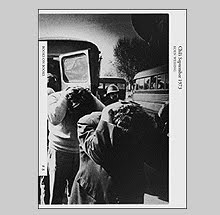
Trapped in the proverbial vacuum of Southern California's National City, John Baldessari discovered a way to accept the void, the cultural isolation, the boredom and estrangement. He made a series of snapshots, sometimes from a moving car, sometimes from the hip, of life in National City - pictures of street corners, various storefronts, suburban homes, car dealerships - everything he saw as "the real situation." These he would use photo emulsion to apply them to canvas and as a finishing touch, hired a sign painter to paint a caption, usually the location, in a straight-forward and matter of fact style. These photo-texts pieces he created starting in 1966 would lead him to ceremoniously cremate all of his previous works in his possession on July 24, 1970.

A book I picked up at Artbook Cologne earlier this year from the Museum of Contemporary Art, San Diego called John Baldessari: National City (1996) features most of this work plus newly realized pieces created when Baldessari revisited sites in his former hometown.

These works raise questions about image and text in similar ways to Ed Ruscha's self-published artist books of the time. One reads Twenty-six Gasoline Stations and then peruses photos of gasoline stations but all the while we are looking for more, questioning the simplicity. When Baldessari has his picture taken standing in front of a palm tree in a suburban neighborhood, then has his sign painter caption the photo "Wrong," we stumble for a moment. Is he questioning rules of photography? The palm tree sprouts from the head of the figure, breaking a conventional rule - do not photograph people so things appear to be growing out of the subject's head. When he directs us to look at an "Econ-O-Wash" at 14th and Highland do we accept the image or are we distrustful of the artist. Is this conceptual art? On first viewing, the images seem funny and according to Joseph Kosuth, the use of comic irony fell into pop art, and he once implied, "conceptual art could not be funny." So in essence, Baldessari (according to Kosuth) was doing everything "wrong." Why are these canvases sized 59 x 45? So they could fit inside the artist's van.

As a book, John Baldessari: National City, is not a great object but to have these works in a single volume at an affordable price is the draw. Along with eight essays by various authors, the plates are reproduced in color and works from the series not included in the exhibition are shown in duotone as well.
Look for this one before it gets too pricey.

Saturday, October 17, 2009

Rome + Klein by William Klein


"I compare Rome, once again, to an artist's studio, not that of the elegant artist, who, like ours, dreams of success and plays a role, but that of an old artist with messy hair who in his time had a streak of genius and who now squabbles with shopkeepers." -Hippolyte Taine

In 1956 while Federico Fellini was in Paris for the premier of I Vitelloni, he received a phone call from a young William Klein who asked to meet and show him his recently published book Life is Good & Good for You in New York. Upon meeting the following day, Fellini mentioned already owning the Italian edition which he said he liked and kept by his bed. According to Klein, within minutes he was invited to become an assistant to Fellini on his latest project, The Nights of Cabiria. His job was to photograph during the casting and document the prospective whores and pimps, black marketeers, hoods, and other "scroungy characters" needed for the film. Finances were delayed and Klein was free for eight weeks to roam the streets looking for his own take on the city, sometimes accompanied by Fellini, Alberto Morovia and other avant-garde writers and artists. Klein's Rome: The City and Its People was published in 1959 and Aperture has just released a new 50th anniversary edition as two books housed in a special PVC slipcase.

Like his reworking of his classic book on New York from 1995 (Marval), Rome + Klein is not a direct facsimile reprint of the original. He has left much of the graphic design by the wayside in favor of full bleed images and inclusion of additional photos that did not appear in the original. As Klein has said of his revisitation of the New York work, "The first book was about graphic design, the second is about photography" - the same approach holds true here.

Klein's Rome, the original, is the only of his "city" books which I do not own so direct comparison is not possible but what I gather is that most of the additional material included in this new edition is from his various fashion assignments shot in the streets with his usual flare for mixing the staged with the unpredictable. Klein has written of the fashion pictures, "I found it hard to take seriously, and the photos were mostly private jokes." What is not a joke is that within eight weeks Klein literally blitzed the city and produced one of his better books in such a short time.

Appropriately not as vertiginous as the New York work, Klein keeps a quick visual pace even among Rome's seemingly sluggish citizens. Rome + Klein opens with a photo of the guard to the famous Cinecitta film studios relaxed next to sculpture of Greco-Roman wrestlers, his rounded stomach more akin to the bulbous fenders of the nearby Vespa scooter than the marbled muscles of his arm-locked ancestors. Klein shoves his Leica and trademark wide lens into the crowds while they walk, eat and play while also making more static (albeit visually loud) portraits of his artist friends that acted sometimes as his guides.


In one, on invitation from Fellini to meet up with Vittorio De Sica, Klein gets a bonus appearance by Roberto Rossellini and a crowded portrait of three of the greatest film-makers is made, but Klein's image is not one of star struck glamour, he photographs them as if they were anonymous figures found on any street corner.

After a brief introduction about the "why and how" the work came into being, the first book is all photographs whose flow is only interrupted by the chapter divisions which make up the six parts. The second book is a thinner volume of Klein's captions and extended texts from a variety of authors along with design elements that playfully litter the margins. It is within these writings that one discovers Klein's own texts are as entertaining and smart as his photographs. For anyo
ne who has read the Manhadoes essay or captions from the booklet attached to Life is Good... will know, Klein is extremely funny and writes in a style that puts the free verse of some of the Beats to shame. I find it curious that his texts are never mentioned at all in regard to his books since their strength is so apparent.

As books, Rome + Klein are well conceived and beautifully produced. I like the split of the two books into photographs and captions, certainly the sma
ller caption book may invite people to actually read his texts which in a combined volume would have been a task due to the larger size and weight. The PVC slipcase is printed with the same colorful jacket image that graced the original. My only critique is that Klein has been employing the same typography and layout for several titles now and the graphic elements lack the former surprise and playful irreverence.

Klein has been recognized as one of the major talents of the twentieth century, not only as a photographer but as a film
-maker as well. He challenged each medium he tackled from painting to photography to graphic design and I would add, even writing. This work, unlike his work from his hometown of New York, was unplanned and the fruit of a chance meeting. In the words of praise from Fellini, "Rome is a movie, and Klein did it."

Note: Aperture is having a Benefit and Auction on November 2nd. Click here for more information.

Saturday, July 4, 2009

Paris on just 2 books a day


It has been a busy week although not for 5B4 postings as you all figured out (I wanted the Playas book to sink in a bit so I let that rest at the top of the page for a while). I have been in Paris since Tuesday and will be going to Arles on Monday for the start of the photo festival where I hope to do a few posts onsite but from what I hear there is little time to sleep let alone write.

Paris has always been fruitful bookwise and this trip has had me hitting my usual book haunts except I am showing great restraint unlike my complete breakdown of will in Germany last month. There will be no shipping of books home at exorbitant rates nor heavy boxes being carried as hand luggage. Only the necessities will make it home this time around and I have further decided that they cannot weigh in total more than 10 pounds. Possible?

Ok, so you see eight books in the composite photo from only five days and you ask if that is a sign of showing restraint. I say yes because they are all very small, light in weight and were very cheap.

The first, a new edition of Daido Moriyama's Light and Shadow came to me by way of Sebastian Hau who was running the book table at Diane Dufour's party for her new museum project Le Bal which is slated to open next year. About the size of a pocket paperback this is a reconfiguring of his book from the 1980s. (Weighs in at around 5 ounces)

Sophie Ristelhueber's book Operations was found at the Jeu de Paume museum in the Tuileries. This is her book of 'invisible wars disguised as poems.' Words only, no images, but a fantastic artist book. (Weighs in at around 6 ounces)

The next two books are a part of the series La Carnets de la Creation from Editions de l'Oeil. I hadn't noticed these before even though the series has been going for some time now. They are 24 page long booklets, softcover and about 5 x 7 in trim size. The first that caught my eye was on Mikhael Subotsky and his images from the Beaufort West prison and the other features Malick Sidibe's portraits of people with their back turned to him. They aren't great by any stretch but well worth the 5 euros they retail for. The printing is decent and all the texts are in French. (Both weigh in at around 4 ounces)

The next is the biggest of the lot at approximately 10.5 x 11.5 inches is the Match and Company Takashi Homma book Trails. Not to be confused with the new Hassla edition of similar material, this is a really beautiful book published in Japan in an edition of 700. I am not a huge fan of Homma but this is a really good one. I will spend a bit more time with this and the Hassla book First Jay Comes when I return homma. (Weighs in at around 8 ounces)

The next two are publications in the Linea di Confine della Provincia di Reggio Emilia series. These are the results of workshops given by various photographers invited to work in Italy. The first catalog in the series is from 1989 and on Guido Guidi who explored the province of Ruberia. The third in the series is Michael Schmidt's work in the outskirts of Correggio in 1991. At 32 pages they are short but the content is well printed and nicely presented. (Both weigh in at around 12 ounces)

The last book has a geek factor of 11 but I couldn't resist since it was the only copy I saw. It is a bibliography of all the publications that reproduced photos by Eugene Atget during his lifetime. It is from the publisher Stanislas Fourquier in 2007 and features many black and white reproductions of the magazines and books. I figured it was well worth the 15 euros since oddly, it is numbered and only one of 250 copies. Who puts out a limited AND numbered edition of a small softcover bibliography of Atget? Alain and Stanslas Fourquier that's who. (A mere 5 ounces)

So my book weight total so far is around 2.5 - 3 pounds but just wait till I get into Schaden's Supermarket of Printed Matter in Arles. 1000 square meters of book heaven. I'll be the one in the corner weighing books on the scale.

Friday, June 26, 2009

Playas by Martin Parr


If I understand correctly, Martin Parr and the publishers of his new book Playas, Editorial RM and Chris Boot, left all creative control of the book to the printer they employed in Mexico. That is, the design, sequencing, format, everything. This decision was made after asking several different low cost printers to design a cover and then Martin picked the best (or worst depending on how you look at it) and that company won the job to do the whole production. The result may be the best Martin Parr book in quite a while.

Playas is Parr's take on various beaches through Latin America. His subjects dip into the water and take the sun amongst a variety of detritus both bought and washed ashore. They or should I say we, come off as an awkward lot as he points us to micro-bikinis, flesh in all sizes and shapes, and the wide variety of relaxation techniques.

The first image which appears on the front endpaper shows a train of people either arriving to or departing from the sand. Behind them a sea of bodies have staked a claim amongst the umbrellas and small cabanas that litter the horizon. It is an image which sets a tone of exhaustion, both the physical and the visual. Throughout Playas there is so much information that, like being sapped of your energy from the sun, you sense the exhausting nature of a day at the beach.

Formally Parr does his best to juggle the information with a flare to accent the oddity. A green bottle of soda, a towel covered head, various magazine spreads (photography of photography) or an odd splash of color all get worked into frames that are often dense and complex. At their best, they are a surprise and at their weakest, they describe motifs as photographically common as a stale one-liner.

Bookwise, Playas wins hands down. Parr seems in near constant examination of humanity as example of bad taste. His book design's often flirt at this when what they needed to do was haul back and slap to convey that bad taste. The Last Resort, his book on New Brighton, added graphic blocks of color to accent the superficial, hyper-reality of his flash enhanced colors. One of his latest books, Mexico, tries its hand at being tacky with its cover design and bright green spine. What fails for me is that it is often graphic designer's idea of bad taste instead of the real thing.

The designer of Playas pulls out all the tricks and makes the photos seem as if they popped from a digital photobooth that might have lined the strand. Bordered by graphics of palm trees and the ubiquitous truck mud-flap silhouette of a nude woman, Parr's images have found the frames they have wanted for a long time. Small in format and made from cheap material, Playas will test the reader's strength to stomach kitsch with other added faults in production like severe non-registration and inconsistent page trimming that snips into the images and graphics.

Playas retails for $7.00 and I hope it stands the test of time a lot better than the beach umbrella I bought last summer for roughly the same price.

Sunday, June 21, 2009

Landmasses and Railways by Bertrand Fleuret


Daisy, Daisy,
Give me your answer do!
I'm half crazy,
All for the love of you!
It won't be a stylish marriage,
I can't afford a carriage
But you'll look sweet upon the seat
Of a bicycle built for two. - Lyrics by Harry Dacre, 1892

Video Killed the Radio Star - The Buggles, 1979

When Dr Haywood Floyd, played by William Sylvester in Stanley Kubrick's 2001: A Space Odyssey, first approaches the newly discovered monolith on the moon, he and his fellow scientists do so without the fear and apprehension their ape ancestors had two million years prior. Rather, like a group of tourists, a photo is arranged and snapped. They have evolved to a point and their tools have improved, but faced with the understanding of what stands before them, they are powerless to do anything but snap a photo.

Whatever the name of the planet that Bertrand Fleuret touched down upon in his new book Landmasses and Railways there is much that initially looks familiar but upon closer examination, it is a world drawn from metaphor representing a frightening vision towards the future. I won't belittle this book by describing it as a "message," but it does emit an ear-piercing alarm as unsettling as Kubrick's monolith.

The first chapter, The Meloncholy of Departure describes the touchdown. Our vehicle, an 18th century wooden and glass pod (now preserved in some museum) leaves us far from signs of civilization. Water and mountain ranges will need to be crossed but first our sight will need to recover. The first images have us seeing through a haze in which we make out only part of the landscape leaving it difficult to get our bearings.


Chapter two, we approach a city and the feeling that we have touched down on a familiar planet is slightly assuring but not entirely. Are we home again? Gravity works holding the landscape in place but occasionally there are inexplainable light aberrations that hint at different rules of physics at work on this planet (or have our eyes not fully adjusted to the new sights?). Inside the walls of the city we encounter others who seem to be as new to the environs as we are. They wander almost dumbfounded not seeming to accomplish anything but staring (and take photos) at what has been created - like so many tourists.


A building is encountered, abandoned as if after an apocalypse. Searching among the debris, we see that technology and tools of man have flourished but amounted to a cold, emotionless state while pictorial representations of "civilization" paradoxically depict warmth and vitality. After such discoveries, escape back to "the garden" might be a relief but for the realization that one cannot return home again - consequences have been created and will resound at every turn. A dead bird and monstrous horse signal that the garden is tainted.

A card slipped into Landmasses quotes the photographer William Gedney as stating, "All facts lead eventually to mysteries," which rings a similar note to Winogrand's "There is nothing as mysterious as a fact clearly described." This was my journey in Fleuret's novel in photos and certainly your own will be different. It is a book full of possibilities which for me is the joy like any great work - trying to grapple with its mysteries and discovering what they unlock in you.

Landmasses and Railways is the size of a hardcover novel. Its design is as straight forward and clean as pages of text would be. The matte paper and printing provide a fine foundation. Landmasses and Railways was published by J&L Books. An advanced edition of 100 copies bound in a different color buckram, signed and numbered, is available through Schaden.com.

Friday, June 19, 2009

A Manx Stamp Album by Chris Killip


One of the perks to being one of the few photographers of note to come from the Isle of Man is that the postal office will eventually come around to issuing a stamp set featuring your photos. This honor has been bestowed upon Chris Killip and the occasion inspired him to create a small and very limited booklet called A Manx Stamp Album.

A Manx Stamp Album of Water Mills and Thrashing Mills 1970-1973 features the eight images that now grace the stamps. It was a huge surprise to me that only two of the images had made it into Killip's first book Isle of Man: A book about the Manx, even though they would have been a fine addition to the edit. Made around the same time as the pictures that did make it in, these describe the water-driven mills and crop thrashing machines employed to work the land.

Chris's portrait of the Isle of Man had more to do with a community whose identity was being encroached upon from the rich who were buying up the land as tax sheltered property. My initial drastic misreading of this work was clouded by a romantic tenor that I was ready to tarnish this work with. Turns out when you spend time with these photos and see the finer details of lives worn by constant work of the land, they become much less idyllic and more about survival.

The design of A Manx Stamp Album is simple. Small in trim size fitting to the scale of stamps, it features the photos on the right-hand side and each stamp adhered to the facing page. It is signed and numbered on the last page and was published in an edition of just 24. It comes enclosed in a small envelope that has been mailed on the first day of issue to Killip at an address in the Isle of Man and of course the postage used was his own stamps.


I should also mention another Killip rarity which is a booklet of postcards published by the Side Gallery from his exhibition of the Isle of Man work. It has 6 cards hinged together with a short essay by Nigel Kneale. Again, one of the images that appears here is not in the actual book version.

Lastly is the limited edition version of his newest book, Here Comes Everybody. This is by far a much more elegant edition. Each photograph was printed separately and attached to the page making this the true photo album which the trade edition strived to be. The covers lock closed with two flaps of cloth covered board and magnets.

This edition of 300 comes signed and numbered with a print.

For more information or to order A Manx Stamp Album visit www.chriskillip.com

Tuesday, June 16, 2009

The Plan by Michael Schmelling / Platz Ist Wo's Hinkommt by Jacob Kirch


As you can see I am doing some Spring cleaning with the Photobook Exchange so I thought two book reviews along those lines were in order. Michael Schmelling's The Plan from J&L Books and Platz Ist Wo's Hinkommt by Jacob Kirch from the Institute for Book Arts in Leipzig will help with some tidying up and making a few home improvements.

In 1992 I moved into a tenement railroad style apartment on 35th street and 9th avenue in Manhattan. The elderly woman who occupied the place before me was a compulsive hoarder of cloth swatches and scraps that she would gather from the dumpsters of dozens of garment sweatshops that lined my street. I heard from neighbors that she had filled the front room of the apartment which was about 10' x 12' to a depth of about 5 feet deep with the swatches. It took two days to cart all of the material to the street and when the workers made substantial progress, they uncovered a full dining room set and various pieces of furniture that hadn't seen daylight for years. When I moved in I had one milk-crate of books, another full of clothing. The space echoed for about a year.

Michael Schmelling has been photographing the results of compulsive hoarding by tagging along with a New York-based agency called Disaster Masters as they venture into the homes and apartments which are filled to the threshold with clutter. His new book The Plan could be seen as not only documentation, but an extension of the mindset of someone suffering from pathological hoarding. At approximately 600 pages, the amount of material is as overwhelming as a room full of useless possessions.

The Plan opens with a small polaroid photo of a washbowl within which sits an arrangement of beer tabs found in Walker Evans's home in Old Lyme, Connecticut. The lip of the sink is cluttered with other found objects rendering the basin unusable; not to mention the sign that rests just above the beer tabs that reads, "Please do not disturb the arrangement of tin beer caps in this washbowl." A still-life to be photographed to one day? or ready-made sculpture that has taken over a bathroom?

Schmelling finds hundreds of small still-lifes to describe and much of The Plan is concerned with those that follow in the spirit of Evans's beer tab arrangement. Setting about looking through this book is as unsettling as what the photos describe. It is bulky yet as unwieldy as a small phonebook. Its thin pages make it nearly impossible to grab just one. Its ink comes off on your fingers and smudges the white covers. Its construction leads to some confusion with a section of green pages (why?). In short, it is probably the perfect representation of a book about the disgust and repulsion of out of control filthy and clutter. Would you expect a book about such a subject to be clean? Why the green pages? Perhaps because venturing into one of these rooms piled high with junk is about as unpredictable as a book that suddenly reproduces its last pages in monochrome green.

There is a method to the madness but you need to decipher just what that is.


Once your home is cleaned and everything carted away by Disaster Masters, you can start repairing the damage. Jakob Kirch's Platz Ist Wo's Hinkommt could be the guide you are looking for.

Platz Ist Wo's Hinkommt is an artist book/ graphic design thesis that compiles various illustrations that were common to home improvement magazines from 1975-1990 in the DDR (Deutsche Demokratische Republik). Initially interested in Claude Lévi-Strausse's distinction between the "engineer" and the "amateur handyman" (an engineer makes use of objects made for a particular project, the handyman uses whatever is available to him) Kirch set up some formal rules in the creation of his book. The illustrations were chosen for their formal qualities yet Kirch arranges them into compositions on each page according to their original positions as they appeared in the handyman's magazines, making editing into a subtractive act to avoid overlapping images. Moves between subjective and an objective sets of rules, Kirch's new guide to home improvement force the formerly step-by-step illustrations into new associations that are puzzling yet hint at a deeper pool of knowledge beyond the rational.

The design of Platz is brilliant. It is comprised of 13 staple-bound booklets glued together to form one book. Each "section" provides illustrations from individual magazines and the last booklet - reproduced in bright yellow - provides a legend to provide each photo's caption and determine which magazine the illustration came from. This section folds out just beyond the main book block so it can remain open while the reader flips through the book, making access to the captions easy. Platz was published in only 150 copies by the Institut fur Buchkunst Leipzig in 2006 and is available for 30 euros.

The similarities to Schmelling's The Plan make these quite the pair. They are remarkably close in trim size, quality of reproduction (very rough), type of materials (thin paper) as well their tenor of what human activity creates and what it looks like when reinforced by a logic that might escape most people's understanding.

Sunday, June 14, 2009

Denver by Robert Adams


This year sees two re-releases of Robert Adams' books, Denver and What We Bought: The New World from the Yale University Art Gallery.

Denver: A Photographic Survey of the Metropolitan Area 1970-1974, the second book, in what could be seen as a trilogy starting with The New West and ending with What We Bought: The New World, was originally released in 1977. In Adams' words he "wanted to explore whether a romantic view of Denver and the American West was entirely wrong." In 93 photographs he presented his critique of America's poor stewardship of the land with rapid expansion of housing and obsessive consumption.

John Szarkowski's "suggestion of redeeming value" in regard to the buildings, homes and roads as he wrote in his introduction to The New West three years prior, is questioned in this body of work starting with the first chapter and its almost sinister heading Land Surrounded; To Be Developed. The promise of expansion to provide better way of life, a new start, is dashed with the trampling of the landscape. Motorbikes carve pathways into prairie land and an impotent fire hydrant stands comically within foot high scrub while smoke from a fire is seen miles away on the horizon. Man acting on his folly has identifiable consequences but within the historical flow of action, those consequences are sometimes difficult to determine in advance. It is this selfish behavior which comes under Adams' gaze throughout the book while the paradox of a love for people "who are, although they participate in urban chaos, admirable and deserving of our thought and care." That romantic western view of John Ford and the like isn't so much a lie or entirely wrong but that of a much smaller scale.

Adams describes exteriors and interiors of homes which, although complete with the amenities of convenience, seem sapped of any spiritual character. His are descriptions of the superficial. A room crowded with furniture of competing styles or a relatively empty one whose long expanse of couch seems metaphor for a desiree for endless comfort over all else.

Although mostly unpeopled but for distant figures dwarfed by the landscape, Denver does contain a few images that resemble portraiture. More indirect in approach, they describe a factory workers toiling over their repetitive work and a few shoppers wandering among aisles of brightly lit products. A couple of photographs which show their subjects in profile and perhaps in a moment of reflection might serve as self-portraits of the artist. Both subjects seem to represent visually the only conscience in the whole book.


This edition of Denver strays from the original in picture count and design. These changes are significant and notable since Adams himself has been said to have disliked the final book. He called it a "compromised fragment," which may be in reference to the words of his introduction where he states being taken by Yasunari Kawabata's phrase, "My life, a fragment in the landscape." The original is also very poorly printed. Although that lightness of the printing may accentuate the sense of "perpetual noon" as Lewis Baltz described the quality of light in these pictures, this edition's tritone plates with separations by Thomas Palmer are beautifully mastered.

The change in design brings this volume down to the same trim size as What We Bought: The New World. The plates however are
slightly larger accounting for the vast amounts of white that surrounded the photographs in the original. Gone also are the blank white pages that appeared occasionally breaking the sequence and rhythm. This new edition presents a long train of images broken only by the chapter headings.

The other change is with adding 26 photographs. A few fill in the previously blank pages which faced the chapter titles in the 1977 edition while others make for new pairings within the sequence. It is interesting to note that What We Bought: The New World arose from the Denver project as that book came from a box of
images which didn't make the original Denver edit and had been stored away for years. Now 26 previously unpublished images have made their way back into the book proving that photographic editing is an on-going process of evaluation which shifts with time.

None of the changes draw any complaint from me only praise. It may have taken 31 years to do so, but this new volume is now more beautifully realized than the original and no longer a compromised fragment.

Thursday, June 11, 2009

Visible World by Fischli & Weiss


Seeing the foot thick book dummy at the Fotobook Festival in Kassel by Katharina Gaenssler has me looking at books which challenge the viewer with a bulk of imagery. That dummy must have had thousands of images, many of which on their own wouldn't hold water but that obviously isn't part of the artist's mindset. Gerhard Richter with his Atlas explored bulk images as reference points to culture and I would even point to Gilles Peress' Farewell to Bosnia which is in his words, is an "unedited book" of the Balkans wars. Fischli and Weiss' Visible World
(Sichtbare Weld) published in 2001 by Walther Konig is another worthwhile exploration of the book as mass of information.

No text and with 8 photographs per page, Visible World is a globetrotting description of landscape and cityscape contained in a few hundred pages. Their approach seems to be from a tourist perspective. A great deal of what they describe would have drawn any passerby to lift a camera to the eye. Horizons are straight and the depth of focus sharp. They are seductive in beauty from the light to the color in the same way that postcards describe "good" representations. They point towards the exotic and the familiar with equal distance both formally and emotionally.

Seeing them arranged as grids, time is stunted. Repetition with only slight variance to framing brings to mind contact sheets but as long as we may linger on one vista, an entire continent can be spanned within one page. It is a catalog starts and pauses and I would draw momentary comparison to their video The Way Things Go in how these often disparate images link up and push the flow of the book.

What seems to be missing is any sense of how one would perceive the world through the daily media or human experience. War, famine, terrorism, disease, poverty, pollution, natural disasters are all distant concepts from what is described here. It is a pure world where harmony and a sense of calm persists. I think it is fitting that this book was published in the year of 9/11 since that disconnect is so strong. Theirs is essentially, as the title suggests, the superficial world as we may pass through it disregarding deeper thought. The hippo emerging from the water is only seen as he breaks the surface, the rest is not visible.


The sequencing jumps from continent to continent and since this is presented as one venture in continuum, the comparison of one landscape with another weaves the world into a tighter, neater package. History is also present where the primordial (crocodilles and hippos) and unblemished horizons mix with man's modern presence (billboards and inner city traffic).

The longest pause is on airports. Near the 2/
3rds mark, they spend several pages of grids describing the planes and terminals that made their adventure possible. I raise this because it was their book Airports that first made me recognize that whoever was behind the camera (Fischli or Weiss or both), they actually craft wonderful individual pictures. That section departs slightly from the traditional tourist view (although many amateur's make pictures of the planes they are about to enter at the start of their trip, most are not as obsessive as is observed here).

As much as most of these pictures already exist in our mind's eye (they are so common to guides about how to take "good" photos), and can be considered cliches of tourist confirmations rather than discoveries, they have a sense of banality but also are compellingly beautiful beyond expectation. Because of this one might get
the sense of a parody at work; a dissection of tourist views thrown into a conceptual mass of photographs.

The task of describing the totality of the visible world is, of course, impossible. This fragmentary view which spans so much distance and appears cyclical, provides a pleasure in taking in only a small portion of truth and with willing participation we follow in tow, embracing blissful ignorance.

Monday, June 8, 2009

Wald by Gerhard Richter


It seems one can't move within a bookstore now a days without risk of knocking a new Gerhard Richter book off the shelf. One however caught my attention, Wald published this year by Walther Konig is more artist book than catalog and due to its smaller size you might not have noticed it.

For a few years, Richter has been photographing in a forest near his home in Cologne, Germany. 35mm in format the first impression might be that these are paintings. They follow some of his formal traits and the color palette and range of tone will seem familiar as well. A dense book of 285 photographs, all verticals, he loosely groups them into categories of form. Horizontal branches, vertical groupings, logs and fallen growth are framed into compositions where the line of branches reminds one of his swipes of the palette knife across his paintings.

What amazes me is that the vast number of images does not diminish their individual attraction over the course of the book. Interspersed are short texts which are, as I have read elsewhere, nonsensical passages chosen from forestry magazines and compiled via a random text generator. The text, perhaps like the forest itself, becomes most dense in the middle of the book and from start to end, it has a presence that fades in and fades out.

I wrote before about Richter's experiments with overpainting photographs and the idea of a ready-made artwork that is dependent on one action guided by instinct. That of course is photography itself and for the seeming casualness of these photographs, they actually reveal a maker so skilled and informed that each holds a unique appeal. Each solid yet testing different combination of form that risk repetition and failure.

Beautifully printed and in my opinion, the perfect size, Wald is a pleasant break from the many Richter books which I find so unsatisfying. Finally a return to examining an artist in full exploration relating to the world rather than just another catalog touting his greatness.