Kratochvil, Pellegrin, Uimonen and the new photojournalism
In contemporary photojournalism there are a few practitioners who are testing the boundaries of the forms that traditional journalistic images have adopted. These are photographers who now embrace blur, rough impressionistic description and what I have referred to before as visual gymnastics into their images. This is perhaps an attempt to slap the viewer into paying attention. The combination of these characteristics has created what amounts to be what I see as a new formalism among some contemporary photojournalism.
When Gilles Peress traveled to Iran in 1980 to see the reality of the Islamic revolution first hand, he brought back a new form of personal journalism. His choice of the implied road trip narrative to covering current news events paved the way for younger journalists seek out new ways of describing the events they were covering. It has created a form of impressionistic photo story where facts are described in ways that favor the general mood and emotion of the situation. It is essentially a subjective journalism infused with the personal reactions of the photographer.
What creates this sense of personal reaction is obviously directly linked to how photographers adopt and hone their individual instincts in making pictures. While honing these instincts the photographer (all photographers) often learn by example. For instance, in photojournalism, the adoption of the 28mm wide angle lens and the in-close, low to the ground vantage point was an attempt to bring the viewer into the realm of the action (and vicarious danger) and thus became a standard descriptive tool. Many photographers used this new language, applying it to their subjects in an attempt to fit in with the newly perceived dynamism that was being seen in the work of others.
It is one thing to adopt and force a form onto your subject and yet another to react using your instincts to find the form of the picture. This is what Garry Winogrand was so adamant in attempting to maintain in his own work. “If I see a photograph that I know, I do my best to change it somehow.”
Now I do see the vast difference of not only the intent but situation in which a journalist works and how Winogrand worked. There was little chance that Winogrand might be harmed within the arena that he was engaging the world. A journalist has it much different as death is, at times, a constant possibility. For these photographers to work in that mode of stress is fascinating enough. But if one is able to set that aside for one moment, what I am calling into question is the transition from instinctive response to a subject, to the moments when force of habit takes over.
While looking through the De-Mo book WAR from the photo agency VII, I found an interesting moment in a photographer’s work where it seems that force of habit has overwhelmed other instincts. I am speaking of the work of Antonin Kratochvil and his work in this book in particular.
Of the 29 images that make up his contribution to this book, 25 of which are remarkably similar in the approach to their construction. From the tilt of the camera to the arrangement of the subject matter, they all follow a very similar form. It is as if Antonin is following a formula into which he is crow-barring his subject. Take the following examples from WAR.


This seems to be a trend in his work that has established itself over the past decade or so. If one looks through Vanishing, his last book effort, they will see much of the same force of habit on display.
This is not to say that the work fails on all fronts as sometimes the world cooperates with this formal application but if you look over the course of much of the recent work it is undeniably seen. One has to go back as far as Broken Dream to see the photographer free from the handcuffs of his own constraint. In that title Kratochvil is at the top of his game in that he hasn’t thrown out all convention but is pushing at its edges with good result.
As a book, Vanishing is an interesting exercise in design and tone. This is something that a few De-Mo designed titles have done to good effect. I think Vanishing feels great as an object and pushes against conventions as you orient the book in your hands differently. It is a horizontal book that is bound at the top edge, which forces a somewhat uncomfortable way of reading. I like that, in essence, it makes you pay attention in a different manner than you might otherwise.
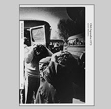
Broken Dream follows the conventional route although like the best of books, it is the photographs that make that title worth while. Made over twenty years, the work in Broken Dream examines the communist countries of Eastern Europe. In Kratochvil’s own words, “All I wanted to do was record how all those poor people adapted to lies and suffering, how they got used to it, how in fact they were bound to miss it when it was over.”
Paolo Pellegrin is another photographer working in what I perceive as the new journalistic vein. His book Kosovo 1999-2000: The Flight of Reason uses some of the same language that I’ve been speaking about. Like Kratochvil, Pellegrin often pushes his subjects to the edges of the frame while imposing his order. Although unlike Kratochvil, he doesn’t seem to be locked into his own rules of design but experiments freely with a combination of examples set and his own instincts. On a superficial level this provides at least a variance of imagery so the story doesn’t seem to follow a pre-prescribed formalism.
Flight of Reason is mostly about the displacement of people caused by the conflict in Kosovo. Paolo plays both sides of the conflict showing in equal measure Serbs and Kosovar Albanians. As it was with the war in the Balkans over a decade ago the lines are blurred as to telling one side from the other and in this book one feels that same sense of the unknown.
The book is interesting in its design in its pages are entirely black so all of the imagery has an added ominous tone. The only thing I don’t like is that the paper stock is a touch too glossy. I would have liked to see how a matte paper would have treated the content. Most all of the images run across the gutter and are shifted to one side or the other but luckily the book opens relatively flat so there is minimal disruption to the photos. Be careful though as the binding does not seem to be the strongest and after a while the signatures shake loose from their glue.
Ilkka Uimonen is another of the Magnum set that is utilizing impressionistic imagery to present his stories. Uimonen is slightly different as his images often seem to be descriptions of a point of panic among the subjects. The blur and on-the-run feel of his images is their strength as it puts us momentarily in the midst of the perceived chaos.
Cycles is a book about the Israeli / Palestinian conflict. It documents suffering on both peoples and instead of taking sides seems to be more concerned with the obvious reoccurrance of history and human behavior. The book is mostly black and white but does include a few images in color. This is a bit confusing as it reminded me at least of his other responsibility which is fulfilling magazine assignments. In terms of the work as a whole it seems less realized because of this mix.
The book is appropriately simple in its design with bright white covers that get smudged and dirty in just a few readings. There might be a metaphor there somewhere. The book opens right into the photos until it ends with a small quote from Jung, a caption list and acknowledgements page. The book was designed by Ilkka and holds onto a handmade maquette feel to the whole production down to the strip of binders tape on the spine.
Book Available Here (War VII)
Book Available Here (Vanishing)
Book Available Here (Broken Dream)
Book Available Here (Torst)
Book Available Here (Flight of Reason)
Book Available Here (Cycles)
![]()