Friday, June 5, 2009

School by Raimond Wouda


I have mentioned many times my fascination with photography is mainly due to those rare moments when a camera in the hands of a skilled practitioner can achieve the miraculous. That is, when a photograph contains so much information, reordered to perfection where every element within the frame keeps adding surprise and revelation. It does not happen often.

This is why I am so envious in some ways of painters because they can control each element or figure. Brueghel's dancing peasants, Ingres' Turkish bath, or Poussin's ordered chaos of The Rape of the Sabines deal with multiple human figures which all find their place within a deep space. Those paintings hold so much descriptive force that new discoveries upon repeated viewings are a part of their draw. For me, in photography, the image first must keep me engaged even after hundreds of viewings and this is why 'ideas' behind images are much less compelling when the execution of the work does not master the thought. This is one reason the work in schools and colleges of Raimond Wouda is so compelling to me.

Wouda started to observe the relationships among groups of teenagers while they were on the school playground across the street from his studio. Something about those observations drew him to approaching the institutions in order to gain access to their hallways and common areas with his view camera and strobes. It wasn't the classroom he was interested in but what was happening when the students were on their own and what that might reveal if photographed. His newest book School from Nazraeli published this year brings together a tight edit of 35 of these images.

School is often less about learning the classroom lessons but learning about your place in societal structures. Groups or cliques and those desires to be accepted often form confidence or devastate it. Finding your place was a form of recognizing something of yourself in others. Being in school was often about being obsessively aware of your body, each movement and what it might reveal about you. Clothing, hair and accessories merge into your identity within fads that have little to do with you as an individual. What is so amazing about Wouda's work is that with all of this self-awareness present in such an environment, he and his cumbersome view camera and strobes could somehow go about their tasks relatively unnoticed. Photographers do not tend to tread lightly.

His camera is the omniscient observer. The height, beyond normal human perspective, describes from above and allows for renderings of a deeper and more complex space. We do not experience just a foreground and background but a full field of view which is made more intense with the amount of characters he juggles. Massimo Vitali would be a natural comparison but for me his images are too wide angle and he treats the characters as minor players within the large expanse of landscape. Here Wouda gives equal treatment to both people and environment. There is no hierarchy but a complete merging of form between the two.

Like a painter, Wouda is able to choose moments within a chaotic environment where each element and character finds their own space in which to be described clearly. It is within these moments that small individual one-act plays are caught, cliques formed and individual personas perceived. An image of a school dance shows a clear divide of male and female while each group eyes the other with desire stifled by hesitancy to breech the divide alone.

My fascination with these images extends to the edges of the frame. Wouda's other strength is his ability to fill the frame even to the very edge and somehow the world cooperates to introduce more interesting elements. Page 17, a boy in a red shirt with an angled black stripe across his chest near the left side of the frame pauses against a slice of a brick wall while on the opposite right side a young woman in white looks left and a boy seated at a table nearby clasps his hands in front of him, elbow at the very frame edge and angled to mimic the black stripe of the boy on the opposite side. All of these small elements hold the tightness of the frame while in between a frieze of faces and gestures.

Add to the complexity, color. Once within the already difficult task of creating a new order from chaos, the introduction of color can either break or enhance compositions. A distracting color could grab attention from the rest of the frame destroying its integrity. The cover image of school was shot within a locker area - a space that Wouda works often. Within this image, reds become important signifiers of holding the frame together. The bottom left, a young woman's shirt starts a line of red shirts that continues to the back of the space, meanwhile the balance on the right side is achieved by a couple of flower ponytail holders and a last minute product placement of a Coke bottle sitting within a locker at the very frame edge. You could go on and on noticing the arrangements of blues, yellows and blacks as forms within forms.


As formalism itself is only interesting to a point, the real pay off is in the stillness of revealing moments. Among the juice boxes and backpacks, it is the expressions and readings of body language that are important. One exudes confidence while another awkwardness. Two boys flirt with a woman while others look on with curiosity. A few boys hang around a vending machine fronting toughness within the candy-colored safety of a hallway. These pictures show the building of our inner foundations which can sometimes seem formed from the painfully trivial.

As a book School follows Nazraeli's usual clean design and choice of materials. It gives fine treatment to the photos in scale and printing. It is handsome but I have to say, after experiencing some of the great design talents from The Netherlands I wonder what this would have looked like in the hands of a different designer. The edit is very tight and although I do not know what was left out, every photo included is worth its weight.

This is the 4th in Martin Parr's selection of ten bodies of work. His tastes and mine tend to differ a bit but with the selection of Wouda, we couldn't agree more. This work is THE reason why this medium is unlike any other and to me, these photos are clear examples of why I will never tire of its surprise.

Wednesday, June 3, 2009

Novemberrejse by Krass Clement


Krass Clement is known for his great book Drum from 1996 but did you know that he is a seasoned book maker with 17 other publications under his belt? While at the Fotobook Festival in Kassel I was able to get a hold of two as well as see a few of the others and this larger exposure has me begging the question - Why is Krass Clement not more well known?

Krass's approach can seem traditional at first - it's black and white, small camera, etc - it uses a language which I think people immediately pigeon-hole as old-fashioned or not 'contemporary' and this is a shame because it merits much further attention than it obviously gets.

His book Drum was rumored to have been made with 'three rolls of film and five pints of Guinness' while in a small pub in Drum, Ireland. It is a book which on first glance looks very traditional in regard to its design and format until you start to follow the sequence. People have spoken of its filmic quality due to the repetition of images and concentration on a small amount of time (a few hours? an hour? 30 minutes?) as one character in the bar slowly moves off to drink alone and it is within these subtle (often very subtle) shifts in the pictures that minor changes in body language become all the more meaningful. What is most difficult, is that being filmic wouldn't be enough without each image standing on its own.

A few of Krass's books employ this implied sequential method and his newest book from Gyldendal, Novemberrejse does so beautifully.

The book opens with a prelude of sorts. We enter a town, it is dark and the air is hazy with fog, the interior of a barber shop shows signs of life and we watch from the window a few men finishing their days work. Quickly Clement establishes through just a few photos that we are looking through someone else's eyes. This is not photography as a fly on the wall omniscient observer, whoever this protagonist is, they're made of flesh and blood and like us, they are exploring unfamiliar territory.

Novemberrejse, or November Journey, is an implied narrative of a stranger visiting a small town (Rubjerg in Denmark). You get the feeling he is a stranger first from the general tenor which is a bit dark, lonely and melancholy but also because he (it seems like a man to me) doesn't seem to be able to connect with the natural rhythms of the town. He wanders observing and re-observing the lay of the land and some of the repetition of the images act as a way of establishing landmarks - familiar territory - tracing and re-tracing steps. The white building on the book's cover is seen within the sequence twice as if passed multiple times on the street.

He seems out of sync with life. The stores are mostly shuddered and for a short while the only human connection is observing a few people waiting at a bus stop across from his rooming-house window. When he is invited into the parlors or kitchens of the local's homes the warmth of new connections only lasts as far as the door's threshold before the mist and grey skies dampen spirits.


Towards the end of his stay he is met with different servants or guides; a man in a bowtie, the hotel staff, and finally a haunting image of a ferry worker directing us onto the ship. It is dark and after the implied stasis of the previous sequence, we may be entering a boat that will either provide escape or further loneliness. The tenor is not offering much in the way of promise.

As I mentioned before, the sequence alone would not hold water if it weren't for the prowess of the photographer in making great individual images. They are graceful and finely constructed frames, full of information and tonality that extends into the deep shadows.

Vertical in format, Novemberejse is fairly traditional in design but elegant none the less with fine choices of material. The printing
is well done although perhaps the choice of a finer printing screen might have been wise on the part of the publisher. A very minor criticism for this book but I think a finer screen would better serve the grace of his print tonalities. I know I have already pointed out a few books which are my "best of's" for the year but Novemberrejse has secured a slot very high on the list. This is a new favorite. Perhaps because I find a connection in image making similar to my own or maybe simply because I like being within his photographs


Another of Krass's books I was able to get a hold of is Hvor Ingen Talte. This is an entire body of work shot on one day during a state funeral in Moscow on August 24, 1991.

Again, on first glance the 38 photographs that make up Hvor Ingen Talte will seem to follow in the traditions of a street documentary-style genre except the repetition of form to each image hints at an almost conceptual frame reigning over the whole body of work. Each image describes a few figures within the frame, some aware of the photographer and some not. Photographed from a relatively close distance, they are direct but not confrontational like Klein or Winogrand. These are calmer images that contain a grace common to Clement's images.

Whereas Weegee famously turned from the event towards the crowd for a more human expression of event, Clement keeps from providing
much in the way of information regarding the significance of this event rather his are mostly unguarded moments fully implying a gauge of the inner thoughts of the individuals. Small gestures as simple as the clasp of hands or twist of the shoulders while leaning on a fence - the rewards of each image reveal themselves seductively.

The repetitive form invites perception of the pictures as an on-going train much like the long pan of a newsreel camera. In fact, the observant will notice individuals at the edge of one frame sometimes appear in the next. Only occasionally is this line broken with a vertical or an image that completely breaks from the rest through approach but all add up to a group portrait during a collective moment.


Hvor Ingen Talte isn't the best example of fine bookmaking as the materials and design are so ubiquitous of so many photobooks from the late 1980s early 90s it seems generic, which is a real missed opportunity. It isn't going to be the package that draws you to discover these pictures but take my word for it, it is a fine body of work that again amazes me that this was from one day's worth of film.

Monday, June 1, 2009

Health and Efficiency by Dr. Lakra


Dr. Lakra, Jeronimo Lopez Ramirez, is an artist from Mexico known for the embellishing of various surfaces ranging from magazine pin-ups to dolls to human skin. A tattoo artist by trade his series of irreverent etchings over images torn from vintage nudist magazines is now contained in a book called Health and Efficiency from Editorial RM from Mexico City.

The nudist magazines he used as the starting point for his art were purchased from an outdoor market in London. Cloaked in appreciation for nudist values, the upbeat tone of these soft-core mags is despoiled by his cast of devilish characters and surrealist fantasy.

Dr Lakra gives image to the transformation of man into beast or demon unlocked by a lapse of sexual repression. Demons that surround the women with lascivious craving are literally etched onto the page with tattoo needles and ink. Where as porn has a natural way of sneaking past critical evaluation and slipping into the id, Lakra's images by design depict the id in all of its drooling self-gratification.

Lakra turns the Eden-like gardens of the nudists into a post-apple opening of Pandora's box. The amphibians, serpents, bats and plethora of genitalia that escape turn the idyllic innocence into a gang-bang tinged with sado-masochism. Lakra pencils in tattoos of the tribal and prison variety on the women's bodies partly empowering them with a protective skin that seems to ward off the acts of rape and defilement.

These are violent images pierced with humor, the embellishment of the reproduction offers angry fantasy that borders into misogyny. Lakra's parade of creatures prey on the women while at the same time expose humiliating masturbatory desire. Many of his phantoms are left simply watching, unable to participate beyond launching their seed in from the margins.

Lending to the tradition of the depiction of death like Jose Guadalupe Posada or Manuel Manilla, Lakra's skeletons possess their senses and desires. These beings return to drink, eat, (fuck), taking part in earthly pleasures. The Kamasutra meets the Tijuana Bible.

Health and Efficiency (the name of the magazines the source material was gathered from) is covered in sensual black felt with Dr. Lakra written in a silver debossed flowing script. It gathers 41 of Lakra's guilty pleasures and although it invites reading in one sitting, it is better in small doses. Abraham Cruzvillegas, Lakra's partner in crime pens a fine introductory essay. If you aren't a Spanish speaker, be sure to order the English edition.


A precedence could be found by way of Dr Lakra's father who is the great Mexican artist from Oaxaca, Francisco Toledo. Toledo's own watercolors and drawings often feature a mix of man and nature with his own odd twist of sexuality and preoccupation with imaginative couplings.

In 2004 while walking down the street in Oaxaca with my wife I spotted the maestro himself approaching us on the same sidewalk. Shyly introducing myself in my broken Spanish, I mentioned we had just see an exhibition of his and bought the catalog. Being such a moment of synchronicity, he inscribed it to us before sliding back into the anonymity of the crowd where he seemed more comfortable. Francisco Toledo: Libreta de apuntes (Sketchbook) is a facsimile of one of his sketchbooks from New York in the 1980s (it even has a green Pearl Paint price sticker on the cover) published in 2003 by the Fondo de Cultura Economica and the Galeria Arvil.

Toledo's world is populated with a fantastic zoology of beings. Coyotes, turtles, crickets, fish, deer, rabbits become symbols of animism without shedding a bit of their horny nature. A deer screws a turtle who's head is kissing another within a doubly-penetrated woman. Others copulate like puzzle pieces finding a new form of hybrid species. Shocking and provocative, his seems to be a desire to twist traditional depictions of man and nature while creating new implied fables.

Hierarchal structures upset, man is not at the top of the pecking order but an equal among the smallest of beings. His animals possess sleek bodies of muscle and tone while his humans are obese and sluggish looking. His color palette earthy and liquid. This sketchbook, as expected, reveals intuitive action in combination with more fully realized works but all add to his forever morphing mythology.

Nicely produced except I would have liked a nicer paper choice, mine is an edition which comes housed in a slipcase which has an original work affixed to the cover. There is a regular edition without the limited slipcase.
Friday, May 29, 2009

Three books of found photographs...


Michael Abrams' book from Loosestrife a couple years ago, Strange & Singular, raised the bar on collections of found photographs and just when I thought there was no need for another book of them, no less than three have crossed my doorstep in the past few weeks that have been refreshing in approach and presentation.

The first two books Lesen and #01-105: Anonyme Fotografien aus Deutschland come from the same author, Gunther Karl Bose and the Institut fur Buchkunst in Leipzig.

Lesen, which means "read" in German is my favorite. Credited with Bose and Julia Blume as the authors, the book opens with several pages of spotty xerox black which seem more appropriate to open a Dirk Braeckman book than one of found photographs. The concept seems to become clear as we come upon the first plates which are family snapshot-type photos of people reading while on the opposite facing page is a xerox image of a page from an open book. Is it supposed to be the page the person is reading at the moment the photo was snapped? This conceptual implication is belied by close examination which reveals inconsistencies but still, the presence of the pages greatly expands our own imaginative fancy.

Lesen has a great design and that in itself makes this book one step above the norm. The contrast of the well-printed photographs to the xerox images is visually dynamic as is the gap of time between images clearly made in the distant past sitting opposite modern reproduction.

Published in 2005 by the Institut, Lesen is only 300 copies. ISBN: 3-932865-40-5. According to the Institute's PDF catalog this book is only 13 euros which makes it certainly the cheapest and most enjoyable books I have had the pleasure of viewing so far this year.


#01-105: Anonyme Fotografien aus Deutschland is an earlier book from Bose published in 2003. Also very inexpensive (13 euros) it has the production values that most 40 euro books do not. This a collection of 105 anonymous photographs from Germany run in a linear fashion across the bottom of the book pages. The design, like in Lesen, makes itself felt early on and encourages reading the links between each photograph.

Most of the photographs do not have dates but those that do seem to have been made between the early 1900s and the late 50s. One interesting design characteristic is the sporadic inclusion of any numeral or identifying marks that appeared on the original print. For instance one reads: Stealit - Magnesia - AG Bln. - Pankow Florastr. 8 Weihnachten 1933, which seems to indicate the type of photo process, the company address and the photo's caption which for this was Christmas Day 1933. Many of these markings are cryptic and nonsensical while others indicate dates or location. They float in the large white space on the page due to the bottom alignment of the images.

If you get a copy, be sure to peek under the dust jacket for an interesting design of debossing into the cover board. There must be something in the water at the Institut fur Buchkunst in Leipzig because I have now acquired several books from their catalog which I will be mentioning in the future. Great stuff and wonderfully inexpensive!!


The last I will mention is another offering from Paul Shiek's publishing company These Birds Walk. Away by Abner Nolan starts on the road with a couple speeding down the highway with the top down, the tones of the print fading almost to oblivion. The following images take us on a short tour of family and place, intimacy and detachment.

His choice of images reflect a fascination with deterioration and technical flaw which interrupt much like the hazy veil of memory. These become open ended fragments which when pleasantly paired can achieve interesting dynamics but I feel the book is either too short or too sporadic for it to lead up to a larger understanding of why these images, in this order, etc. Fragmentation can be interesting as memory itself is not a continuum but bits and pieces often shuffled and fleeting much like the opening and closing images.

Away follows the format of the TWS Subscription Series #2 that are a bit larger in size and have the fun repetition of the author's name and red title stamping on the cover.

Wednesday, May 27, 2009

The Spoils from Germany and Holland


One great thing about traveling for me is the discovery of many books that are hard to find in the States. This trip was particularly fruitful and by the time I arrived back home I had two large boxes waiting for me. Here are a few things that caught my attention in no order of importance.

When in Germany, look for German books. I found a great copy of a book I passed on buying twenty years ago and have regretted it for the past ten. Michael Schmidt's Waffenruhe has now made its way onto my shelf. I paid a bit for it but a very good price considering thanks to getting it from a friend of a friend. Thanks Egbert and Sebastian.

I also found a small catalog from the Kunsthalle Bremen, Michael Schmidt Fotografien. Published in 1999, it is a good selection that seems to be a mini-retrospective but the printing suffers a bit. Solely for Schmidt obsessives and in Germany they can be found for just a few euros.

I found three super cheap Christian Boltanski books: Zeit, Les Suisses Morts, and Sterblich.


I have always wanted a copy of Fischli and Weiss's Visible World and found the German edition readily available at regular prices. There is no text so it reading Sichtbare Welt as the title is something I can live with.

I met Krass Clement at the Fotobook Festival so I bought his new book Novemberrejse (November Journey). This is a really good one which I will spend more words about soon. Highly recommended. Krass also gave me one of his
older titles Hvor Ingen Talte which is another fine book of photos he made at a state funeral in Moscow. This will also be covered here at a later date.

My fascination with Russian works was sated by the discovery of a reprint/study of Mayakovsky and Rodchenko's Pro Eto which was published in 1994 by Ars Nicolai. This starts with a facsimile edition in the front (black and white illustrations of the Rodchenko collages) followed by essays and additional plates that show the same collages in full color. The texts luckily are in Russian, German AND English.

Following closely in excitement was finding the reprint/facsimile of El Lissitzky's About Two Squares which was released as a two book set by MIT. Now out of print, these facsimiles themselves command some expense. What I found is only one of the books but it was only around 10 euros.

In the "books on books" department I found 'remainder' copies of Russian Book Art 1904-2005 available for 14 euros. This is a book I saw first through Ursus in New York with a large price-tag of $90.00 dollars. Funny how that happens right?


John Baldessari: National City from the Museum of Contemporary Art, San Diego is now a remainder in Germany of all places so I picked up a very cheap copy.

For rarities, my other discovery besides Waffenruhe was Ed van der Elsken's Sweet Life (German edition) for a mere 75 euros. That is a very good price but this same book can be found in varying conditions actually starting fairly cheap
ly at around 140 dollars plus shipping. This copy is virtually unread interior with only very slight chipping on the dustjacket at the edges. My luck was in force as this copy had literally just been bought from a person selling books to the store and the bookseller had just started to clean the cover when he asked me, "Do you know this book by Ed van der Elsken?"

Eva Leitof's Rostock Ritz published in 2005 made it back to NYC. I reviewed her book Deutsche Bilder eine Spurensuche 1992-2008 last year. This book is one title I couldn't buy at PhotoLA just because I had no way of actually getting it home.

Raimond Wouda - who's book School from
Nazraeli is going to get full treatment here soon because it is a new favorite of mine - made two other books that made their way home with me, Sandien and A'dam Doc.k. Sandien is a brilliant book which was recommended to me by no less than 6 people within a week so it was imperative that I get a hold of one while in Amsterdam.

Ever since the inaugural issue of PA magazine from David Campany that featured Patrick Faigenbaum along with Jeff Wall, I was compelled to get a copy of Faigenbaum's Tulle. I may tackle that book at some point.

One of the most exciting discoveries was a book by the Russian artist Ilya Kabakov, My Mother's Album published in 1995. My initial impression was that this book has a similar seductive quality as Boris Mikhailov's Unfinished Dissertation with its ephemeral quality. I can't wait to spend some time with this one and see what its all about. This will get some space featured here soon as well.


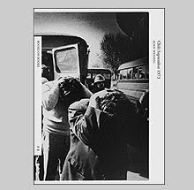
I found two books by Koen Wessing the author of Chili September 1973. O Mundo de Koen Wessing is a good hardcover exhibition retrospective from Portugal on this fine Dutch photojournalist. The second is a copy of Koen Wessing's Flashes from South Africa an oversized 36 page booklet published in 1993.

An interesting artist book made from found images called I Want to Eat by Mariken Wessels was irresistible and will get some coverage too.


Marijaana Kella's book which was in Parr/Badger Vol. II has a body of work I like very much, the Reversed portraits. This was the sole deciding force to bring this one home.

I was able to get home safely a copy of Jens Liebchen's oversized Playing Fields published in 2005 by J.J. Heckenhauer. I hope Jens gets to work on a new book because he has a habit of challenging perception.

Vija Celmens' intricately detailed drawings are a favorite of mine but few books published of her work do it justice. A hardcover catalog from the Museum of Modern Art, Frankfurt features larger illustrations and the best I have seen so far, so it has found a new home.

In the "who the hell is that" department, Jutka Rona's 1975 conceptual artist book Wolvenstraat was a great suggestion from Yannick Bouillis of Shashin Art Books in Amsterdam. This book will be covered further later.

And lastly, one book that I was extremely critic
al of but did not have has finally broken my resistance will power. Empty Bottles by Wassinklundgren is now in my house. I am tempted to write a re-evaluation of this book to more clearly express my views.

I think that's all...any more would just be the work of madness.

Wednesday, May 13, 2009

There I Was by Collier Schorr


The basis for Collier Schorr's newest book There I Was is almost a cinematic cliche. A friend of her father's who was the local champion muscle car driver of Ditmars Avenue gets drafted into the Vietnam war and killed within the first month of his tour. Every war film has one, a Brooklyn or Queens eighteen year old straight from central casting with an endearing accent who's hometown pride is worn on his sleeve. Always a bit player, they usually wind up dead by the third act.

For Schorr, Charlie Synder aka Astoria Chas, was that bit player. His story is a subject ripe with ideas about masculinity - a teenager already engaging death before war via his passion for racing, going to war ("No one wanted to go, but if you were from Astoria, you just plain went.") and transformed into a "man," and after his death, neighborhood legend. The dramatic change that usually follows one's return from war as seen in films like The Deer Hunter, haunted by their own brutality or that of others, would not be witnessed. No evidence of that damage to tarnish his image compounded by the legend of his car, which would later be raced by friends and set track records.

Schorr is often engaging in ideas of masculinity and There I Was explores those notions through drawings, photographs, and ephemera from this story. Schorr's father has known Astoria Chas and had written a few feature stories about him for muscle car mags in the late 60s. Where her father had mainly concentrated on the '67 Corvette Chas raced, Schorr uses the story to create a portrait of youth in transition.

Her drawings of young soldiers bring to mind (and are often revisionings of) famous war-time photos by the likes of Burrows or David Douglas Duncan. Vulnerability is read on the faces and in body language of her minimalist sketches. One soldier curls into a ball and another covers his face with his arm while his mouth reveals distress. Before the weakness shows, a photo of a silhouetted figure, bare chested and wearing a helmet fills the mind's image of a silver screen hero projecting sex appeal.

Schorr has in the past explored the real and the imagined with her work in Southern Germany. Here, it is the shift in mediums which initiates ideas of artifice. Her sketches from war reportage mixed with the staged photographs point to a gulf between both medium's ability to describe past history let alone provide a complex portrait of its players.

There I Was is handsome down to the heavyweight matte paper and clean, simple design. The whole endeavor has a lightness that adds an interesting contradiction to the weight of the subject. The title There I Was could be coming from the mouth of either Schorr or Chas and if from Schorr, it reads as a memorial - a remembrance of a time long ago. Or perhaps, with this current conflict, it is not about the past at all.

Friday, May 8, 2009

Scrapbook by Donovan Wylie


For the past few years Timothy Prus and The Archive of Modern Conflict have been responsible for publishing and co-publishing some of the more interesting photobooks being made. They* had a hand in Stephen Gill's Hackney Wick, Hackney Flowers and A Series of Disappointments. They co-published Henryk Ross' Lodz Ghetto and Larry Towell's The World From My Front Porch with Chris Boot. They produced Nein, Unkel the scrapbook of Nazi snapshots. They published Thijs Groot Wassink's Don't Smile Now. Currently along with Steidl they have co-published Donovan Wylie's newest offering, Scrapbook.

The sectarian violence in Northern Ireland permeated households and extended into personal albums which held family photos sitting alongside clipping from newspapers that kept a gauge of daily life. These scrapbooks often held an odd timeline of the personal and public while encompassing a range of emotional responses to the situation.

The idea of a non-sectarian version of a scrapbook from Northern Ireland, one that pronounces both "aich and haich," is a curious document. In war, the divide between sides can be so great that communication towards resolve is seemingly impossible. For the conflict in Northern Ireland, the single mindedness of Thatcher in clash with the tactics of the many factions of the Irish Republicans split the country where identification with one side or the other not only made everyone a player but was essential. Wylie and Prus's album is meant not to be the view of one but of many. It is a communication between two opposing forces from a fictitious witness. Decorative yokes from the Orange Order sit in close proximity to hand drawn displays of support for the IRA. The reverend Ian Paisley's doughy face pops up several times making him the ever-ready political opportunist while a recipe for a Christmas plum pudding ends with the directions "Serve with Bogside sauce and Petrol Cocktail."

Each viewer of course will flip through this scrapbook with their own politics extending through their fingertips which makes this object perhaps less of a communication than a dual argument wrapped in the same cloth.

Bookwise, Scrapbook is mostly well done although the cover stock feels a bit on the cheap. I realize that part of the idea is the irony of such a serious subject sitting within a dime store scrapbook but I wish that a little better choice had been made for the cover. The interior page stock is well chosen and conveys a strong sense of handmade craft.


On a similar note, the visual artist Steve McQueen's intense first film Hunger gives study to the lives of Irish political prisoners in the notorious HM "Maze" prison. Centered around the various protests for basic prisoner rights - right not to wear a prison uniform, right not to do prison work, right of free association with other prisoners, and to organise educational and recreational pursuits, right to one visit, one letter and one parcel per week, full restoration of remission lost through the protest - it depicts vicious beatings and abuse from prison guards reflective of the stubborn no negotiation policies of Margaret Thatcher that cost the lives of many during hunger strikes.

Prison officials took away the toilets in each cell to which the prisoners responded with a "dirty" protest by refusing to wash, cut their hair, and due to the lack of facilities, smeared feces all over the cell's walls and poured their urine under the doors so it flooded the hallways. Since they refused to wear the clothing of criminals the prisoner's sat naked covered in dirty wool blankets. The discomfort and frustration felt by the guards fed the intense beatings and abuse. In the hands of McQueen, there are few portrayals of hell on earth as visceral as this one.


The film is structured in three acts. The first introduces the characters in the prison through an almost dialogue-less half hour portrayal of the abuse and violence. McQueen's camera is poetic while keeping a claustrophobic tenor within the prison. The second act is an exquisitely acted 22 minute unedited conversation between Bobby Sands and a priest talking over the morality of going on a hunger strike. Taking a page from Bela Tarr or perhaps McQueen's countryman Alan Clarke whose long takes defy traditional filmmaking,** this pivot point of the film left me exhilarated from its endurance and grace. The final act follows the last days of Sands' life as his body transforms with agonizing reality. It is an intense depiction that leaves little room for relief. This film is not for the squeamish.

* Who 'they' are beyond Pruss is something of a mystery as the 'Archive' has no website and little information leading to an actual entity from what I can find.

** Bela Tarr's masterpiece Satantango has by my estimate only around 150 cuts/edits to the film over its 7.5 hour running time. Alan Clarke's Elephant used long-take steadycam shots to depict sectarian murders.

Sunday, May 3, 2009

Back to Okinawa 1980/2009 by Keizo Kitajima


Keizo Kitajima's newest publication via PPP Editions Back to Okinawa 1980/2009 is a revisitation of work he shot in clubs and bars in Koza, a red-light district situated near the US Air Force base of Kadena. Kitajima was a student of Daido Moriyama and set about working the nightlife selling prints to his subjects much like Katsumi Watanabe had been known to do in the late 1960s early 70s in Shinjuku.

Kitajima's plan was to self-publish bi-monthly magazines of this work starting in 1980 called Photo Express Okinawa but only four issues were realized. Each of these booklets - probably the equivalent of the low-fi music 'zines of the time with their DYI tenor - covered a specific period of a few weeks (ie: January 1-15). These short visual diaries were about the equivalent of one dollar and Kitajima priced it to be cheap and affordable to anyone who wanted a copy. This book reproduces all of the images that appeared in those four issues but with a new design and arrangement.

Kitajima's subjects reflect the influence of the near by military base with many photographs portraying Westerners getting drunk, dancing and mixing with the locals. Although this book concentrates on the Okinawa work only and includes no New York photographs, a couple years later Kitajima would live in New York where he would scope out a similar territory in the East Village among the now legendary rock clubs CBGB's, A7, Max’s Kansas City and The Mudd Club.

Kitajima ssys of this work: “Affection, hatred, rejection, acceptance: everything was there in Okinawa and nothing was a given. I wanted to make photographs that transcended all that… My generation was profoundly impacted by America. It is impossible to objectify my feelings about it.”

On the surface, this book's first impression is one of quality and elegance. At seventeen inches tall and a foot wide, the heavy silkscreened cardstock cover is beautifully done and the accent of the black thread binding a nice touch. Most of that excitement disappeared for me as soon as it is opened and with the discovery of 36 pages of cheap newsprint that make up the interior. It isn't just that the newsprint is cheap but since there were no negatives or prints to do proper scans the publisher has scanned from the magazines resulting in images that are completely broken up by the original magazine line screen. High contrast and poorly printed, we struggle to make out what is going on in the photos. Many are translated into blotches of black tone where even the most grand of gesture gets abstracted.

One may argue that, like I mentioned above, this could be comparable to 'zines of the time and honestly I like that thought. The quality does bother me but I often like the low-fi when it works. What is not comparable to 'zines is that the starting price of this newspaper booklet was $100.00 (it is signed by Kitajima and only 250 copies). Now, just a couple weeks after release the price has been raised to $135.00 (feel the panic?). I'm going to leave this one for the collectors and wait to see how the planned 900 page book from Rathole Gallery on Kitajima turns out.

Special thanks to Bryan L. for the loaner copy.

Thursday, April 30, 2009

Photography and Cinema by David Campany


It is no secret that David Campany is a friend to Errata Editions since he contributed the essay to our study of Eugene Atget's Photographe de Paris so risking cries of cronyism I highly recommend his book by Reaktion called Photography and Cinema. This yet another title in the interesting Exposures series which is being edited by Mark Hayworth-Booth and Peter Hamilton.

Photography had been in existence for about sixty years when the Lumiere brothers were granted a patent on their movie camera and projection system. One of their early films from 1895, a static shot of the arrival of The Photographic Congress to Nueville-sur-Saone, records men walking down a gangplank and passing through the frame. One man pauses with a large plate camera, snaps a photograph and moves back into the flow. This act caught on film, whether a real image was made by the photographer or not, marks an interesting start for Campany's exploration of the multitude of points where these two mediums have cross paths.

For someone new to those crossroads to those familiar, this expanded dialogue covers the spectrum with an ease and intelligence that avoids being pedantic or dry. With photographers fascinated with film (Crewdson, Sherman, Klein) to film-makers fascinated with still images (Varda, Marker, Antonioni) Campany considers the various approaches and explores the nature of those relationships. In well over one hundred illustrations that provide complex examples which extend far beyond the expected, Campany assembles "the missing history in which photography and cinema have been each other's muse and inspiration for over a century."

By the way, if you don't trust my objectivity, Photography and Cinema just won the And/Or Moving Image Book Award (Kraszna-Krausz Award) which was just announced this past week. Congrats David!

Monday, April 27, 2009

Studien nach der Natur by Jurgen Bergbauer


The expression of space by any means whatsoever, sharpness of edge, vividness of colour, etc. assisted by greater pitch of shadow, and requires only that objects should be detached from each other by degrees of intensity in proportion to their distance, without requiring that the difference between the farthest and nearest should be in positive quantity the same that nature has put.
- John Ruskin

Many of you know that I am always on the lookout for books that stray from the usual and a new book from Fotohof by Jurgen Bergbauer called Studien nach der Natur does just that.

Studien nach der Natur (Studies after Nature) certainly isn't going to everyone's cup of tea but my tastes run wide and this is now one of my favorites of the year. This is an archive of 665 photographs of 152 different rock forms that were found at roadside. Bergbauer photographed them from various perspectives and arranged them, in his words, by "form and applicability."

The 42 plates in this book (plus 6 fold-outs and an extensive archive of all of the objects) show compositions of the rock formations silhouetted against plain Becher-esque off-white backgrounds. These "studies" were based on the compositional criteria of: form of the object and positioning of the objects within Bergbauer's defined space. Studien nach der Natur is rigid formalism with a methodical, almost scientific approach. Bergbauer's camera shoots them from various angles that would have made Brook Taylor take note.

Bergbauer in the past has photographed various architectural forms and removed them from the context of their surroundings - sitting them exposed for their own consideration against his standard off-white background. In the case of these "nature" studies he is creating these compositions from the individual elements as opposed to just finding them arranged in situ. In fact, Bergbauer's method behind them is complex and part of this book begs for that to be decifered.

His book's title seems also to be a slight play on words as most of the objects are far from naturally occurring - they have been altered by the hand of man in a few ways. Like stone cut blocks one might find near a quarry, each seems to have been shaped with a purpose in mind. They have been removed from nature, cut and shaped then replaced into nature, "removed" a second time (metaphorically speaking) by the photographer and placed into these compositions. Stone cutting and theories of perspective have had an important relationship throughout history so does that have something to do with Bergbauer's choice of subject? I wouldn't doubt it.


Interspersed every few plates is a foldout which reveals additional complex compositions of hundreds of the rocks stacked together as if they were a restraining wall found along a highway. These six plates are titled Nature I - VI. In addition, the last few pages includes the entire archive as thumbnail images with corresponding identification numbers. Bergbauer also classifies each type of object variation and provides a key to unlock the logic behind each composition. With all of the numbering and method it is hard to not think the design is due to specific theories of perspective at work.

As a book Studien nach der Natur is perfect in my opinion. The design by Till Gathmann is tight and clean with a fine flair for blue accents on the jacket (think Tschichold). The choice of materials couldn't be better. I did say this is perfect so do I need to mention the wonderful printing?

Studien nach der Natur was published by Fotohof Edition Salzburg in 2008. The edition is only 450 copies unfortunately.

Saturday, April 25, 2009

Waters in Between by Lukas Felzmann


In the center of the Sacramento Valley two rivers, the Feather and Sacramento, flank several wetlands and marshes called the Sutter and Colusa Sinks. Much of this land has been drained and become some of the richest agricultural land for fruit orchards and various grains and rice. The photographer Lukas Felzmann has been drawn to these marshlands and especially the role water has taken to shape and transform the landscape. His new book from Lars Muller, Waters In Between is an empirical archive or as he describes the collection, "a sort of poetry of ruins."

Constructed as part methodic examination and part meditation, Felzmann and his 5x7 camera describe a landscape both naturally formed and manipulated by man. It is a transitional space upon which people have built homes and their presence has turned naturally occurring floods historically common to the area into "disasters." The attempt to control water through canals and underground systems speak of a cultural change and the power of economy on the area. There is a similar feeling behind this work to the moment when you find out Polanski's Chinatown is really about corruption controlling water.

Felzmann's camera is stylistically varied in ways that are refreshing. This book is not just a collection of the formally rigorous but playful with occasional panoramics and exchange between black and white and color. Individually the photographs are well made but it is his sequencing that make this project as interesting as any dealing with place that I have seen in a long while. Short poetic text pieces by John Berger and Angelus Silesius compliment Felzmann's work are interspersed throughout.


Waters In Between is an image of prosperity of natural growth mixed with images of the failure of man to sustain. The ruin left in his wake are ugly blights on the horizon line that one might wish could be wiped clean from stronger waters. Repetitive images that open the book of a whirlpool sucking into a black abyss starts the journey that ends with another set of photographs of an area under a cement overpass as it goes through various states of growth. Feldmann's accomplishment is an expanded dialogue which extends far outside its territory in thought provoking ways. At once we are aware of fragility of lives, the impact on the environment, life in transition, the natural and cultural systems and their effects, while at the same moment realize the irony in that this landscape is traversed by travelers speeding through what may be perceive to be a flat and boring stretch of highway.

Waters In Between is a long book at 320 pages but interest is sustained throughout. It is beautifully printed and designed and the materials used were nicely chosen. Should I venture to guess this may be on my list of "Best books of 2009."


Note: It is really hard to give a good sense of this book through the comps above. My suggestion is to take a look at a local bookseller.

Wednesday, April 22, 2009

Here Comes Everybody by Chris Killip


Chris Killip is not an easy man to predict. His follow up to his first book, Isle of Man - a lyrical portrait of his homeland - was an unexpected molotov cocktail thrown in the face of the political establishment, In Flagrante. Almost twenty years later arrived Pirelli Work which some saw as an extension of the same Northern English community now engaged in the long desired employment after a decade of humiliation. His newest book, Here Comes Everybody, departs to attend the annual pilgrimages to Croagh Patrick and Mamean in the west of Ireland.

For many, the modern enactments of ancient religious rites such as pilgrimages can often seem more observant of the familial tradition to participate than the goal of observance or serving penance. Where as Saint Patrick's ascent on Cruach Phádraig was followed by his reputed forty day fast, the discomfort today is offset by snack food and mylar blankets - small comforts should the journey become taxing. It can be a festive outing cloaked in seriousness. The usual penance - a scuff on the ankle after a slip on the shale.

Through Killip's images, both can be found. The hardcore penitent that walks barefoot up the steep slopes covered in loose rock to the family struggling with grouchy children in tow. The contradictions of past and present abound with many pilgrims carrying wooden staffs to assist in their journey like Saint Patrick while the modern accoutrements of Addidas trainers are more assuring of steady footfalls.

Killip has been photographing these Catholic pilgrimages in color and black and white for a dozen years starting in 1993 and initially thought it 'not his territory' until a visit with his mother in the Isle of Man revealed that he was one quarter Irish. The bigotry against Catholicism his mother had endured had stifled all discussion of her childhood or origins until then. By familial ties, these pilgrimages and community would become his 'territory;' a call to explore these rites from which he had always been distant.

Stylistically there will no doubt be naysayers who see Killip's turn to this calmer subject and his addition of color as problematic when compared to his past work. This is not In Flagrante with its exploration into tension and frustration, nor should comparison be made. Here Comes Everybody is a turn from the outward gaze inward. As Isle of Man was a loving portrait of homeland, Everybody is an exploration back into family but a family he never knew he was linked. Photographers have flocked to these pilgrimages for "good" pictures and at times almost outnumbered the participants but this album seems to have been conceived to make these rituals a part of his own life. This book is a facsimile of a photo album he made and dedicated to his mother who died at 86 years of age in 2008.


Killip's discovery of landscape and tradition is felt throughout. Fences of loose rock piled to delineate property or path are described with the same eye towards beauty as the pastoral views and fog shrouded mountain tops. His pilgrims ascend in small groups and pause in a landscape so idyllic that they teeter on the purely romantic. This is where his construction and sequencing become the most important element holding this book together. His juxtaposition of black and white and color slyly keep us jumping back and forth from past to present, from old tradition to new, preconception and reality. His penitents in their misty struggle upwards are faced on opposite pages with clarity and heavenly crisp light. 'A fiction about metaphor' as he has said of past projects is at work here too.

My full engagement with his journey is unfortunately slightly belied by the quality of the production - the publisher Thames and Hudson hasn't shown full effort with this book. Chris's other volumes have been exquisitely produced where the richness and quality strike the viewer immediately but here printing and poor choice of line screening tarnish his efforts. Like some of the pilgrims, Killip's long awaited achievement has come down from its journey needing a band-aid. Perhaps the very affordable limited edition in which every photo is tipped onto the page in true photo album fashion will allow a fuller realization of this project.

At the end of Here Comes Everybody, Killip relates a story from childhood of returning home early one day from school and discovering his mother playing a piano and smoking. Surprised, he said, 'I didn't know that you smoked or that you played the piano.' Her response was, 'There are a lot of things in this world that you don't know. Now, why are you home?'

There were indeed many things he didn't know which may have been why he turned to photography. This exploration may also be another question that he is asking of himself upon his discovery of Irish roots - Now Mr. Killip, why are you home?

Monday, April 20, 2009

Lost Review by David Maljkovic


With the economic world in turmoil, David Maljkovic's slim volume Lost Review couldn't be more timely as it takes Croatia's Zagreb Fair as its subject. The fair in its heyday of the 1950s and 60s was the major economic link between East and West and the only trade related fair where the US, the USSR and other countries exhibited through the Cold War. Its many pavilions made up a small-scale world of cooperation and optimism during a time of major division.

For this project, which is part of a larger series on the Zagreb Fair, Maljkovic makes collage of old images from the yearly fair reviews and brochures published to present the fair's success juxtaposed with photos of the current state of the fair grounds in decay and neglect. By splicing the past against the current he describes states of flux, loss of optimism and failure.


Black and white photos of the empty ruins of once grand architectural achievements are overlaid with 'windows' of the past that compress history and idealism. Interspersed are beautiful color photos of weathered signs displaying film products and other business ventures that could have been found at the fair.

Lost Review is a fine graphic object wh
ich, although a bit eclectic in subject, is smartly assembled. Rough combinations with the artist constantly showing his hand in the creation keeps the rift between the two economic states apparent. Printed on slightly thin paper probably similar to the original source material, it places Maljkovic's new art within the context of being an extension of the yearly reviews - a report, stuck somewhere between two ages - both an homage and a call for reclamation.

Lost Review was published by Koenig Books in 2008.

Friday, April 17, 2009

...all the days and nights by Doug DuBois


It is hard enough to photograph your family let alone to be honest about it. At worst, the images are pure falsity on the part of the photographer that rely on visual descriptions of natural beauty or grace - usually the most tiring of domestic cliches. The best unlock that which is powerful enough to make you wish you could curl back up into fetal position hoping for some comfort. Doug DuBois' new book from Aperture ...all the days and nights is the latter.

DuBois has been photographing his family since 1984. A few of the photographs have trickled out over the past two decades, some in MoMA's The Pleasures and Terrors of Domestic Comfort show and in Doubletake magazine, but mostly they have remained unseen but by the lucky. Lucky because this memoir, for lack of a better term, is weighted with an unflinching gaze that risks acquiring too much knowledge both on the part of the photographer and the viewer.

The narrator of memoir projects onto its subjects, and photography is good at amplifying and projecting. DuBois' story is cast with two main characters, his parents. Although many images show his siblings, the central spotlight is on mother and father. The book opens with quiet, everyday domestic tranquility; the father fiddles with a suitcase illuminated with a play of light; a daughter worries over her groomed appearance while the reality of her room is complete chaos; the parents are happy together having drinks - the mother reacting to the flirtations of the father. They are minor events of small gesture which, to a lesser attentive narrator, would certainly not have triggered the same instincts to record.

Eight photographs in and the tranquility is disrupted by event - the father is hospitalized with major injuries that we learn were sustained from a near-fatal fall from a commuter train. It is here that the book takes a momentary dangerous turn towards a literal narrative and purpose. Lucky again that DuBois knows to quickly steer back to the quieter, less obvious moments that are leaden with the unspoken.

During the father's convalescence, it is impossible not to notice the constant state of inner reflection on the mother's face. Her intense and sullen expressions transcend concern for the father's condition pointing rather to a deeper psychological wound that has opened. Never again do we witness a smile or lightness of being in her. Every photo there after is an individual portrait. The few times when the parents are in the same frame the estrangement resonates clearly. By book's end, the split is clear.


...all the days and nights is broken into two parts. DuBois made these images during two working periods, the first from 1984-1990, the second from 1999-2008. The sequencing and edit are well handled as is the printing and layout. The introduction by Donald Antrim, a regular contributor to The New Yorker, is with full understanding of DuBois accomplishment and beautifully realized.

DuBois' own brief pitch-perfect afterword describes battles with depression and attempts at suicide on the part of his mother. It also describes his role as memoirist for his family and the truths the photos reveal. His father asks, "Was it really that bad?" when he first sees a mock up of this book. All along one senses that where ever the underlying tension in DuBois' photos was coming from, reality was probably far worse for each of the players. Photography can act as a mask just like a person's countenance yet what DuBois is willing to lay bare in this book is painfully clear.

"Was it really that bad?" The strength of this work is, with all we have been privy to -- all of the intrusion and embarrassment that comes with Dubois inviting us into the household -- we might presume to answer for one of the characters.