Emmet Gowin Photographs reprint

While I was attending The School of Visual Arts in the late 80s, one book that I spent quite a bit of time with was the Alfred A. Knopf release Emmet Gowin Photographs published in 1976. The pictures of his family from the mid to late 1960s like Barry, Dwayne, and the turkeys, are still among those that have had a lasting impact for me some twenty years later. A new edition of Emmet Gowin Photographs has just been jointly published by Pace MacGill Gallery and Steidl.
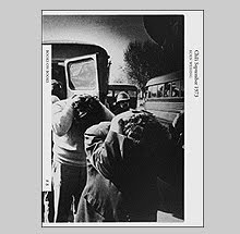
Presenting a little over a decade's worth of images, it includes; the early family photographs, the extremely wide angle full circle images, still lifes and portraits of his wife Edith from the mid-70's.
Pulling my well-read copy of the original from the shelf the first difference is with the cover image and design. The "ice fish" image has been replaced for the image of Edith standing among the debris from Christmas morning in 1971. The title font is also cleaner, changed from the older, clunky handling of type seen on the cover of the original. The trim size has been enlarged a quarter inch on all sides. It is the same format and ratio, it has just grown slightly (or maybe my old copy shrunk). Internally, the book is the same although the images have grown that quarter inch too. Same images, sequence, essay and typography.
An interesting comparison is in the printing. The original was done by Sid Rapoport whose plant in Lower Manhattan in the 60s and 70s was famous for a process known as "Stonetone printing" which this book was created with. The new edition is, as I mentioned, by Steidl with separations made by Robert J. Hennessey.
Now one would imagine that printing technologies have improved much in the last 32 years but I have to say that the books look close to identical in print quality. Rapoport's old Stonetone process, which I have seen some very bad results from, in this case, holds its own beautifully. Rapoport produced a lot of photobooks in those years including ones by Avedon, Frank, Lyon, JM Cameron, Fox Talbot, Ed Muybridge, as well as Aperture magazine. The first photobook he printed in Stonetone was the 1969 version of Frank's The Americans which turned out rather horribly. As he explains to Tom Dugan in Photography Between Covers (Light Impressions 1979), "Unfortunately, they wanted a copy of an existing book that was printed in the gravure process, using the dull matt inks and coming off with a very formidable book. Since then we've found that the results are much better if we don't try to imitate gravure..." Comparing these two versions of Emmet Gowin Photographs, the Rapoport version has slightly more contrast in some of the plates but does seem to have slightly more noise to the prints. The Steidl version is much smoother and with a more subtle tonal range.
All in all this is a beautiful reprint which accompanies an exhibition at Pace MacGill Gallery in New York through the 21st of March.
![]()