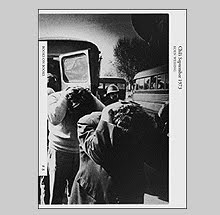
American Sports 1970 by Tod Papageorge
It is fitting that Tod Papageorge’s new book American Sports, 1970 or, How We Spent the War in Vietnam would be published at this moment in time. In 1970, the war in Southeast Asia had been raging full-on for about five years and hey…here we are again, almost five years into another confused foreign policy that has divided the country and which will wind up as a costly failure.
Papageorge, with funding from his first Guggenheim Fellowship, set out in an “attempt to document as clearly and as completely as possible the phenomenon of professional sports in America.” He adds, “It takes a thousand brief acts to create the theater of spectator and sport, and my concern would be to present them with an accuracy and power which would provide much more than the sport, illustrated.”
Sports are often wrapped up in metaphor for war. Teams “do battle” on the field. Coaches act like wartime Generals and do their best to out wit each other while the pawns beat each other bloody and pay the price of a poor leadership with torn ligaments and broken knees. Animations on the tv screen during Monday Night Football now remake players into futuristic warriors akin to Verhoeven’s Robocop sans machine guns (Give them time. I do think that randomly placed landmines would make soccer more exciting to American audiences.)
If Garry Winogrand once said that ‘we have not loved life,’ Papageorge’s thesis seems to concur. We know how to love, but what we love is not one another but watching the defeat of ‘the other.’ Our ethical dilemma of not loving thy fellow man is quelled by our blind patriotism and myths of redemption.
The opening sequence of photographs set the stage and tone for these parallel universes of war. Photo #1: A frieze of young boys lined up by a concession stand, one of which sports a shirt with an image of a B-52 bomber dropping its graphic payload and the slogan ‘Fly the friendly skies of Viet Nam.’ Photo #2: The soldiers take to the field. Photo #3: The Generals take their seats and observe at a safe distance surrounded by their wait staff. Photo #4: The public settles in and waits for the battle to heat up. Within a few frames, the clowns are sent in to distract and sugar-coat the violence while the cops, batons at the ready, keep any voices of dissent at bay.
Throughout the seventy photographs, Papageorge shows almost none of the battle but instead directs his attention to us, the everyman and everywoman, as we sit complicit in fuelling the atmosphere for war. We are egged on by the triumphant spirit of cheerleaders and marching bands whose military-like uniforms never get soiled and give the impression of conflict waged without bloodletting. The book’s final two images are of the architecture of America’s forays; the playing field and the war memorial (in this case, the memorial in Indianapolis). It is opposite the war memorial photograph that we are given the following statistic: In 1970, 4,221 American troops were killed in Vietnam.
The subtitle of the book ‘or, How We Spent the War in Vietnam’ gives an appropriate nod to Kubrick’s anti-nuke film Dr. Strangelove or, How I Learned to Stop Worrying and Love the Bomb as both share a look through America’s tunnel vision. (The cover image contains a second much more subtle nod as one of the stadium guards wearing a cowboy hat looks strikingly similar to Slim Pickens’ character Major Kong who, at the end of the film, rides a nuclear bomb to its destination as if he were on a rodeo bull.)
These photographs are now thirty-seven years old and they excite on one level simply because they represent a time when photographers were actually interested in seizing movement. Does anyone remember those good old days? As Tim Davis remarks in his perspicacious essay To Hell in a Hand Camera, “it is startling to realize how few contemporary art photographers employ the camera to stop motion.” These photographs embrace the constant flow of life and Papageorge proves himself to be proficient at crafting dense, irreducible frames. How about passing on some of that to your students?
The book is published by Aperture and they have done a fine job with the production. The design by Francesca Richer seems to follow a very traditional layout until you notice that she has pushed all of the photos to the bottom of the page leaving more margin space above them than below. This is an interestingly simple design quirk that gives the book an up-to-date and contemporary feel solely by picture placement. The printing is rich and full of tonality.
The timing of this book and its relevance to current events adds to the impact of the work if simply in recognizing the frustration of repeating the same mistakes and being powerless to break the cycle.
Thank you Tod for making it so palatable before rubbing it in our face.
www.aperture.orgBook Available Here (American Sports 1970)


