Monday, October 15, 2007

Revistas Y Guerra 1936 - 1939


For those of you who are lucky enough to be in the New York area, there is a great show at the International Center of Photography on Gerda Taro.

Taro was one of the better (some say the best) photojournalists who photographed the Spanish Civil War. She traveled with Robert Capa to photograph the war but it seems her political sympathies could be as strong as her drive to photograph. It certainly shows in her photographs. She often chooses vantage points that stress almost Leni Reifenstahl-ish images of heroism.

She and Robert Capa were a couple although she refused his proposal for marriage. She was killed on July 27th 1937, the very day she was supposed to have returned to Paris, after a tank collided with her car during the retreat from the Battle of Brunete. This unfortunate event made her most likely the first female war photographer to be killed in action.

In the short life she had as a photographer, one might wonder whether she would have taken some of the wind from Capa’s sails as to who would have gone on to become the world’s great war photographer. She and Capa were planning on traveling together to photograph the conflict between China and Japan.

One of the rooms in the Taro exhibition is of posters and magazines that were printed during the Spanish Civil War. The posters, known as “shouts from the wall,” played a strong part in the defining the image of that war and are considered great examples of the propagandistic documents of their time. Using photomontage techniques, they both excite and alarm through their imagery, design, typography and use of color.

While at the exhibition a friend of mine discovered a book called Revistas y Guerra 1936-39 which is an exhibition catalog from a show that was on view at the Museo Nacional Centro de Arte Reina Sophia in Madrid. Magazines (revistas) played a strong part in disseminating information and images during the Spanish Civil War and hundreds were published in that time. The Spanish Civil War may have been the photographic equivalent of what the Vietnam War was to television, at least for the amount of images made and for their rapid distribution to the public.

The objective of most of the wartime magazines was to reach the greatest number of people to relay the propagandistic message in the content. Many were targeted to a particular group and not only served to untie that group but to act as rallying cries aimed at the opposition and to define political ideals.

A few of the magazines were published directly from the front lines of battle. The periodical Avace was actually produced via mobile presses which were hybrids of trucks and printing presses built to work ‘en campana.’

What seems surprising is the number of and variety of publications that were produced during a war where paper, ink and access to printing presses were difficult to obtain. This exhibition concentrated on magazines but there were many other newspapers and bulletins that blur the distinction as to what constitutes a magazine.

The book Revistas Y Guerre 1936-39mis small in trim size but has almost 400 pages of content. It reproduces all examples in full color and it features hundreds of illustrations. It is an import from Spain so the price seems a bit expensive at $85.00. Especially if just basing on the size and the fact that it is soft cover, but the content is rich and the package is very handsome.

The essay is in Spanish throughout the body of the book and there an English translation in the back. The only draw for English speakers is that the illustrations are disconnected from the translation so there is much back and forth page turning required to follow along. Otherwise brush up on your Spanish.

One note, I am usually very careful in handling my books but I have noticed a few of this one’s signatures pulling out of the glue on my copy. So beware, I do not think that this is the best bound book out there. Regardless, this is a great one for poster and magazine design of the Spanish Civil War period so get it and let it fall apart. Better yet, destroy it and allow it to show that it is loved and not neglected.

www.icp.org

Friday, October 12, 2007

The Memory of Pablo Escobar by James Mollison


Since I just wrote briefly about Danny Lyon’s foray into written history, I need to mention a new book that I just purchased yesterday that makes for a nice follow up. The Memory of Pablo Escobar by James Mollison published by Chris Boot is a must read. I just finished it…after a five hour reading marathon in which I could not put down this 350 page book.

Mollison, a photographer who worked for Colors magazine, originally was on assignment photographing prisons in Valledupar, Colombia when he was asked if he wanted to meet one of the facilities most famous inmates, ‘Popeye’, a man who served as Pablo Escobar’s head of security. After meeting him and then becoming fascinated by the Escobar myth, he returned to Colombia to start a project about ‘Narcotecture.’ That is, the evidence of the influence of drug money on architecture.

This initial interest was sidetracked when the ‘narcotecture’ he found wound up being visually disappointing. But like the fortuitous event of meeting ‘Popeye’, Mollison would have more luck come his way disguised as an annoyance. While trying to photograph one of Pablo Escobar‘s former homes, he was briefly detained by some security guards who led him and his camera to the officer in charge. Turns out he was in breach of security rules as the house was now a government building. Upon hearing his intentions and curiosity about Escobar, the officer in charge, whose office happened to previously be Escobar’s bedroom, said, ‘I have a bag of Pablo Escobar photographs- would you like to see them?’

From that moment on, Escobar, who was Colombia’s most infamous drug kingpins, became an obsession for Mollison to explore and separate the truth from the myth.

For those who are unfamiliar with Escobar, he was the head of Colombia’s Medellin Cartel which in the 1980s controlled 80 percent of the cocaine trafficking in the world. He was initially adored by the poor as he used his vast wealth to build housing for the homeless and helped repair and improve poor neighborhoods. By the mid 1980s and early 1990s, his fight against Colombia’s threats to allow his extradition to the United States on drug charges fuelled a deadly war that cost the lives of thousands of innocents along with the guilty.

Escobar’s fight caused Colombia to fast become the world’s murder capital where there were 7,081 murders in 1991 alone. This increased murder rate was fuelled by Escobar giving money to poor youths as a reward for killing police officers. These murders caused the police to retaliate against the youth with death squads that would seek out an assassinate anyone who fit the profile, innocent or guilty.

Escobar had so much power over the events that were unfolding in his country and could evade capture so well that the government, in an act of desperation to end the violence, agreed to Escobar’s terms for his surrender and imprisonment. This made for one of the more odd episodes in the story. Escobar was allowed to remain in Colombia without facing extradition and reside in a prison of his creation, with his own ‘guards’ that oversaw the inside of the prison while normal federal guards oversaw the outside to make sure he didn’t simply walk away. As his head of security ‘Popeye’ is quoted as saying, ‘They put a 10,000-watt electric fence around the prison with the switch in Pablo’s room.’

Even as he was in ‘prison’ the Medellin Cartel was moving cocaine and making money, keeping in competition with other cartels that were trying to take over the routes to the US. At one point in 1992, the excesses of the ‘La Catedral’ prison were revealed and plans to transfer Escobar to a real prison were discussed. But as they were being implemented, Escobar escaped and remained on the run from authorities for almost two years. He was eventually killed in a raid on one of his safe houses on December 2, 1993, one day after his 44th birthday.

Besides the compelling story, what makes this book fascinating and difficult to put down is the way that the story is complemented with images and documents. Through exhaustive research in tracking down original photographs, police files and the massive trail of unseen ephemera that is associated with Escobar’s life, this book is fully illustrated and presents the material right alongside the text.

Millison was able to come across archives of photographs that are presented as collections instead of breaking up the material in ad hoc fashion. The result is a fascinating series of short chapters that propel the story along while addressing the various facets and key players of the events. One section of photographs is from Escobar’s personal photographer who was hired to document family events such as birthdays and parties. While another is a series of rather grisly evidence photographs from a bombing that took down an Avianca airliner in one of Escobar’s attempts to assassinate a presidential candidate who would have pushed for his extradition. Luckily for us, those are reproduced at a size that renders them just a bit too small for us to be haunted by them. They reminded me of extreme human versions of Peter Beard’s dead elephant aerial photographs from The End of the Game.

One interesting book highlighted in the story is one that Escobar self-published while in ‘prison.’ (If only I had known before I could have included it in my self-publishing post.) Pablo Escobar Gaviria en Caricaturas, 1983-1991 is a leather bound book of hundreds of cartoons and photographs of Escobar that had been published in various newspapers since 1983. 500 copies were printed and given to friends and family. A small pile of these books was found by his bed after he escaped from ‘La Catedral.’ One is up for sale for around $60,000 US dollars but the family of Escobar is contesting the sale on the grounds that it is stolen property.

The design of The Memory of Pablo Escobar is another fine accomplishment by Stuart Smith of Smith Design who I have mentioned glowingly before. Here he has created an extraordinary book that both looks and feels good. It is thick and hefty and at no point over the 350 pages does it allow for a lapse of attention. The choice of paper for the pages is a thick stock which accounts for how dense the book feels. The reproductions are well done and the documents are presented as objects on pages allotted solely for the images.

James Mollison worked on the text with Rainbow Nelson who is a freelance journalist who has worked in Colombia since 1992. It is very well written and the short chapter form allows for the reading to be done in small snippets or to be devoured in one sitting.

This book makes me wonder why other titles that discuss history do not include more visual material among the text. Most images in books of historical nonfiction get clumped together in sections of glossy pages where the original reference in the text has to be sought out for clarity. Here, it is a natural flow of information with reference images that makes it all more memorable.

As stated on the back of the jacket, The Memory of Pablo Escobar is a landmark in visual journalism.

Book Available Here (Memory of Pablo Escobar)

www.chrisboot.com

Wednesday, October 10, 2007

Like a Thief's Dream by Danny Lyon


Danny Lyon has a new book from Powerhouse called Like a Thief’s Dream.

Lyon is a curious type of artist for me. He is one that I make a point of keeping an eye out for and, although I seem to wind up owning what he offers, often it feels a bit thin and undernourished. In this way he is similar to Larry Clark. The name has a draw that seems to dupe me with promises of new greatness equal to their past accomplishments but rarely does it satisfy.

His two great books are of his earliest, The Bikeriders and Conversations with the Dead. In these, Lyon seems fully engaged and his photography is richer for it. I will say that I have never been a big fan of most of his photography by itself. His talent lays partly in the way that he combines images and text to create a self portrait that melds into the story. In his better works, there is a balance to the treatment of subject and self examination. When he has dwelt solely on his home life and family, we may wonder why we are made privy to it and why does it make a book. The result makes me think of restlessness.

So when I opened Like a Thief’s Dream and found it to be all text and almost no images made by him, I breathed a sigh of relief that it wasn’t another book of collage or bad polaroids of his family. No. Words, nothing but glorious words. And you know the biggest surprise? Lyon is a damn good writer. This book does make me wish that he put down the camera (Leica and 16mm Eclair) after The Bikeriders and Conversations with the Dead and settled for the same life but with a more active pen.

The story that Lyon relates is about a man named James Renton. Lyon met Renton in 1967 while he was working in Huntsville Texas on Conversations with the Dead. Jimmy Renton was serving on a capital murder charge and spent part of his time working in the prison darkroom. Although Renton does not show up in any of the photos in Conversations, he helped Lyon to make a 16 page portfolio edition of the book using the prison printing press. Renton’s name is credited as the lithographer under Lyon’s on the front cover.

When Renton was freed from prison in the early seventies, Lyon reconnected with him and shortly after, Renton was involved in the murder of a young police officer in Arkansas. The consequent criminal investigation and capture of Renton makes for a compelling read. Lyon seems to have fallen in with a man who could provide plenty of compelling material as after being charged and serving a few years in prison, Renton escaped and provided Lyon with a written account of the events.

Renton was one of the FBI’s ten most wanted until his eventual recapture. After his death in 1995, Lyon started to pursue the details of Renton’s crimes through his personal letters, court transcripts and the large amount of paper documenting the man‘s life. The book’s title comes from one of Renton’s letters to Lyon when he referred to Lyon as living a life that was like a thief’s dream.

In my opinion, Lyon has found a third vocation in writing that may prove to be stronger than his first two. Let us hope that he continues for this is the best work he has done in thirty years.

Book Available Here (Like a Thief's Dream)

www.powerhousebooks.com


Sunday, October 7, 2007

Four Self Published Books


It should be obvious by now that I think that books are the best way to experience photography. No other medium is treated better and with more respect than photographs in the book form. Paintings are best experienced on walls but are often reproduced too small in books. Sculpture is best in person as reproductions sacrifice the whole concept of a three dimensional work. Film…what?…a giant flipbook?

First off, a book is so intimate. You cradle it in your hands and turn the pages, experiencing the work at your personal pace. You can touch the art so to speak. Because of this tangible aspect, you have a different relationship to the photos. In a gallery, no matter how comfortable you may be in those environments, there is a subtle but very real influence to move through an exhibit faster than you may naturally want to. Either because of what I consider a somewhat stifling environment or due to the presence of other people, we do not linger as much while on our feet than we do in the comfort of our homes in a chair with a book. Our peripheral vision also plays a strong part in influencing our speed through galleries or museums. Seeing the next image on the wall out of the corner of your eye can distract you to “moving on” more rapidly. In a book, the page acts as a barrier, you do not know what is coming until you turn the page. Books also seem to be more effective at adding punctuation into the mix through their design and layout.

So how do artists get their books published? Some are able to find publishers. For Alec Soth, the strength of his work in a handmade volume of Sleeping by the Mississippi found a great reception at the Santa Fe Review and within a year he had his first book with Steidl. Someone like Jessica Backhaus actually spent several days at the Frankfurt book fair showing her portfolio around to every publisher who was interested in photography and found a comfortable home with the publisher Kehrer. Some spend years trying to find the outlet into publishing and never find it, and in some very rare cases, the publishers come searching out the artist.

Lastly, you have people like Lee Friedlander who make the decision to go DIY and start their own publishing company. This last example is a fine way to retain complete control but it is also the way that risks personal financial loss if the book does not find its audience. Boxes of books stored under your bed, in closets, garages, and in parents basements I can imagine have a funny way of constantly reminding you of that loss. The aspect that keeps most artists from pursuing self-publishing is, how do you distribute the book to your audience, or more importantly, how do you let them know it exists at all?

This posting is about people who have taken the reigns and made the decision to do the work themselves. These are four titles that you probably will not know about or have even heard of. And although all of which are fine examples of photographers who have taken the initiative to risk expense and the possibility that they will not find their audience, they also made the decision to limit the amount of books they have printed so they comfortably avoid the issue of storage.


The first is a book that was created using one of the few available online publishing companies like Shared Ink and I discovered it in Brooklyn’s independent bookseller Spoonbill and Sugartown on Bedford Avenue. Patrick O’Hare’s Slipstream is a fine book of twenty landscape photographs made between 2003 and 2006.

Patrick is a quiet photographer who chooses to point his camera at landscapes found up and down the East coast from his New York base. He is a photographer who finds a certain amount of ironic beauty in the landscape but his images, unlike much of what is done in similar territory, is not burdened by only being ironic. Most photographers tend to approach this territory with a cold detachment and what is refreshing about O’Hare is his ability to look and infuse his images with warmth, tenderness, sadness and the joy of simply looking. He is pointing to show what we have made, how we have treated it and how it will be constantly changing. There is a fine amount of melancholy to these pictures. It isn’t depressing but like the title may imply, we are going to be carried along and what we are shown along the way may not always be pleasant but O’Hare tinges it with beauty.

Truthfully, when I saw the book on the shelf, I judged it by the cover thinking Oh…I know what this is going to be but I was so pleasantly surprised by his craft and approach that I was compelled to not only buy the book but to contact him to find out more about who he is. Like his photographs, Patrick is quiet and unassuming. He photographs and seems more interested in where the photographs take him than the attention that may result from creating this book. He is at work creating another book using this same print on demand technology from a new body of work that is about things disappearing or becoming invisible called Learning to Vanish.

Slipstream was made in an edition of 100 signed and numbered copies. A special edition that comes with a signed and numbered 8 by 10 inch C-print on Crystal Archive Paper is also available.

For inquiries and copies of Slipstream, contact him through his website www.patrickohare.com


The next book is by a photographer most of you will already know. Ed Grazda has previously published three books of his work through the publishing houses Powerhouse and Der Alltag which was Walter Keller’s house before SCALO (r.i.p.). This new special edition artist’s book by Ed will come as a surprise for those that know his work. For twenty years he had been photographing in Afghanistan since 1980 and the two books published on the subject are more personal road diary than what we may currently expect from photojournalism in that part of the world. This book is his first that departs from politics, conflict or religion but it is still a road trip of sorts.

Called American Color Slides, he utilizes the print-on-demand technology of the Apple i-book to present 15 photographs that were originally made in the American Southwest from the late 1960’s to the late 1970’s. Playing on the title of Walker Evans American Photographs, American Color Slides is a road trip through the desolate southwest where the roadside architecture either fights for your attention or ignores you with its plain functionality.

Opening with a shot of the long road ahead (complete with a cross in the pavement cracks that lets you know God is with you) he takes us into the dust and white hot sun of Nevada, Arizona, Texas and New Mexico. Due to the consistency of the light and the blueness of the sky, it could seem at first that all of the photos were made on the same day, giving the impression of a series of stills grabbed from the car’s open window. The viewer is placed in the passenger side seat and our minds are kept off the heat by watching the passing landscape.

This is a book that is partly about the less than subtle infringement of color within that landscape. Red is the attention grabbing hue in most of these photographs. In one image, a woman in red walks from a gasoline station and would stand out in complete contrast if not for the Coors and Gulf signs that share the exact same redness and fight for our attention. The signage on storefronts and roadside advertisements is also bright red as is the Chevy parked under a sliver of deep shadow.

For a man who has worked in black and white for the past thirty years, Grazda is quite good exploring in his early years with color film. His choice of material for these images was rolls of Kodachrome and Agfachrome which is specified in each caption as to which was used. This a book that laments both a past era within a landscape which is slow to change while using a technology that this book could serve as an equal memorial.

American Color Slides is published in an edition of 50 signed and numbered copies and like the original edition of Evans’s American Photographs, it wouldn’t have been complete without an errata slip gracing the title page. There is also a very limited edition of ten copies that will come with an 8 by 10 inch print. This the first in a series of books that Ed is creating of images culled from his vast slide archive.

For information on acquiring copies of American Color Slides call Eye Studio at (212) 242-1593.
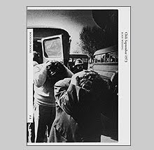
(Afghanistan Diary 1992-2000)
(New York Masjid)

Enough of this print-on-demand technology, the next two photographers decided to actually take the plunge and have their books printed traditionally with ink on a press. Both of which oddly enough arrived from Australia.


The first is a small book of black and white photographs from Sean Davey called Pidgin. Pidgin is a different kind of road trip. It is a road trip mostly taken at night by a group of friends as they navigate, or more likely stagger through a landscape of drinking, driving and the pursuit of the next good time. The promise of that next good time is often obliterated by a haze of blur that leaves one with a slightly nauseated “contact” hangover. The power of these 48 images is that left over feeling of slight sickness attributed to trying to drink away that feeling of what it is to be on the cusp of adult life and being unsure of what the future holds.

The title Pidgin means a language that is simplified and adapted so that small groups can communicate. Being that this wordless book is from Australia, that title probably has more of a cultural subtext than viewers in other countries may be privy to. To me, it refers to the language of friends and how they come to understand one another. It is a personal communication that creates distinctions between insiders and outsiders. This book allows us to tag along, but what is transpiring between the participants is real and we can only observe and grasp what we can translate.

Sean Davey funded a very small run of this book of which he had only 50 signed copies printed. The book is very cleanly designed with one photo to each right-hand page. There is no text at all. This is a book that challenges the viewer to make up their own mind about what is being presented.

Sean can be contacted at www.pidgin.com.au but there may not be any copies of this book still available.


The last book, Wounded, is from the photographer Jesse Marlow and it is probably the riskiest, most expensive to produce of all four of these featured books. Jesse is a photographer who is carrying forth the fine tradition of so-called street photography. His book Wounded may be the only book of these four that has been seen in public light as it had enjoyed a bit of distribution here in the States.

Wounded is an often hilarious collection of black and white images of the walking wounded. Jesse has apparently been drawn to looking out for the bandaged, the limping, and the bleeding for sometime as the page previous to the first image attests: 39 people were injured in the making of this book.

Now I usually don’t like books that seem to be so cleanly wrapped up (excuse the pun) in an idea or illustration of that idea but this book is too charming to dismiss on those simplistic grounds. First, Jesse is great at juggling information on the fly. For anyone who has spent a lot of time trying to be in the right place at the right time and be facing in the right direction (and then find the exact place to stand and vantage point) will know that these accomplishments are no small feat. And although mainly a humorist, Jesse’s running commentary on the variety of infirmities also allows our frailty to be under examination once the laughs subside. Many of the bandages become glowing beacons of our resilience and the fact that all of these images were made in public attests to that fact. Though hobbled, people continue to go about their business although a bit more slowly and carefully.

The added charm of Wounded is in its packaging. The book comes housed in a slipcase that mimics the texture of a plaster cast. I have the regular edition of the book but have heard that there is a limited edition that actually has to be cracked out of its cast enclosure. The book was published by Sling Shot Press in 2005 and is in an edition of 1000 copies.

Copies are available through Photoeye.com More information and work from Jesse can be found at www.jessemarlow.com.au

Friday, October 5, 2007

Two books on the American Snapshot


There is a quote by John Szarkowski that I read years ago and cannot remember clearly. He said something about photography being promiscuous. I am not quoting him obviously because I've already said I can’t remember...but it was something like: Photography is a promiscuous lover, she will give it up (a masterpiece) on a one night stand to an amateur as readily as she will to some professional who is wed to her. I am sure the actual quote doesn’t say “give it up” but you get the point.

The countless number of family photo albums hidden away in various credenzas will attest to his sentiment. Inside those albums, trapped in pages of that electro-stick paper are masterpieces worthy of sitting beside the world’s great masters of the medium. Who would have thought that when Uncle Pete took a photo of Aunt Jean by the family Ford that the photo gods would notice Pete taking a photo and suddenly grace him with an image that could elevate him momentarily into a master? It happens all the time. Photography is an unpredictable slut.

Since photography is mostly a mechanical process these things are possible. Some other thoughtful soul said something to the effect of: The photographer is capable of making a sketch or a masterpiece using the same gesture. (I probably butchered that one too). I guess if you handed a brush and paint to a 5 year old that they could, in theory, make something as visually sophisticated as Cy Twombly or Robert Motherwell. That is what a lot of people say isn’t it? My five year old could do that. There is currently a movie out which addresses this exact topic called “My Kid Could Paint That” although the little girl featured is four years old not five. And her paintings sold for over $20,000. But since there are billions more images being made than paintings are being painted, we have tons of examples of exactly what I am talking about.

This begs the question, if a photograph or “piece” is created with complete naiveté, can we /should we approach it in the same way that we consider the “real” art in a museum or gallery. I want to say that it doesn’t matter what a person’s intention was, all that matters is the final image. And even if the image was created by a “non-professional” in the most jaw-dropping, casual manner, then it is as valid as anything that could be hung next to it.
Picasso and Uncle Pete.

Two new books feature collections of such “masterpieces,” The Art of The American Snapshot 1888-1978 from Princeton University Press and Michael Abrams's …Strange and Singular…from Loosestrife Editions.

The Art of The American Snapshot 1888-1978 is a catalog that will accompany an exhibition of the same name that will be on view at the National Gallery of Art in Washington DC on October 7th. The photographs in the exhibition and catalog are culled from the collection of Robert E. Jackson who believes that creativity is not solely the province of artists but resides in all of us.

The book is illustrated with a couple of hundred images, the earliest of which correspond to the year that Kodak released its first camera, 1888 and the latest from are 1978. Within essays by Sarah Greenough, Diane Wagner and Matthew S. Witkovsky, the catalog provides a history that reflects the technological advances from Kodak Brownie (the first generation) to the Leica (the second generation) to the third and fourth generations which enjoyed cartridge loaded cameras and instant cameras with Polaroid materials. Matthew Witkovsky mentions in his essay on 1960 to 1978 a rivalry between Kodak and Polaroid as there were collaborations with artists that gave Polaroid a certain respect that was previously only held by Kodak.

The photographs featured in this book are surely fine examples of wonderfully inventive and playful photos but considering how much has been produced (Polaroid estimates that over a billion instant photos were made in 1974 alone) there could easily be twenty volumes on this study and we probably wouldn‘t get tired of looking. Thankfully, this book is large at almost 300 pages. It is finely produced with a nice design contributed by Margaret Bauer and the photo separations were created by the masterful Robert Hennessey. One interesting touch is the reproductions are mostly actual size of the originals and include the various straight or scalloped decorative edges of the photos.


Michael Abrams ….Strange and Singular… is another title that is a collection of found family snapshots. The difference here is that the book’s construction and design creates a much different dynamic. Books of found photos are somewhat common. Some like the Fraenkel Gallery’s recent The Book of Shadows feature photos presented in thematic ways. The Book of Shadows has the photographer’s shadow appearing in all of the images.

The dynamic created in Michael Abrams’ book is an edit and order to the photographs so as to create what the book’s title implies. The full title, taken from Michel Foucault is: A readiness to find Strange and Singular, what surrounds us, a certain relentlessness to break up our familiarities, a fervor to grasp what is happening and what passes; a casualness in regard to the traditional hierarchies of the important.

What better description of the impetus of photography can be found (in a very French intellectual kind of way I mean)?

The book is a linear journey through photographs that moves along effortlessly due to the strength of the selection of images and a compelling design. As with all of Loosestrife’s books (I think) John Gossage is credited with the design along with Mr. Abrams. Together, they tempt disaster with design quirks such as images where one half appears on one page and the other half appears on the verso but the risks they have taken only add to the artistry of the book. The visual flow and “narration” that comes in the form of various quotes about photography keeps you moving through this familiar yet unknown and often confusing territory. The sequence opens with an optimistic image of a car on the open road and ends with two photos of a taxi that seem innocuous until you notice the chalk outline on the pavement.

Occasionally throughout the book quotes from various voices appear mostly in dialogue with photography itself. I read this as a kind of “narration” coming from Abrams directly. Although I like the way they designed the type in relation to the images with words laid over photographs or the text being obscured by the photos, the quotes sometimes fall flat for me. That may simply be because I am familiar with many of the quotes chosen and I immediately see the cleaver pairings.

The book is made from very fine materials and as with all of their books, it feels as nice as it looks. This is the smallest in trim size in relation to Loosestrife’s other titles, some of which are epic in their proportions but it holds its own with its intimacy. One surprise is few actual photographs that have been slipped into different places in each book making each edition unique.

These two titles make me question the art of photography. It is almost depressing (to my ego) that so many great photographs are made by someone just responding to something with naiveté and the result produces something of wonder. The difference is how the maker and the viewer respond when looking at the final image. Most likely the two have very different perceptions. We may see the pattern of the dress Aunt Jean is wearing and the shape of the fender on the Ford as siblings from the same family (and the dog pissing in the background) and perhaps the photographer just sees Aunt Jean and the Ford (and the dog pissing in the background).

Art is in the eye of the beholder. I sometimes wish I could just see the Ford. It is enough to make you feel so damn mediocre to see the art in everything.

Book Available Here (Art of the American Snapshot)

www.press.princeton.edu

Book Available Here (Strange and Singular)

www.loosestrifebooks.com

Sunday, September 30, 2007

Anthony Hernandez: L.A. Photographs of Waiting, Sitting...


“Street photographer” has been a term that gets tossed about in regard to any number of photographers. Garry Winogrand was regarded as the epitome of the “street photographer” but he actually thought the term didn’t mean anything, that it was dumb…not dumb like stupid, dumb like it doesn’t say anything. And in reality, it doesn’t mean anything but an assumption. Was Ansel Adams a “forest photographer”? Brassai a “hooker and thug photographer”? Lately Robert Adams has been a damn good “leaf photographer.”

Well…I have finally discovered someone who I am fairly comfortable in calling a “street photographer.” His name is Anthony Hernandez and his new book from Loosestrife Editions is called Los Angeles Photographs of: Waiting, Sitting, Fishing and Some Automobiles.

Why am I willing to call Anthony Hernandez a “street photographer” and not the other usual suspects commonly associated with that term? Simply because while looking at his photographs of Los Angeles pedestrians waiting at various bus stops, it is the street that takes center stage and carries most of the weight. With folks like Mr. Winogrand, it was mostly the human element and the seven deadly sins that make his photographs carry so much meaning and substance. With Mr. Hernandez, it is the street and its horrific endless hardness and uncomforting layers that cause us to be unsettled about the human condition. So finally…a “street photographer.” Maybe it’s just LA. The photographer Lewis Baltz said of the place, “I always believed that God would destroy L.A. for its sins. Finally, I realized that He had already destroyed it, and then left it around as a warning.”

Working with a 5 by 7 view camera, Hernandez spent his days making his way around L.A. and his choice of time of day seems to be high noon. Perhaps that is his homage to the great westerns spawned from Studio CityL.A. because escape from the sun may be a futile exercise. The city was created in the one of the more hostile areas for humans to set up shop. or perhaps that time of day is a fitting description of

Hernandez is a "street photographer" also because the people who appear in his photographs know the streets intimately. These are pictures that describe a working class who use public transportation as a car might be convenient but is ultimately unaffordable. In the book‘s third act, these same people take small pleasure in recreating in spots that are little more than areas where man’s desire for more asphalt constructions has waned partly due to the impediment of a small body of water. Here they fish…for what? Food? Pleasure? In these photos it seems as though the idea of fishing may be more pleasurable than the act.

His book is divided into four parts and the last is dedicated to that myth of status, the car. L.A. is constantly being described as a city where the car is a necessity. In Hernandez’s L.A. the car is present but it is of a make and model that is thoroughly weather beaten and just on the verge of an expensive repair. In fact, if we were to believe Hernandez’s vision of car culture, we would declare it a pointless endeavor and just take the bus. The last image in the book is of an empty car dealership lot on Glendale Avenue; another wasteland with remnants of car parts and litter left for the sun to beat up on.

The book is a wonderful piece of creative design by the photographer John Gossage. He handles the cover typography so well that Neville Brody would nod with approval (who else would give a bold “Printed in China” credit a prominent spot right on the cover?). The interior of the book is a series of gatefolds with the photographs hidden beneath pages of city street maps that identify the locations. And although this aspect makes it a book that takes some extra handling and effort to see the images, the quality and feel of the materials makes it a pleasure and not a burden. The paper choice and printing style lends a chalky bright high key quality to the images that has you searching for a bit of shadow to seek refuge under.

The pleasure of Loosestrife books is that every aspect of the book has been taken into consideration and although they may cost a bit more than other books, after you bite the bullet, you realize that there is a reason for the higher price. This book had to have cost a small fortune to produce with its design quirks. Thank you John and Michael for not sparing the expense.

Book Available Here (LA: Waiting, Sitting, Fishing, and Some Automobiles)

www.loosestrifebooks.com

Important Photographs Christie's Auction Catalog


OK…enough fairs and exhibition distractions, this posting is for all of you Robert Frankophiles. You will want to check out the new auction catalog from Christie's entitled Important Photographs (from a private American collection).

Although this is a small auction by usual standards with only 37 items being offered, almost half are works by Robert Frank. And since he is the dominant artist featured, the entire catalog is dedicated to showcasing his works and comparing them to the other important artists whose works are also being offered.

The catalog was overseen by Stuart Alexander who was responsible for the Robert Frank Bibliography published by the Center for Creative Photography in 1986 and he was given carte blanche by Christie's to make the catalog according to his wishes. The result is a fantastic production that pulls out design features including gatefolds and reproductions of book jackets and other publications where the photographs have appeared in print. As Alexander states in his brief introduction to the catalog: The importance of context for the interpretation of photographs inspired the design of this catalog to include relevant quotes, facsimiles of book covers and page spreads of early presentations of these images.

The descriptions of the different lots include many details on the material’s provenance and in turn, their historical relevance in either exhibitions or in the creation of Frank’s landmark book Les Americains. The entry on Trolley-New Orleans offers interesting details about how Frank used his prints while planning for Les Americains. One part reads: The pinholes in the corners, numerical markings, size and apparent age of this print suggests that it was used in the final stages of preparation for the first edition of Les Americains published in Paris in May of 1958. Frank made 8 x 10 inch prints from the negatives he exposed on his Guggenheim Fellowship. He edited them and made decisions about sequencing by pinning, tacking and even stapling prints on the wall of his studio.

The National Gallery of Art in Washington DC has dozens of prints- some even still have the staples in them. Many of the work prints used in early stages have the negative numbers written on them in grease pencil.


Among the reproductions of the images, there are a few detail photographs of the stamps and stickers that had been affixed to the prints. When Frank applied for an extension on his fellowship, he submitted several prints as supporting material onto which he affixed adhesive labels with penned captions. One image that was in this group is of three (theater?)usherettes from 1956 which is an image that did not appear in Les Americains and is one that I believe has never been published before.

One interesting fact of the book’s title comes under discussion as Alexander recounts that Frank’s original title for the maquette was Americans but since the book was first published in French, the language required the article Les to be added, thus Les Americains. When this was translated to English, the article tagged along and thus sparked some negative reaction to the assumption that the book was meant to be a description of all Americans.

The prices of these items are very high due to their exhibition history of their being used to create the book. For instance, the Trolley-New Orleans photograph that graced the cover of several editions of the book is estimated to fetch between $150,000 and $250,000. Hmmm…let’s decide, $250,000 for an apartment or a piece of paper? (In New York City, the apartment you’d get for $250,000 would be too small to even hang this 8x10 print so you should probably just go ahead and buy the photo.) The rest of the prints stay within the $30,000 to $60,000 range.

Walker Evans appropriately is the other artist in the catalog with the most images for sale from this collection. All of his images are from his classic subway images that eventually made up the book Many Are Called.

The other artists whose works are being offered for sale are: Helen Levitt, Arthur Leipzig, Dorothea Lange, Brassai, Diane Arbus, Lisette Model, Morris Engel, Ben Shahn, Weegee and Margaret Bourke-White.

The auction date is scheduled for Wednesday October 17, 2007.

Buy catalog at Christie's

Sunday, September 23, 2007

Four books on Avant Garde Design


I wanted to mention a few design related titles that I have found recently that are very worthy of note. The one thing besides photography that has really been an obsession for me lately has been Avant Garde and Russian design. The following books delve into graphic design that was challenging the norm from the 1920's until today.

The first is a small book called, Letters from the Avant Garde: Modern Graphic Design by Ellen Lupton and Elaine Lustig Cohen. Published in 1996 by the Princeton Architectural Press, this book was created parallel to an exhibition called The Avant Grade Letterhead that was organized by Cooper Hewitt, National Design Museum, and Smithsonian Institution and appeared at the American Institute of Graphic Arts in March of 1996.

The works under discussion in this book are the different letterheads that were created by the likes of El Lissitzky, Theo Van Doesburg, Kurt Schwitters, Laszlo Maholy-Nagy, Le Corbusier and many others. The book is broken into chapters which concentrate on the different avant garde movements. Dada, futurism, Dutch Modernism, Bauhaus, De Stijl, and Constructivism are all discussed and each chapter features many reproductions of original letters as illustrations.

I like this book a lot but it perhaps suffers from being too much of a specific subject for most audiences. The paper letters are reproduced as objects so this book serves as the next best thing to starting your own collection. Most of the examples given derive from the collection of one of the authors, Elaine Lustig Cohen.

The next book is also very specific, Stenberg Brothers: Constructing a Revolution in Soviet Design published by the Museum of Modern Art in 1997, this was the catalog from an exhibition of the same name.

The Stenberg Brothers, Vladimir and Georgii, were responsible for an amazing but short career as designers of mass produced posters used to advertise films in Russia. While they achieved great design for theatrical sets and costuming, books and even architecture, it is their film posters that are under examination in this book.

One of their talents as designers was their ability to create the sense of motion and of the passage of time in their pieces as they juxtaposed or “collide” disparate images. Their most well known pieces were for Dziga Vertiov’s The Man with the Movie Camera made in 1929 reflects the relationship of Bolshevism to “the machine” as a way to achieve utopian societies through technology. In the poster, a camera tripod and camera meld with a woman’s high-stepping torso. Half of her face becomes the camera and lens, though the center of which is a wide and staring eye.

The career as I mentioned was rather short lived as, like many artists working in the Soviet Union at the time, they fell out of favor with Stalin’s decree of social realism being the only mode for representation. Georgii was killed in a motorcycle accident in 1933 when he was struck head on by a truck. His wife, who was also on the motorcycle survived. Vladimir, Georgii’s brother and design partner, insisted that his brother’s death was a murder committed by the KGB and the Soviet secret police. Vladimir later died in 1982.

Unfortunately out of print, this is a fantastic resource for anyone interested in Russian design from that period. Its design was created by Michael Bierut and Sara Frisk of the prestigious design firm Pentagram (see Pentagram Papers posting here at 5B4). Copies can be found through ABE or Bookfinder.


Next is a German book from the Museum Folkwang and published by Plitt Verlag in called Glaube, Hoffnung - Anpassung. This title’s subject is what was happening in Soviet imagery from 1928 to 1945.

From the 1920’s onward, photography was playing an even more important part in the poster design and montage that was appearing in the work of artists like Gustav Klutsis, Rodchenko, Valentina Kulagina and Vavara Stepanova. Photography was deemed to be the medium best suited to describe the vital economic and sociopolitical developments within this new socialist country.

Margarita Tupitsyn who is the author of this book, has done several other titles relating to Russian design with titles on El Lissitzky, Kazamir Malevich and one on soviet photography published in 1996. 1996 and 1997 were apparently great years to publish books on this subject as three of my four titles here appeared at that time.

The book features many illustrations of photography and graphic design in black and white and color and although rather conservatively designed it has good reproductions and there is a nice feel to the whole production. The essay is translated into English which appears in the back of the book, so English speakers will not be deprived of Tupitsyn’s fine essay which brings into context the works in relation to the events particularly as they related to Stalin’s implementation of the “five year plans.” A side note in relation to 5B4, the poster design and title that I used to use as the logo for 5B4 before I switched to the graphic of the book spines came from a poster which was advocating the completion of one of the “five year plans” in “four years.” Hence, "5 - B - 4." I am not an advocate of Stalin’s practices, I just thought it was a fantastic design and appropriated it for my own nefarious use. That being said, Mr. Whiskets on the other hand, is an advocate of keeping your friends close but your enemies closer. I will have to watch my step as he is very capable of having me purged and subsequently retouched out of all of the archive photos of 5B4.


The last book for this posting is by the prolific author of over 80 design related titles, Steven Heller. Merz to Émigré and Beyond: Avant Garde Magazine Design of the Twentieth Century published by Phaidon in 2003 is a very substantial 240 page book that surveys “the paper stage” of avant garde periodical publishing from the 1920’s to the 1990’s.

What is great about this book is that it reproduces the magazine covers and content as the full objects complete with drop shadows. I made the mistake of leafing through this on the F train while on my way home (from the Strand bookstore of course) and I had a fit of involuntary barking from excitement when I came across a two page spread that reproduces almost an entire issue of USSR in Construction that Rodchenko designed in celebration of the revolutionary poet Vladimir Mayakovsky. This 38 page magazine spread is a fascinating and dynamic use of montage and collage from 1940 which uses slipsheets and gatefolds integrated into the design.

Also stressing typography, this book follows the development of the use of type up through recent magazines such as Émigré, Raw and even handmade “fanzines” that were popular in underground music movements. This book weaves the hundreds of illustrations around an extensive essay by Heller and as with most of his books, his extensive knowledge, even in obscure territory, is the draw. The dedication to this book is to Elaine Lustig Cohen who was the author of the letterhead book which was the first title featured in this posting.

I will be doing more postings soon about work and books created in this same time period. My recent obsession has led me to a number of great discoveries worth writing about. Stay tuned.

Book Available Here (Letters from the Avant Garde)

Book Available Here (Stenberg Brothers MoMA)

Book Available Here (Glaube Hoffnung - Anpassung)

Book Available Here (Merz to Emigre and Beyond)

Friday, September 21, 2007

Tim Davis: My Life in Politics


I just discovered something that I think is tantamount to a crime. I was reading over the Photo Eye bookstore newsletter and I see that within a few weeks they are going to be receiving a whole slew of Aperture titles that will be subjected to the Deep Discount bin. Now regularly I get excited as I think, whoopee I can get a couple books for cheap, but then I saw that Tim Davis’s book My Life In Politics is going to be a measly $12.98 a copy.

Has the world gone insane? Is this a Bush administration ploy? Where are all of the people writing their congressmen and women? This was the best book published in 2006 and it costs less than Mary Ellen Mark’s Twins book? (Mark Twain is somewhere nodding and laughing) That, ladies and gentlemen, is the crime at hand.

As we gear up for another round of political horse racing (like Christmas decorations, it shows up earlier and earlier) it would be helpful to take a look at Tim’s book. Davis dwells on the outskirts of obvious political imagery and finds meanings in many facets of the political landscape partially hidden from view. It is a contemporary view of how we, as a nation, have painted ourselves into a corner due to our politics being ruled by “urgent emotions” that forego discourse. Ours has become a process does not celebrate great communicators, just great image makers, posing as substance.

It is about appearances and surface and signage. It is about the importance governing has over our lives and yet how embarrassingly powerless we seem after being confounded by its wind and unrelenting distraction. As Jack Hitt writes in his essay “Our empty public square is a marble echo chamber, reverberating with the distant sound of the banishment of deliberation and meaning from our politics.”

Davis finds the appropriate situations in which to relay his message. A roadside political placard shows up staked on a grave in the middle of a cemetery. We then see through the names on both headstone and poster that the son is the politician and the father is, well, dead but championing his son’s cause from the grave and possibly casting a vote as well.

For each photograph, the caption which appears in the back of the book is a poem by Davis who has a couple books of poetry published as well.

For a close up on the crotch of a statue of George Washington, the corresponding poem reads:

Founding Father’s Crotches

How the Beaux Arts said to manufacture manhood. Unintimidatingly flaccid and unembarrassingly fulgent. The Great Compromise as opening theme and fertile crescendo. DNA standing for Do Nothing Attributable. Democracy, No one Argues, is as sexy as stenography. Hear ye, Hear ye, Being everything to everyone means getting no one’s knickers in a twist.

Two lobbyists, both on cell phones sitting in a room awash with empty chairs; one drinks a Diet Pepsi, the other a regular Coke.

Daves do what Daves will do. Pacing the cell placing the call. Targeting. Listing. Crossing off. Red in the elbows. Daves hold the hand of the handholder’s handler, praising emoried nails and dangling with taint prose. Is there a special circle in Dante for middlemen? I’d call it power.

Davis, as a photographer, is extremely sophisticated in how he creates his frames. Seemingly simple at first, they keep revealing and compounding meaning and interpretations yet they are never too clever for their own good. Davis is a refreshing voice for those of us who love complex photography that is well crafted yet not weighed down by its own devices. He is essentially a classic photographer in the vein of Walker Evans who has learned the lessons of those before him so well that they are new and refreshed under his application. These are photographs that can stand up to repeated visits. Even after owning this book for a year now, I still think it is a great book. Yes…I did say great.

Both essayists, Tim Davis and Jack Hitt are fantastic writers. Enlightening and poetic, their word play is limited to a 1500 word essay by Davis called “1500 Word Essay” and Hitt’s 3,000 word dissection of American political speech and image called “The Vacant Public Square.”

The book is playful with its design which was done by Andrew Sloat who also contributed drawings that reference the words in the photographs. The printing is well done

So…this book joins the ranks of other great books that, at the time of their release, were thrown to the remainder piles. I may piss off a few people but I do not feel at all odd adding Davis’s name to the same remainder pile list that has included books by Winogrand, Eggleston and Frank.

If at this bargain basement price of $12.98 you still do not find the incentive to own this book, then my friend I am sad to say that the terrorists have won.


Buy online at Aperture

Book Available Here (My Life In Politics)

Buy online at Photo Eye