Thursday, August 28, 2008

Ray K. Metzker: Light Lines


With two large career retrospective books on Ray K. Metzker on my shelf I was wondering if a third is necessary. What could be added to the collections found in Unknown Territory from the Museum of Fine Arts in Houston (1985), or City Stills from Prestel (1999). This year Metzker enjoyed a retrospective at the Musee de l'Elysee in Lausanne and a huge catalog called Ray K. Metzker: Light Lines published on that occasion is just out from Steidl.

For more than 50 years, Metzker has bent the medium of photography to meet his curiosities. His many series of photographs usually depart from traditional individual picture making to take advantage of multiple frames, composites and printing techniques that produce puzzling and pleasing results. His is a concern for formalism tied to humanity which reinvents itself through his many working methods.

My initial interest in Metzker was due to an association I saw with his work to his teacher's, Harry Callahan. Both worked the streets of Chicago and both were drawn to the hard contrasts of brilliant direct sunlight and deep shadow. Both experimented with multiple exposure and found a lyrical quality in a strong concern for the formal elements and yet each seemed to be humanist to the core. Not taking anything from Callahan but Metzker in the end appealed to me more once I had acquired a copy of Unknown Territory. It seemed Metzker had learned the lessons from his master and taken them to new levels.


Getting beyond the confines of single images, Metzker's double and triple frame photographs string information along in panoramas dynamic in their design and content. Not a gimmick created without necessity, these are sound and irreducible images that create a dialogue between the disparate elements. His are often photographs that at once wish to be appear as one unified field of vision and at the same time bisect and divide inducing spacial confusion.

His Pictus Interruptus series is very adept at creating that confusion. Even with many viewings, figuring out what the image describes is a pleasurable chore to try to discern. In these Metzker breaks up sharply focused landscapes with unsharp slashes of white shapes close to the lens (white card? metal?) that disrupt the field of view and create unnatural puzzles that fit tightly together with surprising fluidity.

Many artists have resorted to altering their images when their 'straight' work is proven weak or derivative. Metzker however is of a rarer breed that has produced substantial amounts of work both ways. His street photographs from Philadelphia and Chicago are as carefully formed as his composites and each rewards the viewer with lasting strength.

Light Lines was edited and sequenced by William A. Ewing the director at the Musee de l'Elysee and it presents a chronologic walk through Metzker's life in photography. Even for those readers who are familiar with these bodies of work, this catalog is dense with more than 200 images, many of which are not represented in his other books. The quality of those reproductions is close to perfect. Since Metzker's work often relies on deep black tonalities, the printing has to be rich in order to represent the work well - this title does just that. Along with a very clean design and large trim size Light Lines is a hard book to resist. This work has finally been given the full attention it has long deserved.


Buy online at Steidlville

Tuesday, August 26, 2008

Japan by Horace Bristol


Earlier this year when I received a copy of the 802 Photo Books from M+M Auer (5B4 January 18, 2008), one book that I purchased blindly was a copy of Horace Bristol's Japan. In M+M Auer, they illustrated the entry with a shot of the cover of the book and an interesting image of a Japanese woman diver dragging a fishing net aboard a small skiff. From the look of the cover, the elegance of the book was apparent with a design that included ivory clasps that hold the outer covers closed so I figured the $15.00 asking price wouldn't be too much of a loss if the photography didn't meet expectation. Truthfully after receiving the book, the photography for the most part doesn't (there are some really good photos that get swamped by the majority of weaker ones) but there are other interesting things about this book to mention.

First, the "book" is actually 13 booklets encased in a foldout cover. These loose booklets make up different photo essays on cultural aspects of Japan,
most of which deal with exportable materials and their making. Much of the content is given to shots of workers while producing silk, lacquered goods, rice, pearls, pottery and crafts. The other booklets feature children, architecture, the city of Tokyo, the Tokaido highway, geisha, and religion. Two booklets, one called Honeymoon and the other Hatsushima, stand out as the most interesting yet the most out of place.


Honeymoon as the title implies it is a short photo essay of a young Japanese couple with Bristol as the third wheel. He follows along, or more like, orchestrates the events as Goro Saisho and his wife Yuriko go about their post-wedding ritual of visiting hot springs in Atami. Bristol photographs them playing cards in their loose fitting "yukata" (the text informs us that it was raining outside so they were passing the time until the next bath), eating meals, Yuriko being fitted with a komono, relaxing on a rumpled bed, enjoying the scenery of Atami and finally, as a bookend to the first image of them in street clothes waiting for a train, returning to Tokyo with luggage in hand. Coming after the other booklets shot in small workplaces and with an air of the impersonal, this booklet stands apart due to its implications of intimacy and sex.


The other book contains an essay on the island of Hatsushima at the entrance to Tokyo Bay. Its inhabitants exist on fishing and the essay concentrates on the top-less female divers that fish and gather seaweed. In his introduction, Bristol apologizes for the inclusion of these two books, "...results in the inclusion of one or two rather trivial and unimportant sketches, included frankly to enliven the tone of the book as a whole. To put it bluntly, to sell the volume to the average reader. For this I must apologize to you, whom I know to be a reader of superior taste and refinement; I must admit though, that I too, take a sneaking second look at those stories."

Tongue in cheek as it may be, his whole introduction is actually a long apology for the entire book - which is always a curious way to introduce something you want to sell. Bristol starts, "This book is frankly experimental. There have been other picture books on Japan, including similar material, individually more appealing photographs and more literate text." He does go on to mention the division of the "book" as a whole into individual booklet stories as being the unique reason it should be read but he starts the next paragraph with, "Now that the book is printed, I realize a few of the many ways in which it could have been better presented...this has resulted in a feeling of lack of continuity in the whole volume." He then speaks of a volume II of the book should it ever be published and how that volume will "profit" from the mistakes of this edition. What an endorsement.


With a little research I also discovered this book was released in the early 1950s in an edition aimed at military personnel sent overseas with the cover title and seal US Fleet Activities. Apparently those two booklets that Bristol was so apologetic about found a new audience and second printing for I strongly doubt the other content would be of interest to men away from home.

For me this is interesting as an example of experimental bookmaking. If this was published as one traditional book it probably would have died a quick death without much notice. The design and package at least make it an interesting read while discovering the few fine photos that stand out amongst the weaker. In my opinion, (and probably Bristol's as well) this isn't worth the usual $40.00 asking price by dealers but if found for under $25.00 I'd pick it up. It was published by East-West in 1949, and from what I gather, this edition was self-published. Bristol names himself as the author, photographer, editor and publisher.

To end on a sad note, I have read that Bristol's wife committed suicide some years later and distraught over the loss, Bristol burned all of his photographic work that was in his home in Japan
-- much of which probably made up this set of books.

Book Available Here (Japan)

Sunday, August 24, 2008

Five books from Miguel Rio Branco


Anyone who has spent some time wandering through baroque churches in Latin America will find a similar weight and intensity in Miguel Rio Branco's photographs and installations. Steeped in Catholic imagery with a fascination for the violence and bloodletting, his constructions are dark and visceral metaphors of life lived under oppressive forces.

An artist associated with the Magnum photo agency (Miguel's Magnum status for twenty years has been as a "correspondent"), he has created several fine books relating to his photos and installations. In 1998, Aperture dedicated a monograph to Rio Branco and it is a fine introduction to his work. Since most people know of that book I thought I'd take a look at a few of his other lesser known titles.

Rio Branco's second book was Dulce Sudor Amargo (Bitter-Sweet Sweat) published in 1985 by the Fondo de Cultural Economica in Mexico City.

It now fetches strong prices when found. Fairly typical of a 1980s design and layout but it contains many of Rio Branco's finest 35mm color work from the mid-1970s and early 80s. Notably is the inclusion of his work from Salvador de Bahia's decaying Marciel neighborhood in which Rio Branco photographed the barrio's street life and prostitutes.

Interestingly, Steven Soderbergh in his film Traffic duplicated one of Rio Branco's photos from this series on film. (The similarities are so strong I would be surprised if Soderbergh denied the influence). The photo describes a couple embracing and the point of focus is a scar on the man's shoulder while the prostitute's face appearing in the upper right corner remains unsharp.

The photographs in Dulce Sudor Amargo hint at the metaphor and image pairing that Rio Branco would later pursue - distancing himself from straighter documentarians.


The next book in my collection, Silent Book was published by Cosac & Naify in 1997. This was featured in Parr / Badger II and in my opinion it is his best to date.

A collection of square images that start Rio Branco's intense descent into the baroque. His color palette, always intense, intensifies until the hues bleed and taint the entire photo. A large percentage of the individual images are from a boxing facility in Rio de Janeiro. Within the blue and green walls and rings, the boxers blur into muscular apparitions. The images are sequenced and edited to draw direct comparison to religious imagery and in some cases, seems to imply life imitating the more grotesque themes of paintings from the likes of Caravaggio.

Silent Book
is an artist book of the finest order.


The next is also from Cosac & Naify from 2001, Entre Os Olhos, O Deserto (Between the Eyes, The Desert) is an artist book version of an installation slideshow from Rio Branco.

This work is much less dark and ominous than Silent Book or the books to follow. I had seen the installation of this work in New York, a three projector triptych slideshow of images that fade into one another in Branco's style of free association.

Mimicking that installation, Entre Os Olhos, O Deserto is mostly a series of fold-out triptychs of disparate images that start to link through form or tenor. Image after image of close-ups of eyes, both human and animal, change Rio Branco's world into imagined spaces filled with a tension between beauty and danger.

Entre Os Olhos, O Deserto is beautiful and compelling but as an object it is difficult to operate. The tightness of the binding due to the small trim-size yet thick page count makes opening the fold-outs a chore. I find this effects my willingness to participate and engage with the work fully. It comes with a DVD.


The next book, Gritos Surdos, is from an installation in Portugal at the Centro Portugues de Fotografia in 2002.

Starting off with green neon skulls and smashed car windscreens, the images overlap and crossfade using many of Rio Branco's known images. Sex and sensuality have been a theme in his installations before but here he employs pixelated images from porn films that, following on the heels of the the other dark imagery, wind up looking like modern visions of hellish suffering.
This book, like Entre Os Olhos, O Deserto, comes with a DVD.


The last book to mention is from the French publisher Textuel, Plaisir la Douleur features not only Rio Branco's photographs and installations but his photomontages and paintings as well.

The endpapers flow rivers of blood and the first recognizable image is of a golden halo hanging on a wall. Disturbingly Rio Branco starts the body of the book with a close-up of a horses eye that is so dark, the actual eye is described as an empty, blind hole that weeps oil-black tears. It is an image of suffering and punishment but considering the grotesque visions that follow, it might be an enviable existence.

In his photomontages, Rio Branco constructs fanged monsters and, in a rare moment of being obvious, a modern day Eve and snake scenario. Although these are separate works with a listing in the rear of the book, when sequenced together they bring to mind several religious themes such as the torture and flaying of Christ. Rio Branco seems to take masochisitic "pleasure" (plaisir) by showing pain through the seductive use of his color palette much like the old masters.

All of Rio Branco's books mentioned with the exception of Dulce Sudor Amargo are printed with the images surrounded by black pages so all color seems even more vibrant. The books generally have interesting design but handle carefully -- one flaw is usually with the binding. Silent Book, Entre Os Olhos, O Deserto are susceptible to the signatures separating and loosening through moderate use.

Miguel Rio Branco can be relentless. He throws imagery at the viewer and recycles his photographs to suit new needs. The installations are often projections onto physical objects -- metal, mirrors and glass -- all of which bend and distort to create a real and imagined world where the viewer may not know where one ends and the other begins.

Thursday, August 21, 2008

Portrait Louise Anna Kubelka by Friedl Kubelka


What would a life portrait look like? There are many interpretations of what could be meant by that but in Friedl Kubelka's case, it was to make a headshot photo of her daughter every Monday from the first day of her daughter's life until her 18th year. This act of "Monday photo," as her daughter Louise came to call it, is part ritual, part performance, part obsession.

Friedl Kubelka: Portrait Louise Anna Kubelka published by Fotohof in 1998 presents this work in its entirety.

Arranged in grids of 52 photographs and starting in 1978, we see the passing of 18 years and how it shapes a young woman's face as in a time-lapse film. The framework of photographing Louise's head in close-up against a neutral background accentuates the seeming difference in her moods although photography is too slippery a liar for a true reading.

At sixth months old, Louise seems to show an amusement with the camera, like most, she tends to smile when the lens is pointed in her direction. By the fourth year she her face relaxes into into expressions that seem to serious for such a young age. Perhaps a reflection of her mother's verbal direction ("neutral background, close-up of face, look serious") her "seriousness" seems to be something she grows into as she ages into her teen years.

By 9 or 10 Louisa seems to be shaping her own identity and self-representation apart from her mother. Her hair styles vary and blank spaces appear in the grids where a Monday photo was missed. By the last year, the 18th, only 12 images appear in the first few months until finally the ritual is broken.

In some ways, this work is a display of a coerced collaboration that even Louise has questioned. "I have asked myself whether my mother had the right to use me as an object in this way." But she adds, "Had she waited until I had been able to make that decision for myself, my life portrait wouldn't exist." She later mentions the fictional nature set by the parameters. "When I look at this child in the process of growing up, I see a person who is too serious. Although I know my mother wanted to avoid the artificial cheerfulness of common photographs, I think she should have depicted me true to my respective moods."

This book was produced as a catalog to accompany a show at the Galerie Fotohof in Austria and it does a great job in presenting the work in a huge over-sized form which is necessary to full see the grids and the individual photos. It is cleanly designed and includes a short essay by Annette Michelson and a short text from Louise looking back on her experience with the project.

Photo albums often have the effect of piecing together the time-line of a life in fits and starts that skip vast spans of time. This project is about the tight flow of time but more importantly for me, it is tainted with melancholy once the gaps in the grids start to appear. The bond implied by the structure shifts as most parent / child relationships will, and the silence of those gaps make it apparent that Louise has created a life apart from her mother. This series seems to be one mother's way to resist that change. An act of anticipated desperation presented as art.


Buy at Fotohof

Tuesday, August 19, 2008

William Henry Fox Talbot by Geoffrey Batchen


For one of the guys who invented photography, William Henry Fox Talbot is only represented in my library by way of one object. It is a portfolio of a dozen loose gravure plates which was published by Electra Editrice in 1980 and frankly, my Talbot portfolio has been viewed many fewer times than the Edweard Muybridge or Lewis Caroll editions that I own from the same series. With the rapid advances to the medium it is often hard to look back and get excited by an image of a wall that has barely registered onto paper or a piece of lace that was laid directly onto some light sensitive paper but a recent book from Geoffrey Batchen on Talbot and his practice energizes these early stepping stones of image making.

The invention of photography is shared by several from Johann Heinrich Schulze, who as far back as the 1720s discovered that silver nitrate darkened with exposure to light, to Thomas Wedgwood and Sir Humphry Davy who in the early 19th century were making photograms but weren't able to arrest the development process. Joseph Nicéphore Niepce made the first known photograph in 1826 at the same time that Louis Jacques Mandé Daguerre and William Henry Fox Talbot were working out their own photo processes. Daguerre's announcement of his method of making a positive image on a silver plate took a bit of the wind out of Talbot's sails as Talbot had worked on his experiments in silence years many years before any public awareness of his advances.

What puts Talbot ahead of the others for me is his patented process that allowed photographic illustrations to be included in books. His Pencil of Nature (1844-46), a description of his process illustrated with 24 original prints is considered to be the first photo book.

Batchen's book William Henry Fox Talbot published by Phaidon is a fine tribute to this early pioneer.

With the possibilities open in those early years, Talbot shows himself to be truly curious to a wide variety of descriptions; from portraits to still lifes and from photomicrographs of crystals and plants, to pictures that foreshadow photography's ability to still motion. One interesting example is his "A Cascade of Spruce Needles" (1839). Essentially a contact image of spruce needles but their arrangement implies a pattern of falling needles.

In the 1830s, Talbot would leave home-made cameras lying around his estate during the long periods required to make even the thinnest of exposures; his wife Constance referred to them as "mouse-traps." These mouse-traps caught low angle views of tree groves and rooflines that are barely record onto the paper negative and are represented in the final image through a wonderful haze of chemical imperfection.

William Henry Fox Talbot as a book is a nearly perfect package for these great specimens. The paper is beautiful, the printing is extremely well done, and the final touches of the cover tip-on image and clean design add a modern elegance. The most enjoyable trait is Batchen's caption paragraphs that accompany each image.

Talbot deserves to be noticed especially by book-lovers. He invented the form. If you can't have the Pencil of Nature then this may be the next best thing.

Book Available Here (William Henry Fox Talbot)

Friday, August 15, 2008

South East by Mark Steinmetz


My copy of Mark Steinmetz's book from 2006, South Central, is getting a bit worn. His collection of skillfully made photographs of Knoxville residents and roadside discoveries doesn't sit on my shelf long enough to gather much dust. He is a photographer whose work asks to be revisited - and for the observant - it offers up a little more with each viewing.

Mark has a new book from Nazraeli called South East and this book could be seen as adding another chapter to his exploration of people and place.

The first thing one notices about South East if you've seen South Central, is that they follow the same exact size, design, and construction. They are twins. The similarities do not end with these physical attributes but extend to the photographs too. Not to be mistaken for a suggestion of repetition - I could look at stacks of Steinmetz's photographs for days and not tire - but this is a continuation of the tenor of South Central.

Again Steinmetz brings us up close to the strangers he meets and photographs during his walks through Athens, Georgia and other southeastern towns; a girl with her hand to her cheek looks coyly into his camera looking through a thick mane of hair; a black man stands awkwardly near a parking lot while the world is bulldozed behind him; a young man falls asleep in some overgrown shrubbery and re-emerges on the facing page twenty hard-lived years later as a weather beaten Rip Van Winkle.

I had described some of Steinmetz's photographs before as describing people in transition (5B4 May, 15, 2007). His subjects decide to sit at a roadside or in spaces that wouldn't normally invite relaxation, yet they don't seem as concerned with discomfort as we may be. In one a young man lays writhing on a thin stretch of sidewalk between two spans of asphalt for reasons unknown. In another, a boy decides to sit in the weeds along a roadside and puff into a white balloon.

Through someone else's camera, these descriptions may seem forced or even contrived to the point of self-consciousness but Steinmetz's descriptions do not rely on obvious ploys to gain acceptance. As Peter Galassi writes in his introduction, "Indeed the hallmark of Steimetz's work - the quality that makes us trust his testimony - may be the unblinking constancy with which his photographs solicit grave interest in particular people without claiming unearned intimacy or insight."

As in South Central, animals play an interesting role in South East. They both belong and don't belong. Most are strays that, like the people around them, find their stomping grounds where others do not frequent. Also, they stand apart much like the photographer himself who belongs (Athens is Steinmetz's hometown) yet he is always an outsider as his camera and painful attention to detail are working beyond the notice of his subjects. A very young girl in a flower dress steps into a large pair of adult sized white shoes unconcerned with what the viewer will inevitably see as a set of phallic bicycle grips standing upright next to her feet. Again, Steinmetz doesn't hammer you with small details like the bike grips. They are present but left out of the spotlight for us to discover over time. As is the figure of a man that appears in the background of that same image. As is the tapestry of of wood and fiberglass screening that makes up the porch the young girl stands in front of. There seems to be little left in the frame that doesn't imply meaning.

South East, like South Central, is a full experience and both books together offer the fruits of unique talent who exists beyond the glitz and glamour of much of today's contrivances. They show just how extraordinary and meaningful the ordinary world can be if you have trust and allow it to reveal itself to you.


Buy online at Nazraeli

Book Available Here (South Central)

Friday, August 8, 2008

Aaron Siskind and Louis Sullivan: The Institute of Design Photo Section Project by Jeffrey Plank


In the early 1952, Aaron Siskind and his advanced photography students at the Institute of Design undertook a group project to document the architecture of Louis Sullivan. By 1954 they had photographed over 60 buildings and from the hundreds of photographs taken, 126 were chosen by Siskind for exhibition at the Institute. A new book from William Stout Publishers called Aaron Siskind and Louis Sullivan: The Institute of Design Photo Section Project presents the story and work behind this monumental achievement in architectural photography.

I am writing about this book because I am quite surprised at how much I have enjoyed its company. The draw was Aaron Siskind's name, whose photography I have liked since art school, but upon receipt of the book - and knowing nothing of this project beforehand - I was initially confused to find it mostly filled with the work of his students and not the master himself. One might expect work that the work of his students would be obviously of lesser quality but I find a pleasant surprise with quite the opposite here. Siskind and his students for the most part blend into one vision that is hard to discern one from the other. James Blair, Asoa Doi, Len Gittleman, Leon Lewandowski, Alvin Loginsky and Richard Nickel contribute work that together amounts to a great portrait of Sulivan's constructions. One student that stands out as exceptional and an equal of Siskind in terms of architectural work is Richard Nickel.

Nickel became a student at the Institute using his GI Bill benefits after a stint in the army. His talents were quickly recognized by Harry Callahan and Siskind and he was put in charge of the project. Nickel's obsession with Sullivan would eventually lead him to discovering 38 unknown commissions that Sullivan had undertaken.

The project was in full swing at a moment when many of Sullivan's buildings were being demolished and this pushed Nickel's and the others to work quickly to document the changing face of Chicago. Becoming a passionate spokesman for architectural preservation, Nickel would often get into clashes with demolition crews and developers as he was photographing the buildings. In 1972, his final act was to unknowingly enter the demolition site of Sullivan's 1893 Stock Exchange Building intending to salvage some ornament work from the wreckage. The trading floor collapsed around him and he was killed. Nickel, in the short span of not quite two decades, proved to be an exceptional architectural photographer.

The exhibit mounted in 1954 on eight large-scale panels in an auditorium in the Institute was the largest on Sullivan to date. Even though the project was meant to be a "complete visual documentary," the exhibit included only 35 of the buildings. The arrangement was not one of chronology or building type but with concern to more photographic relationships among perspectives, scale and an avoidance of repetition. The demolition of many of Sullivan's buildings would mark this exhibition and project as a unique accomplishment that could not be repeated.

Aaron Siskind and Louis Sullivan: The Institute of Design Photo Section Project is cleanly designed and beautifully printed and I appreciate the quality of construction. Jeffrey Plank, the Associate Vice President for Research and Graduate Studies at the University of Virginia authors an extensive and informative essay on the photo project and exhibition.

Aaron Siskind and Louis Sullivan: The Institute of Design Photo Section Project

Sunday, August 3, 2008

Three books by Ernesto Bazan


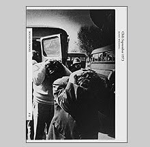
The first issue of Doubletake magazine from the Center for Documentary Studies at DukeUniversity featured a suite of photographs by Ernesto Bazan made in Cuba in the early 1990s. At the time I was impressed by what I saw as energetic and smart street work made even more seductive by my increasing interest in the world that exists outside of the United States. Photographers like Gilles Peress, Carl DeKeyzer and Larry Towell (with whom Bazan has a lot in common photographically) were increasingly on my radar. Dekeyzer's Homo Sovieticus and Towell's El Salvador were two in particular that I spent a good deal of time with and I found a common denominator with the few images of Bazan's that kept him on my list of photographers to keep an eye out for.

A few years later while in Paris, I found a copy of Passing Through for the equivalent of around 4 US dollars. Passing Through was published by Peliti Associati in 1992 and as the title suggests, the book is a collection of Bazan's photographs made in many locations. New York, Mexico, Cambodia, Pakistan, Haiti, Turkey, India, China, Tunisia, Japan, and Bazan's own Palermo. The locations and people are described in his signature grainy black and white style that embraces blur and unsharpness. The best of which handle the elements with a grace and lyricism - the unsuccessful seem forced and exhausted by all of their energy spent on cliché.

Although I like the collection, it does, like many books structured in similar ways, suffer from the randomness that comes with a "greatest hits" assemblage. The randomness is minimized by the title, Passing Through, which conveniently gives reason for the continent skipping where one page we are in Haiti and the next, a place called Shiprock in the United States.

What I like about the book beyond many of the photos is the size and sequencing of the images which lends to a graceful flow. The design handles the photos by running most of them across the gutter. Thankfully the designer has shifted the pictures left and right depending on where the division would land and the binding allows the book to sit flat when opened so the gutter becomes less of a distraction.

I haven’t seen listings for Passing Through on ABE or Amazon but there are listings in France through the FNAC chain of stores although for a rather inflated price of 32 euros.


In 2004, the Italian Academy for Advanced Studies in America at Columbia University held a small show of large-scale digital prints by Bazan called Italiani d'America. These photographs are from Bazan's earliest extended project photographing the Italian American community in New York. Accompanying the show, a small catalog was published containing ten black and white photographs.

This show and catalog contains the best of the images from this extended project and one aspect that is more noticeable here than in Passing Through is a tendency towards heavy handedness in Bazan's printing. He or his printer excessively dodge and burn while manipulating the prints and the result is an unevenness that shows the printer's hand (so to speak). People's faces are dodged almost pale white while the surrounding tonalities sink into pits of black. This kind of manipulation is common to photographers like Christina Garcia Rodero and Sebastio Salgado who insist on unnatural looking darkening of skies where printer's "halos" appear around the figures. For me this always removes me from the photograph and gives more attention to the process which, as a professional printer myself, is simply poor technique.

This catalog was not for sale but given away free at the show. The ten photographs are printed on long sheets of card stock which are assembled as an accordion fold. This accordion folded horizontal booklet is housed in an outer folder of tan cardstock with printed titles that adds elegance to the whole package.


Bazan's latest book is the self published BazanCuba. Where Passing Through was of a photographer on a stop and go tour of the world, Cuba is Bazan settling into 14 years of life on the island of Fidel and the embargo.

In 1992 Bazan first visited Cuba on a package tour entering through Mexico and return visits would eventually lead to his finding a wife and starting a family there. His afternoons of photographing and teaching photography workshops would draw him to discover the streets and people of the island that probably could have only been obtained through vast amount of patience and persistence. The result is 118 photographs in this thick, one foot square book.

Cuba, like India, has stood as a rite of passage for many documentary photographers although most choose color as their descriptive choice - Cuba's light is strong and color saturated. Bazan however has gone to the opposite extreme. His photographs are devoid of light and his dark grey-scale tones reduce the natural color scheme down to dense blacks and white that, at its brightest, is rendered chalky grey. His choice of amplifying dark tonalities turns the island into a phantasmagoria of weathered characters and worn buildings where any stray highlight seems hard pressed to stay unsmudged.

In one, a man carries a clear glass bottle of water on his shoulder that traps the image of decrepit buildings across the square like a ship in a bottle - a visual treat set amongst ruin. In another, a man carries on his head a pig on a platter while three young girls, one with a hoola-hoop play in the background. Others have Bazan's camera weaving through the streets and upon unspecified ritual that seem trapped in the dark corners of a cellar. Figures emerge from the black and the density of tone is in stark contrast Bazan's apparent enthusiasm for the place - perhaps metaphor for the inability to break the human spirit and perseverance during the "special period," Fidel's euphemism for the embargo. This is his Cuba, Bazan's Cuba. A fiction posing as a documentary that tells us we should love what we are seeing as he obviously does.

Like Passing Through, in the best pictures, metaphors are strong and the photographs interesting beyond their visual energy and in the worst, he drags us through the same tired clichés that immediately come to mind when we think of Cuba. Do we really need another low angle photo of a bunch of men playing dominoes? Or an old woman smoking an over-sized cigar? Or a portrait of a guy holding floppy tobacco leaves? Thankfully he somehow avoided including sugar cane cutters.

Bazan seems to experiment with lenses wider than the 28mm and the results splay the perspectives which almost always contain someone looming into the frame at an absurdly close distance. These have so much distortion and attention getting manner of the lens that it leaves me further from the subject. Those photos seem to be about less the subject and more about the photographer proving levels of comfort with the subjects. I have had a problem in the past with some of Eugene Richards’s mannerisms and in Bazan I would point to the same thing.

BazanCuba was self-published by Ernesto's new book publishing arm called Bazan Photos Publishing out of Brooklyn, NY and some of the design of this title highlights the pitfalls of working on self-published projects. Namely my biggest critique would come with the use of text and the typography. Bazan starts the book with huge quotes justified into clunky blocks to type that cross the gutter in extra long lines. The first by Rilke is quite possibly the worst, illegible, headache-inducing use of type I have seen. Rilke's quote is about how art does not follow usual measures of time, and ends with 'Patience is everything' - an appropriate quote considering photography's elusive nature but unfortunately who ever set the type here is testing everyone’s patience. The next pages have the same treatment given to quotes by Robert Frank, John Szarkowski and Raymond Carver - although much shorter that the Rilke, all could have been left out entirely. Those quotes are followed by pages covered with contact sheets. In my opinion, this is where the book should have started.

For Vicky Goldberg's essay at the back called Cuba: A Love Story you will need to keep the bottle of Tylenol handy for that too. The line length is far too long and the spacing between lines is so tight for the font size that I literally gave up trying to follow along after several attempts to get through the essay.

Bazan's also includes several pages of diary-like entries reproduced in his scrawling handwriting - he begins with, 'I look at my contact sheets. A feeling of utter depression seizes me. I sense a huge loss within me. And what's wrong is that there is nothing I can do about it. I want to cry in the silence of the empty room. A reminder of how difficult it is to take a damned good picture. I can only accept the verdict as a sentenced prisoner. EB.' The biggest pitfall when working on your own book is you don't have a strong editor hanging over you that would tell you when you are embarrassing yourself. ‘Verdict as a sentenced prisoner’??? Bazan's handwritten texts do not get any less embarrassing in their tenor. 'When I see beautiful photographs, my heart smiles.' 'I had strongly desired Cuba, as if longing for a woman that you meet only once and can't get out of your mind. I’m almost certain to have lived there in another life' Vicky Goldberg even gets into the spirit relaying a story about a young Bazan, 'At age seventeen, he had a dream in which he clearly heard the words, "You need to be a photographer." The next morning he announced to his parents that that was what he was going to do.' All of this after he starts the book with a quote from Raymond Carver stating, 'Everything is important in a story, every word, every punctuation mark.' Like Carver, Bazan needs the help of a great editor.


The other criticism I would point to is his insistence on the excessive dodging and burning in the prints. In BazanCuba it is out of control and has to be seen to be believed. Personal vision sure, I am certain that is his choice, but the manipulation just builds walls between me and the work. (Note: I took most of my comp scans from Ernesto’s website and they are a lot more open and less manipulated than what you will find in the book.)

Good books are hard to make yet I hate to see 14 years of hard work degraded simply because of the package and some poor design choices. The key to success was with the very quote that starts the book; I sense that somehow Bazan himself overlooked the part that reads, 'With deep humility and patience to wait for the hour when a new clarity is born.' That would have helped, along with a aid of a good book designer.

BazanCuba will be for sale via Internet and through some specialized bookstores starting in July, 2008 at $90 per copy + shipping.

www.bazanphotos.com