Tuesday, October 30, 2007

Obvious & Ordinary : America 2006


Figuring out who the two photographers are in the new book Obvious and Ordinary: America 2006 is not hard to do. Both of these artists have such distinct style that if one has trouble figuring their identities then one has apparently been sleeping a lot lately. What is more interesting is trying to figure who is who among the two. I figure that MP is Obvious and JG is Ordinary.

The book has no text with the exception of the title, requisite Printed in China credit, and small notices informing us that there are 750 copies for America and 750 copies for Europe. In regard to China, I should mention that they did a fine job and the design looks suspiciously in character with the extraordinary aesthetics of Ordinary.

The back story that I have been told is that it is a road trip made by O & O to go visit WE in Memphis. What we get as a result, are photographs from two soloists singing from different song sheets that somehow form a coherent duet. The reason that it works is that it is all sung in perfect pitch for a piece called America 2006.

They are apparently on the same trip, but only on rare occasion do the two seem to be in the same car. In a couple of instances they perform an impromptu form of photographic dueling banjoes when they aim their cameras at the same subject, but mostly they are looking out different windows and at different scenery. While Obvious concentrates on America’s colorful offense to the senses and preoccupation with all forms of gluttony (my own vices included), Ordinary concentrates on what could amount to be the un-noticed ultra-violet spectrum of crumbling infrastructure. Ordinary’s contribution is painted in sinister tonalities of gloom and heavy grey while Obvious’ saturated neon tries to mask that gloom and distract us from our inner unhappiness.

To me this is a tag team description of a failing, or possibly fallen, empire. Its citizens are blinded to its state of disrepair by celebrity and oversized bags of cheese puffs toned with mind-numbing, market-researched colors. I hate the truth that can be found in these pictures. It does not seem post-apocalyptic but wishing for the apocalypse, in order to wipe the slate clean. But, then again, I’ve stopped taking my bright green and white meds.

With a portrait like Obvious and Ordinary: America 2006, it makes it hard for me to look in the mirror. Even the title can be read as an affront to the inflated impression we have of ourselves. We are not special. I am obvious and ordinary (and so can you!).


Buy online at Dashwood Books

Buy online at Photoeye

Monday, October 29, 2007

The books of Frank Gohlke


Frank Gohlke is enjoying a retrospective at the Amon Carter Museum in Fort Worth, Texas and an accompanying book called Accommodating Nature: The Photography of Frank Gohlke has been co-published by the museum and by the Center for American Places.

I have been familiar with Frank’s work for quite some time now. While I was in school I was drawn to his landscape images of grain elevators throughout America’s farm belt that I had seen in various books and museum collections. One image was a part of the old MoMA’s permanent photography exhibit and occupied a space on the wall for what seemed to be five years or longer. Each time I would visit the museum, I would be drawn to that one image as each time it seemed to reveal something slightly different beneath its apparent simplicity.

For a young photographer, it is rare that one gets to own actual prints of any photographer outside of close friends but I have had the luck of coming to own two of Frank’s early photographs. This came about due to my sharing a loft space near Tompkin’s Square park in 1992 with a woman whose parents were friends of the Gohlke’s. When I moved in and she found that I was a photographer she excitedly started to mention a ‘landscape photographer’ she knew, but disappointingly, none of her other photographer friends were familiar with his name or work. She ran to her closet and returned with an 11X14 Kodak paper box and upon opening it she asked ‘Do you know who Frank Gohlke is?’ To my surprise, a print of the exact image that I studied on the walls at MoMA for all of those years was right at the top of the stack.

Originally studying English literature, Gohlke’s first interest was in becoming an essayist but a bout of writer’s block sent him into making experimental films along the shoreline of Connecticut with a Super-8 camera. Soon there after, he found still photography and with the encouragement of Walker Evans, Gohlke enrolled into a workshop taught by Paul Caponigro.

After several years of honing his craft, Gohlke found his stride not within Caponigro’s untouched wildernesses but within the landscape of the Texas towns in which his family had resided when he was a child. It would be this work made in Wichita Falls that would lead to his being chosen to exhibit alongside the likes of Lewis Baltz, Robert Adams and Bernd and Hilla Becher in the now legendary New Topographics: Photographs of a Man-Altered Landscape show at the George Eastman House in 1975. His profile as an important contemporary photographer continued with steady momentum as his project of photographing grain elevators was funded by the award of a Guggenheim Fellowship in 1975, and were the subject of a one-man show at the Museum of Modern Art in 1978

Gohlke’s work has been the subject of three books before this recent publication. In 1988 the Friends of Photography in San Francisco and the Museum of Contemporary Photography published Frank Gohlke: Landscapes from the Middle of the World. This is a modest catalog of Gohlke’s work that has a refreshingly contemporary feel to the design and layout that is lacking in most of the other Friends of Photography publications. This soft cover book served as a mid-career survey of Gohlke as it presents examples of his projects from 1972 to 1987.

It was within this book that I first experienced a sense of lingering danger from nature that is an underlying thread through some of Gohlke’s projects. In 1979, he made a series of images of the aftermath of a tornado that swept through his hometown of Wichita Falls, Texas. He returned a little over a year later to the same exact spot as the first photograph in order to document the change and repair of the sites. The photographs reveal nature’s destructive power in relation to man’s resilience, though even with the quick re-establishment and seeming permanence of the new structures, they take on a frail and vulnerable quality when the photographs are displayed next to one another.

Around the same time as he was photographing the rebuilding of Wichita Falls, the eruption of Mount St. Helens in Washington State would draw Gohlke into a tangential project that continued his exploration of the dramatic forces capable in nature. The eruption had blown a quarter of a cubic mile of earth off the side of the volcano laterally and spread it over 250 square miles. Gohlke revisited the surrounding areas of Mount St. Helens five times from 1980 until 1991, photographing both from the ground and from the air. This work was the subject of his second one-man show at the Museum of Modern Art in 2005 and a book called Mount St. Helens was published as a companion to the exhibition.


In 1992, Johns Hopkins University Press published Measure of Emptiness: Grain Elevators in the American Landscape a book dedicated to Gohlke’s photographs taken in the 1970‘s. Grain elevators provide some of the most distinct architecture of the farmland and Gohlke’s photographs highlight their contradictory alien yet familiar appearance within the flat surrounding landscape.

The image that I used to stare at on the wall at MoMA (and braggingly, I get to stare at here at home) is of a brick building in Oklahoma that is half covered with the shadow of a grain elevator. The shape of the shadow reveals an odd Midwestern version of a Zen yin yang symbol. Its structure is characteristic of many of Gohlke’s images from this period in that he includes vast amounts of foreground in his compositions. This accentuates not only the vertical nature of the structures but places them in context with the surrounding landscape. The horizon line is often a second subject as it sits as a perfectly flat dividing line between sky and land and defines the deepness of the space that is in character with the land. .

Measure of Emptiness was originally published in a hardcover edition and later in softcover. The hardcover edition has become rather valuable and is commanding high prices on the secondary market. Copies of the softcover edition are readily available at reasonable prices.

In 1987, Gohlke and his family move to Massachusetts and in 1988 he accepted a teaching position at Massachusetts College of Art in Boston. This change in local and new territory also sparked a slight change in his work. Up until then it was only on occasion that Frank would work with color (at least that is my impression through the evidence of his books), for his new project photographing the Sudbury River that flows in eastern Massachusetts he chose to work entirely with color film and a 5X7 inch view camera. The river also provided a refuge for Gohlke from his new urban environment. The resulting work that describes the length of this 40 mile waterway is a mixture of a celebration of its beauty and a critique of the pollution that is evident from the surrounding industry.

A small catalog called The Sudbury River: A Celebration was published in 1992 by the DeCordova MuseumSculpture Park. and

This brings me full circle and to the latest book Accommodating Nature: The Photographs of Frank Gohlke. Throughout his other books, Frank has exhibited not only his talent for making images but also his remarkable talent for writing. What is an added joy about this new book is that Frank ties all of his various projects together with a running narrative of text that covers his life with photography as a near constant companion. Uncharacteristic of most retrospective type books, this one is not constructed with a strict chronological order to the images. The photographs follow the text in this regard and pleasurably serve as flash back and memory alongside Frank’s steady narration.

Gohlke is a writer of such talent that by the time we get to the two other essays by John Rohrbach and Rebecca Solnit, although perfectly fine and very well crafted, they seem superfluous as Gohlke’s voice has established itself to be the perfect guide.

If you are not familiar with the work of Frank Gohlke then this book would be a perfect introduction. It is finely printed in tri-tone and four color reproduction. The design is conservative but importantly allows the photographs to be reproduced at a good size to fully appreciate Gohlke’s technical prowess. It is printed in an edition of 1,750 paperback and only 500 clothbound copies. There is a limited edition of 50 that are case bound and signed and come with an original print. These are available through Howard Greenberg Gallery in New York City.

www.howardgreenberg.com

Book Available Here (Accommodating Nature)

Book Available Here (Mount St. Helens)

Book Available Here (Landscapes from the Middle of the World)

Book Available Here (Measure of Emptiness)

Saturday, October 27, 2007

Russel Lee Photographs


In his introduction to the recent publication Russell Lee Photographs, John Szarkowski raised an interesting fact about the nature of a photographer’s ‘appetite as a spectator.’ He raises this issue because a critic of Russell Lee’s once said that Lee had ‘never seen a photograph that he didn’t like.’ Szarkowski continues on in his essay to mention that, although he disagrees with the negative connotation that stemmed from the critic, ‘a generous heart can lead an artist into trouble, just as a mean and calculating one can.’ Meaning that wanting to document everything one sees in order to be ‘helpful’ often runs against ‘artistic standards’ in contrast to, artists that limit themselves for the sake of being ‘neat.’ Russell Lee apparently did not adhere to the idea that a subject could be too insignificant as to not merit some attention.

Lee is mostly known for being one of the FSA photographers who contributed to the vast archive of photographs that documented American life during the Great Depression. He was a documentarian that invested much time and energy to becoming a part of the communities he photographed and his photographs reveal that insider’s link. He was also an early innovator with the use of flash and his influence in that arena can be felt in photographers like Chauncey Hare.

The book Russell Lee Photographs by University of Texas Press is a hefty volume of images that examines Lee’s less familiar non-FSA work. The book is split into sections that group similar subjects such as politics, early New York photographs, the mentally and physically disabled, as well as some of his commercial work and portfolios of photographs made outside of the United States.

One of the more interesting groupings is Lee’s concentration on Ralph Yarborough’s 1954 run at being elected Governor of Texas. A few of the images show Yarborough making stump speeches to small groups of locals. In one, while Yarborough gesticulates with open arms, he seems to be ignored by most of the people gathered on the steps of the courthouse that he is speaking to. Many of Lee’s photographs hint at the differences between the character of politicians and the character of the people who elect them. The best of these photos could be close contenders to another photographer making his way around the political spectrum, Robert Frank.

This is surprising collection and the book treats the material well with decent printing and what amounts to be the last essay from one of photography’s great spokesmen, John Szarkowski. In past publications, Lee’s FSA work has been so much the main focus that one could come away thinking that those were his best works. As good as they are, it is great to see over 100 of this book’s 140 images that have not been published before that relate to his other interests.

I am torn though with partly agreeing with the sentiments of the critic from the beginning although I might direct that notion towards the editors of the book. In this volume, Lee seems diluted slightly by the variety of images. In most, his brilliance as an image maker is so startlingly clear that when the less dynamic are included into the mix, it dulls the overall tone. That being said, Lee is a photographer worthy of more books than he has been the subject of and to have this new volume at hand is an important added study of an often overlooked photographer.

Book Available Here (Russell Lee Photographs)

Buy online at University of Texas Press

Thursday, October 25, 2007

Beautiful Suffering: Photography and the Traffic in Pain


Recently I experienced three episodes in seeing that have had a long lasting negative impact on my psyche. Of these events, two were depicted in photography and one in film.

While watching William Klein’s wonderful film Messiah, which is Handel’s opera put to images and sung by professionals and non-professionals alike, I was struck viscerally by one scene that was to serve metaphorically for the torture and suffering of Christ. The film source was reportage footage from what looked like the war in Sierra Leone. In the footage, a man appears laying mortally wounded in the street while other combatants abuse his body with kicks to the head and displays of celebratory posturing over his fallen body. One man moves in to repeatedly stab the man with a knife and another, like in imagery from the crucifixion, drives a metal spear deep into the dying man’s side. All of this played out in front of and ultimately for, the camera. Had the camera not been present and trained on the victim, the result of death would probably have been the same, but the offenses directed towards his body in his last moments may not have transpired as gruesomely and as horrifically as they had if the cameraman had dropped the lens towards the ground and simply walked away. The presence of the camera effected and in essence, silently condoned the violence that was transpiring.

The second experience I will mention is from almost a year ago when I photographed a man living in Staten Island who had done two tours of duty in Iraq. I was photographing him because the government, due to an ‘accounting error,’ had revoked his severance pay. The severance pay is what most returning vets depend to pay the bills while re-establishing their lives back home. This particular man had a family that had almost been rendered homeless if it weren’t for a NGO that helped find him an apartment and subsidize his rent and living expenses while he sought employment in law enforcement.

What had disturbed me was that while I spent a few hours with him, he showed me some photographs on his laptop from his tours of duty. Although it is against the policy of the military to take such digital images, he showed me several that were of dead people. Although I have seen much gruesome stuff in my life, these were of people who looked as if their bodies had been deflated. I do not know how else to describe it, they were not so much turned inside out, as, simply deflated. After three or four pictures, I told him that I wasn’t strong enough to look any longer. He told me he frequently looked at these photos and missed being in combat. When I described to my wife what I had seen, I found myself uncontrollably shaking and getting extremely upset. These photos have been seared into my memory even though I only glimpsed at them briefly on that laptop screen.

The last incident that has deeply disturbed me happened while browsing the ICP bookshop and picking up Christoph Bangert’s new book on Iraq called The Space Between. Now I do not own the book or have spent much time with it but from my immediate impressions, Bangert seems to be a competent photographer (and former ICP student) who has risked his life to witness the events within a landscape and war that has become fatally violent towards western journalists. One image within his book dealt such a blow to my sensibilities that I literally became light-headed from his description of the violence. The image is of a body that was disposed into a local garbage dump. The man, whose eyes are open, has a wound that has almost decapitated him. It does not appear to be a wound from a knife although that is probably the cause; it looks as if an attempt was made to literally rip his head from his shoulders.

What disturbs beyond the loss of life is the violence upon which he was subjected. Furthermore, it is the thought that human beings are capable of inflicting, willingly, that kind of violence. Surely there is a long line of precedent of carnage that would render this one act as relatively insignificant but what makes this a particularly disturbing example for me is the avoidance of the ‘exoticization’ of the death. As Susan Sontag has written and with which I agree to some degree, the more ‘exotic’ the person depicted in death, the more ‘acceptable’ it is to see. In Bangert’s photo, this man looked like any other person with which I might share a ride on the F-train.

I think this is an important point that fuels our perceptions when looking at images of war and carnage. As Americans we may be shocked by the dead from Bohpal, India or the masses of Kurds that were gassed by Saddam Hussein but we are removed by culture and the vastness of the earth to feel the full brunt of what happened to these ‘other’ people. Large numbers of dead also become too abstract to fully consider. Take for instance the events of 9/11. The entire world held still for a moment of silence for our three thousand dead. If that same moment of silence was applied to the dead of Rwanda, in proportion, the world would have held still for over four hours. Without meaning any disrespect for the victims, how is our dead more ‘meaningful’ as to merit such a world-wide observation when the deaths ¾ of a million Rwandans took place without the entire world making any event for that tragedy? (Former President Clinton finally acknowledged and memorialized the genocide in Rwanda but did so without stepping foot outside of the Rwandan airport) Again I use this example to stand by Sontag’s thesis of ‘exoticization.’

The examples from Klein and Bangert are linked but are ultimately different due to the nature of the ‘capture.’ In the first, it was the camera’s presence that may have exacerbated the situation for the victim. In the second, Bangert had come upon the scene after the fact and recorded what he saw.

Beautiful Suffering: Photography and the Traffic in Pain published by the University of Chicago Press and the Williams College of Art addresses the nature and ethics of such photographs that depict violence or suffering. The book is a catalog with additional essays that stemmed from an exhibition that was on view at the Williams College of Art from January 28th to April 30th of 2006.

For anyone interested in reading essays that parse the subject of violence and suffering in images, this is for you. The essays unlock many facets of the subject and do so through very clear-headed and intelligent texts. The photographic illustrations range from the obvious to the intriguing and more thoughtful.

This is book should be required reading for any photojournalism student. One must first learn what photography does before one lends their talents towards this very misunderstood and complicated area of the medium.

Book Available Here (Beautiful Suffering)

Monday, October 22, 2007

Christie's Important Photographs Auction Results


Back on September 30th I wrote about the Christie’s auction catalog of Important Photographs (from a private collection). This auction catalog was interesting because it was centered on a group of significant Robert Frank photographs. The auction took place on the 17th of October and the results have been posted. In total, 34 of the 37 lots brought in $2,061,150.00. 3 lots did not sell. Here are the results, if you have a copy of the auction catalog you can sing along.

Lot #1 print of Frank’s Political Rally, Chicago sousaphone player. Sold for $91,000.00

Lot #2 print of Frank’s Robert Kennedy seen over Mayor Daley’s shoulder sold for $67,000.00

Lot #3 print from Brassai of a couple at the Bal des Quatre-Saisons sold for $39,400.00

Lot #4 print of Frank’s Charity Ball, New York City sold for $73,000.00

Lot #5 print of Walker Evans’ accordion player in the subway sold for $16,250.00

Lot #6 print of Evans women with hats on subway sold for $27,400.00

Lot #7 print of Evans man with newspaper on subway sold for $18,750.00

Lot #8 print of Evans two women on the subway sold for $22,500.00

Lot #9 print of Frank’s three usherettes (I had never seen this photo) did not sell.

Lot #10 print of Frank’s Movie Premier, Hollywood (woman in profile) sold for $49,000.00

Lot #11 print of Frank’s Movie Premier, Hollywood (catalog cover image) sold for $37,000.00

Lot #12 print of Frank’s Wanamaker Fire, NYC sold for $37,000.00

Lot #13 print of Dorothea Lange’s White Angel breadline, San Francisco sold for $103,000.00

Lot #14 print of Morris Engel’s Harlem merchant sold for $20,000.00

Lot #15 print of Evans’ Havana streetcar sold for $39,400.0

(Sing the following in Castrato)

Lot #16 print of Frank’s Trolley, New Orleans sold for $623,400.00 The high estimate was set at 250,000.00. Turns out, the apartment that would cost the equivalent in New York City WOULD be large enough to hang the print on the wall. Six hundred and twenty three thousand, four hundred dollars or $10,697.00 per inch of image for that print size.

Lot #17 print of Frank’s Canal Street, New Orleans sold for $43,000.00

Lot #18 print of Evans subway woman with child in chokehold sold for $37,000.00

Lot #19 print of Helen Levitt two men on the subway sold for $20,000.00

Lot #20 print of Arthur Leipzig Subway lovers sold for $21,250.00

Lot #21print of Brassai’s Le chat blanc de l'epicerie sold for $32,200.00

Lot #22 print of Weegee’s Mother and child in Harlem sold for $18,750.00

Lot #23 print of Ben Shahn’s Rehabilitation clients, Arkansas sold for $13,750.00

Lot #24 print of Frank’s Caerau, Wales miners sold for $115,000.00

Lot #25 print of Frank’s Welsh miners sold for $91,000.00

Lot #26 print of Margaret Bourke-White’s Cement factory, Novorossisk sold for $8,750.00

Lot #27 print of Frank’s Yom Kippur, East River NYC sold for $85,500.00

Lot #28 print of Evans subway portrait sold for $15,000.00

Lot #29 print of Evans subway man and woman sold for $17,500.00

Lot #30 print of Frank’s Coney Island, 4th of July sold for $21,250.00

Lot #31 print of Frank’s San Gennaro festival, NYC sold for $51,400.00

Lot #32 print of Diane Arbus’s Man and boy on a bench in Central Park sold for $10,000.00


Lot #33 print of Lisette Model’s Running legs did not sell.

Lot #34 print of Frank’s three transvestites did not sell.

Lot #35 print of Frank’s Motorcyclist looking back over his shoulder sold for $91,000.00

Lot #36 print of Frank’s City Hall, Reno sold for $58,600.00

Lot #37 print of Frank’s motorcyclist couple from Indianapolis sold for $46,600.00

I actually find it nice to see Robert’s photographs commanding such prices when twenty years ago for the expense of one Cindy Sherman c-print you could have bought three or four of his. By the way…how are those Sherman prints holding up these days?

Sunday, October 21, 2007

La Liste by Sophie Ristelhueber


A friend of mine was in Amsterdam recently and upon his return he presented me with a nice gift. Of course it was a book. The nice part is that it is a book that I didn’t know existed, AND it was from an artist that I hold in high regard. So needless to say I owe him one.

La Liste by Sophie Ristelhueber is an artist book that accompanied an exhibition of hers at the Hotel des Arts in Toulon, France in the spring of 2000.

Now I should say right off the bat that the book is an inventive approach to book making and has all the qualities that I love about design and craft and these qualities make this a great little book. The problem is…I haven’t a clue as to what the work is about. There are texts which may offer some light in my hour of need but they are in French and there are no translations. I have a few French friends but they now refuse to translate for me because of the current US foreign policy debacles. Bush is even encroaching on my ability to understand art. Thanks George you A-hole.

First what sets this work apart from much of Sophie’s past books is that it does not seem to be directly linked to war and the aftermath of conflict. Here she is working in beautiful landscapes that are particularly attentive to describing trees and what look like hotels. Almost all are made with no visible human presence with the exception of the architecture and roads that are either leading into or out of the area. In only one image, a man is seen far from the camera strolling in a public park.

The photos are a bit dry and besides a few, I find most of them somewhat dull compared to her other work. This is amplified by my not knowing the context of The List, which is the book’s title and a list of names of locations (towns?) on the last several pages.

This brings me to a curious aspect of looking at photographs. How much does the understanding of ‘what the artist is getting at’ alters our enjoyment or reading of the photographs? If I knew what this work ‘was about’ would I forgive the photos that I think are dull just because they have this bigger meaning sidling up behind them that I can associate as the reason they exist? Or, in the most extreme case, would I then say that I like them because I now ‘understand them.’ This particular book, although wonderful to look at, is befuddling.

The reason it is so wonderful to look at is mostly due to the presentation of the photos. The photos appear on different size pages and printed only on one side of the paper. Look closely at my composite photos and you may get a sense of what I am trying to describe. The result amplifies the presence of each photo individually and yet they remain as a group. One ‘page’ is actually a triptych that folds out vertically and requires the book to be turned 90 degrees to see it properly. It makes for an almost completely impractical book to flip through in a traditional sense. The paper stock is thin and the variance of page size makes them a bit more difficult to handle. The triptych is hard to nest back into its resting position without potentially causing damage. All this and I love it…I just wish I knew what it was about. I dislike my position of ‘I like the form but the content escapes me.’ There is more to this than meets the eye.

OK…it is now a day later and I am picking this up again from where I left off last night. I did some research and pulled my copy of Details of the World from the shelf and there is a section on La Liste and here is what it says about this project:

In the spring of 2000, the Hotel des Arts in Toulon invited Ristelhueber to create a work about the Var, the region in the south of France where this contemporary art venue is located. The result was La Liste, an installation of 26 color images accompanied by a recording and an artist’s book that also served as a catalogue. Mainly associated with tourism, the Var includes the glamorous Cote d’Azur and the celebrated lavender fields of Provence. The area is also widely known to be politically conservative, even corrupt: news stories have long suggested that local officials had unethical allegiances and dubious motives, put in the service of nationalism. Ristelhueber concentrated on the dangerous confusion between nationalistic pride on the one hand, and intolerance for those who are different on the other. In La Liste, she did not represent destruction through visual details, but instead considered the destruction of identity as embodied in a “list,” a roster of names, most typically associated with electoral lists. Her focus was a simple and organizational device with enormous significance, the assembly of names and the power each represents as a voter. To Ristelhueber, the result of generations convinced of their authority and unrelenting views has made of the Var, a “lost paradise.”

Using a list of over two thousand names taken from a longer official compilation identifying every mountain, river, town, and port of the Var, Ristelhueber suggests “that you can never say what a place is. But you can always name it.”

The images of La Liste also speak of the paradox of recognition and local tragedy. Ristelhueber considered the abundance and aggression of the architecture that has “cannibalized” this tourist haunt. Her photographs, however, are not the easy images of a cynical critique of nature overrun by commercialism and bad taste. Rather, she was fascinated by the difficulty of finding evidence of the centuries that preceded the present incarnation of this area. Although the images contain their share of new residences, glistening swimming pools, seashores bordered by roads and parking lots, and mountains and fields dotted by antennas, they are primarily views of nature, in which man-made details rarely dominate. Instead, the only consistency is the palette created by the “natural” landscape of blue, green, white, and brown bathed in sunlight. History and nature are highly controlled here.

OK…hmmm, now that my well has been poisoned and I look back over the book, it does make things a little more interesting but not from the stand point of the actual pictures. I think most of what the author is speaking of would be hard to divine from the photographs alone. Even metaphorically, which is what we are dealing with here, the sophisticated understanding along the lines of which the author lays out would be a stretch for most. I know that it is up to the viewer to take away what he or she sees in any work but in cases like this where the reference is so specific to history and politics of region, I would find it hard to believe that many would come away with the same conclusions. Does this make the art so specific to that region making it incomprehensible (without the aforementioned text) to the rest of the world? Curious work and a very curious little book.

For those of you who want a good introduction to Sophie’s work, Details of the World is one of two books that span her career. Published by the Museum of Fine Arts in Boston in 2001, it is very small format (4.5” X 7”) but is over 300 pages in length. An essay by Cheryl Brutvan is woven through the length of the entire book. The other book is by Ann Hindry and is called Sophie Ristelhueber, published by Hazan in 1999. It is larger in trim size but only just over 100 pages in length. Both are good books on Ristelhueber but I prefer Details because of its quirky size and paper stock.

For La Liste, I think it may be hard to find. I know that Dashwood Books in NYC has a copy or two and my copy was purchased from Shashin Books in Amsterdam.

www.dashwoodbooks.com

www.shashinbooks.com

Book Available Here (Details of the World)

Book Available Here (Sophie Ristelhueber)

Saturday, October 20, 2007

Mayakovsky and Lissitzky's For the Voice


In keeping with my recent obsession with Russian avant-garde book design, I have a new addition to my library that is now one of my favorites. No…sorry it is not a photography book but it is a great work of art.

In the spring of 1923, El Lissitzky and Vladimir Mayakovsky collaborated on a book that was meant to house a collection of 13 of Mayakovsky’s poems that were most often quoted in speeches from supporters of the revolution. El Lissitzky was to contribute the visual equivalents of the poems along with the book’s design.

The result was published in Berlin by the Russian State Publishing House and it was called For the Voice. Original copies of For the Voice are extremely rare and when found they are priced in the thousands of dollars. In 2000, the British Library published a facsimile edition along with a separate translation and an accompanying book of collected essays about the project called Voices of the Revolution. All three of these small soft cover books came in a hardboard slipcase.

Mayakovsky was revolutionary both in his poems and politics and considered Bolshevism to be the most viable form for social change. In 1917 he and other likeminded artists responded to the request of Anatoli Lunacharsky, the head of education, to create ‘new, free, popular forms of artistic life.’ Mayakovsky’s poetry rapidly became known as a new literary voice created by Soviet life and a full throated support of the revolution. An amusing anecdote from an essay in Voices of Revolution relates an episode where Mayakovsky was about to do a public reading in the Prussian National Assembly and someone placed a glass of water on the table beside him and he quipped, ‘Do you think I am going to dilute my poetry with water! Take it away!’

For the Voice was meant to be read aloud to large audiences. One of the most ingenious design concepts from Lissitzky was to create a thumb index for each poem so that they could be located rapidly.

Lissitzky worked with the Berlin typesetters to create innovative uses of type. As Lissitzky described, ‘The book is created with the resources of the compositor’s type-case alone. The possibilities of two-colour printing (overlays, cross hatching and so on) have been exploited to the full. My pages stand in much the same relationship to the poems as an accompanying piano to a violin. Just as the poet in his poems unites concept and sound, I have tried to create an equivalent unity using the poem and typography.’

The care in creating this facsimile was not limited to the design but also was extended to take into consideration duplicating the exact color of the illustrations and even the weight and feel of the paper. The accompanying English translation book is less enticing as the paper and color reproduction is vastly different. The book of essays is exhaustively informative with excerpts of interviews with Lissitzky and notes on translations, notes on the poems and notes on the graphics.

This edition was distributed in the United States by MIT but it is currently out of print. If you can track down a copy I highly recommend grabbing it as this is a fine example of, in Lissitzky’s words, ‘the book as a work of art.’

Friday, October 19, 2007

The books of Joachim Schmid


Joachim Schmid is a scavenger. He is a gatherer, a gleaner. I would say that he is also part thief. Part savior. Part trickster. Fictional historian. Archivist. Revisionist. Environmentalist (hahaha). He is all of those things and an artist as well.

For the past 25 years Schmid has been exhibiting and creating handmade books of found photographs. He draws new attention to this discarded material with the conviction that ‘basically everything is worth looking at.’ This conviction to overlook the original use and function and establish ways of clearly looking at these everyday photographs is what ties together these discarded snapshots, ID photographs, newspaper photographs and groupings of vernacular photography.

Originally Schmid was an art critic and writer in the early 1980’s, publishing in magazines like European Photography and others. He started a small journal called Fotokritik which was initially a forum for his writing and criticism, but his shift to becoming an artist was during a period when the focus of the Fotokritik journal turned from traditional criticism into a kind of artist project/anthropological study. ‘I had noticed that the material was much richer than what I was writing about it. Eventually I said; let’s just present the photographs as they are… That raises interesting questions about what the artist actually does and the question of authorship. A lot of American artists started with the question, and then made the artwork. It was the other way around for me. I had the stuff without deciding whether it should be art or not.’ This isn’t to say that Schmid is hands off with the creation of his final work. Even though he does not often physically alter the found images, his editing is the artistic process.

I mentioned in my introductory paragraph that Schmid is a trickster and an environmentalist. These labels (which are mine) were inspired by his project started in 1990 called Erste allgemeine Altofotosammlung in which Schmid placed advertisements in several German newspapers with the following text:

First General Collection of Used Photographs

Year in and year out an unimaginable number of photographs are produced worldwide. Virtually every day each of us enlarges this gigantic mountain of photographs, without giving the consequences a second thought. But while photography seems a harmless leisure pursuit, the chemicals contained in all photographs pose enormous dangers to our health. What‘s more, photographs in such quantities increase visual pollution and undermine our thinking power—to say nothing of the moral dangers they pose for our children.
In these conditions it would be best if we stopped making photographs altogether—but in many cases this is hardly possible. Therefore, it is essential to professionally dispose of all photographs once they are no longer needed. Experts from East and West have warned us for decades about the impending, catastrophic consequences of the photo boom, but their pleas have fallen on deaf ears among those responsible in industry and politics. Today billions of used photographs are stored improperly in homes and businesses, waiting for desperately needed recycling facilities.
The Institute for the Reprocessing of Used Photographs, privately founded in 1990, offers a clear path out of this seemingly inescapable situation. The Institute maintains all facilities necessary to professionally reprocess photos of all kinds—or, in hopeless cases, dispose of them ecologically. We collect used, abandoned and unfashionable photographs in black and white or color, including instant photographs, photo booth strips, entire photo albums, contact sheets, test strips, negatives and slides, as well as damaged and shredded items, in both small and large quantities.
Remember, used photographs do not belong in the household garbage—they need special disposal. Many photographs can serve a new and useful purpose after reprocessing. For the sake of our environment, send your used photographs to the Institute for the Reprocessing of Used Photographs.
Participation in this recycling program is guaranteed free of charge!

These ads created a response where tens of thousands of photographs and negatives were sent to Schmid for ‘recycling,’ thus supplying him with vast amounts of material to work from. For Schmid, it may be an individual photograph or just a piece of an individual photograph that makes for an interesting study. Or it may be collecting and archiving photos that share common traits and assembling a kind of Becher style typology of snapshots from everyday life.

There is a new book published by Steidl, Photoworks and Tang called Joachim Schmid: Photoworks 1982-2007 which serves as a mid career retrospective catalog of his many different projects and installations. As with most of Steidl’s titles, this is another example of a finely planned and crafted book. It treats each major project to its own chapter that are accompanied by a variety of essays by different authors and is a perfect introduction to Schmid’s work.

The last section of this book features Schmid’s handmade books that he started to publish in the late 1980’s under the auspices of Edition Fricke & Schmid with his friend, Adib Fricke. After seeing images of these various books I set upon searching out and collecting them. Turns out that Printed Matter here in NYC had some shopworn copies of a few of the titles and the book dealer/publisher Marcus Schaden sells artist books of Schmid. I have now tracked down and amassed a collection of several different books which are briefly described below. Most have a handmade feel and are precious little objects.

Das Bild Des Fotografen, 35 photographs of people with cameras in the act of photographing. Several are famous images of well known photographers, Man Ray, Andre Kertesz, Erich Soloman, Ilse Bing. Published by Edition Fricke & Schmid in 1988.

Faits Divers, 16 photos with captions. These images are extreme blow ups from newspapers rendered almost illegible due to the large halftone dot. The captions make for odd readings of the distorted images. Published by Edition Fricke & Schmid in 1989.


Errata is just shy of 50 pages of images, captions and advertisements in newspapers that have something wrong about them. Errata = Mistake. The fact that they are taken from German newspapers makes their significance beyond my comprehension. Published by Edition Fricke & Schmid in 1990.

Portraits, published by Edition Fricke & Schmid in 1990 is a book of 16 portraits of mostly famous people also taken from newspapers and rendered in extreme halftone dots.

Erste allgemeine Altfotosammlung is a book of text in German (so I am at a loss as to its actual content) but it seems to be a chronology of the development of the project in what look to be transcripts of conversations perhaps between Schmid and the donors (?). It includes an actual print complete with a bright red stamp of the ‘Institute’ and the photo rests in a plastic holder on the inside back cover. Published by Edition Fricke & Schmid in 1991.


Phantom, published by Edition Fricke & Schmid in 1992 is a book of 16 artist sketches of people. An artist sketch obviously draws from a person's description from memory so maybe these people really exist as described and maybe they don't.

Art Addicts Anonymous, published by Edition Fricke & Schmid in 1993. This is a set of small cards and an information booklet for a 12 step recovery program designed for artists who have art obsession problems. The cards have testimonials of success from former art obsessives who are now clean and living up the good life back in the cradle of society. ‘My name is Susan and I’m a conceptual artist.’, reads one card. ‘That was 3 years ago. Thanks to AAA, Susan is clean today and working as a librarian In Berkeley, California. She’s married and enjoys swimming, surfing and sailing.’ There are 12 cards I all with stories from museum trustees to art critics to art collectors. ‘Depend on the service that thousands of other addicts depend on!’

Bilder Von Der Strabe, die cut cover made from colorful hand made paper. Published by Edition Fricke & Schmid in 1994. This is a book of discarded photos that have been scuffed, torn, rained on, and generally abused. Literally these are Pictures from the Street.

Kunst Gegen Essen, published by Edition Fricke & Schmid in 1996 is one of the more curious and experimental in that it is a book of layout diagrams printed on each page but the photos are all enclosed in a glassine envelope at the back of the book. Like old stamp collector books, the images need to be matched to their corresponding page.

Very Miscellaneous, published by Photoworks in 1997 is slightly different from Schmid’s other projects. This one entailed him ‘completing’ the book’s content by photographing pages of text with very shallow focus to emphasize certain words or a sentence. The photographs were culled from an archive of a photographer named George Garland who photographed people living in and around Petworth, a small village in West Sussex. The texts are from local newspapers and were photographed in a way so as to convey a sense of ‘fading memories.’ The title comes from an ID label that was on the box in George Garland's archive that contained these photographs. This project was commissioned and edited by Val Williams and was part of a larger project called Country Life.

Sinterklaas Zeit Alles / Sinterklaas Sees All Published by the Nederlands Foto Instituut, Rotterdam in 1998 is a set of 180 index cards in a cardboard box that feature found images and newspaper photos with short texts. The images and texts serve as a barrage of modern life presented in an unstructured way that ‘echoes the nature of the urban, pedestrian experience, functioning as a collage of random encounters linked by geography and time, yet otherwise unrelated.’As Schmid mentions in his description of the work, the title unintentionally seems to allude to Big Brother.

The Face in the Desert was a commission by the National Museum of Photography, Film and Television in England in 1998. It was a public art installation of portraits and stories from the archives of the Daily Herald newspaper. The portraits are culled from personal family albums that were requested by the newspaper to run alongside a human interest story that features the subject of the portrait. The photographs exhibited are the re-photographed newspaper versions that were often retouched and cropped in extreme ways. A thin booklet explaining the project was published and a larger newspaper style full color booklet was given out for free in the subway in central Bradford where the installation took place.


Joachim Schmid Photoworks 1982 - 2002 published by Do Trinque. 1000 copies. Number 10 in a series of small catalogs of the work of contemporary artists. They are like mini-mini retrospective catalogs.

Belo Horizonte, Praca Rui Barbosa, published by Joachim Schmid 2002 is a small book of color portraits of Brazilians made for ID purposes by photographers for hire who occupy the local square of Belo Horizonte. After taking the picture and making the print for the customer, the negatives are discarded.

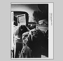
Retratos Decisivos (Decisive Portraits) 2004. This is a small booklet of portraits Schmid found through the George Garland archive (see Very Miscellaneous). The subjects here are of African American soldiers from the 9th Army Air Corps that were stationed in England prior to debarking for the D-Day invasion of occupied France. Installed in Spain, the installation took on further significance due to the US war against Iraq and the commuter rail bombings that took place in Spain in 2004.

A Meeting on Holiday is a set of uncut but hole-punched postcards featuring images of couples on vacation. Taken in restaurants and on beaches or lounging by the pool, they hint at being perfect romantic moments. Postcard poetry of tourist expectations. The uniformity of the visions of what we perceive as relaxing and romantic are under examination here. Romantic moments of course far from our real lives and for the cynical, moments that would last for only a few moments. Meeting on Holiday refers not only to the meeting of couples but to meeting that stereotypical idea of romance and the brief passage of that moment. Published by NEROC’VGM in 2004. NEROC’VGM is a marketing communications company that produces brochures and billboards. This book was inspired by Neckermann travel brochures produced by NEROC’VGM. It comes housed in a plastic rigid slipcase.

Tausend Himmel Published by The Photographer’s Gallery 2007 may be the first project by Schmid which is entirely his own photography. Made to help him deal with a hearing condition called hyperacusis which is when the tolerance for everyday sound collapses, rendering most normally ignorable sounds as unpleasantly loud. For this project, whenever Schmid heard a helicopter flying by, he took photos looking up at the sky. The resulting clouds, skies and helicopter photos are as Schmid puts it, ‘photographs of sounds.’

Schmid’s work invites a very interesting question. With all of the images that exist, is their continued proliferation necessary especially in a time now where cell phones now have cameras? We are producing more images than ever, could the reliance on images and visual material alter our vocabularies and evolution of our ways of communication? In a way, Schmid was being a bit tongue in cheek when he requested a stop of production of photographs until we have used the ones we have already made but then again was it? Is this all just one more metaphoric example of how we do things compulsively and fill our lives with objects that we tend to store away and ignore until we decide to clean house? So the next time you aim the cell phone camera or put the Leica to your eye, consider what it is that you are bringing into this world. Is it necessary? Will you love it and take care of it? Or will they fall into the hands of others to see what we can no longer see?

Buy online at Steidlville
www.schaden.com

www.printedmatter.org

Wednesday, October 17, 2007

Jazz and Photography


In case you are thoroughly depressed by the past three book subjects I have featured…a murderer…a mass murderer/drug kingpin…a war…I will throw you one subject which will be lighter on your conscience.

The neurologist Dr. Oliver Sacks has been doing the rounds on public radio for his new book Musicophilia: Tales of Music and the Brain. Sacks has one of the most beautiful voices and diction (like a sane and elder Werner Herzog) and his discussions of the effects of being a musician on the development of the brain are fascinating. Consider the following, the brain of Einstein according to Sacks did not vary greatly from other ‘normal’ brains in appearance, but the brains of musicians, even after just one year of intensive study, actually develop in ways to make them look differently physically.

This made me think about how music has been described through photography. Immediately I have thoughts of images of jazz because, besides rock and roll, it seems that this is the genre of music most commonly described in great photos. For instance, how many great photographs have been made of classical musicians? Several for sure, but they do not jump to mind as quickly as the wealth of examples that can be referred to in jazz. Ed Van der Elsken, Larry Fink, Lee Friedlander, William Gottlieb, William Claxton and others.

Listening to Oliver Sacks and thinking about how people are drawn to certain types or genres of music, could it be possible that jazz inspired photographers in their own creative process and that this inspiration is the reason for such a wealth of images?

Many people have compared the spontaneous improvisation of creating photographs based on one’s intuition as similar to jazz improvisation. In both cases the knowledge of the instrument or machine is necessary but ultimately transcended by an unexplainable moment in the process of creation that relies on taking risks and embracing possible failure as a guide. When the unexplainable works, we are treated to something that can defy logic and steer us into uncharted waters and, I believe, possibly make part of our brains grow. (That may be a discussion for when the weed is in the bowl and the cocoa puffs are a-plenty)

There have been several books dedicated to jazz, some better than others, here are a few off the beaten path that may be worthy of note.

When we think of the subject of jazz in photography what mostly comes to mind is work from the 30‘s through the 60‘s. Francis Wolff, who was one of the founders of Blue Note records, documented with his Rolliflex the entire cast of characters that flowed through the studio during recordings. The ‘studio’ from 1953 to 1959 was actually a modified living room of Rudy Van Gelder’s parents’ home in Hackensack, New Jersey. Many of Wolff’s images were transformed by Reid Miles into some of the greatest album covers ever designed in any musical genre.


There have been several books that feature Wolff’s vast archive, the best of which is The Blue Note Years The Jazz Photography of Francis Wolff published by Rizzoli in 1995. Unfortunately most of the books on Wolff are not very inspiring and treat the photography as a by-product in relation to the celebrity of the musician in the photograph. This trait shows itself through book design that greatly crop and alter the originals, placing most of the importance on the subject. Even Reid Miles’ designs for the album covers did the same. Whether Wolff’s intention was to make pictures that shouldn’t be cropped or not, is another matter as most wound up being chopped. When given the chance to be seen full frame, many are great works worthy of recognition.

I have had the rare pleasure of printing many of the images in the Wolff archive full frame and what is interesting about Wolff as a photographer, beyond who passed in front of his lens, was the way he juggled the fodder of stands and recording gear of the studio. Like seeing theater actors among the stage rigging, it is the ordinariness of the surroundings that appear odd in relation to what was being put on tape. It all seems surprisingly low-tech when in the background of an image of Miles Davis smoking a joint you see the old television in a Hackensack living room.

The book is not great from a design stand point but it is surprisingly richly printed albeit slightly hard in contrast. The design is fueled by the celebrity and little attention is paid to individual photographs. Regardless, if you want a glimpse into those great recordings and see what the scene looked like, this book covers the landmarks of jazz in the 50’s and 60’s.


William Claxton is another name that is easily recognizable when the discussion of jazz photography in its heyday is discussed. Jazz Life published by Taschen in 2005 is a lap crushing 20 lbs. A part of Taschen’s ‘book as coffee table’ series, this is a tome of hundreds of Claxton’s photographs made in 1960 across America capturing the face of jazz.

Similar in tone to Lee Friedlander (who was Claxton’s best man at his wedding in 1959) but more prone to using a whole battery of different focal length lenses, Claxton describes both the obvious subject as well as what was happening on the sidelines. And like Friedlander, that is where the most interesting photos derive.

The book is obnoxiously huge at 700 pages and with hundreds of illustrations. If the ‘all or nothing’ approach had been avoided, a really nice collection could have been the result. This is a book that, even though it contains so many great photographs, might never get actually dragged off your sagging book shelf because of its size.


The last book chalks one up for the home team of Eye Studio here in NYC.

Jimmy Katz has been photographing jazz musicians for over 20 years and a collection of 175 of his photographs can be found in the new book Jazz In NY just published by Jazzprezzo.

Shooting in black and white, Jimmy Katz is carrying on the tradition of documenting not only a music he loves but its contemporary face. He has been able to gain access into intimate recording sessions that in this day and age have become more difficult for photographers to access. The importance of Jimmy’s photographs is that they bring an image of jazz that isn’t lock up with a romance of the past. These show musicians in love with their craft in both candid moments and formal portraits. The range of personalities is wide, from the known to the more obscure; but all get to play equal roles when framed by Katz. It seems that any jazz musician working today has at one point passed in front of Katz’s prolific lens.

For me, I like Jimmy’s photos the most when he is a fly on the wall and the musicians are immersed in the process of creation. In those moments, Katz has more time to be playful with his frames and capture fleeting gesture and expression that escape some of the staged portraits. These musicians, when engaged in playing, relay the ‘look’ of the process of creation. As viewers we seek out in the slightest gesture or expression to understand what may be transpiring in the artist at that moment. The revelations, even if photography could reveal them which it cannot, would probably be as mysterious as to why some photographs work and others do not.

The book is large and nicely put together. It has a surprising heft that is telling of the fine quality of paper and materials. The reproductions are rich and suit the atmospheric lighting that Katz uses. Where most books published on this subject are riddled with cheapness and concern for quick ‘marketability,’ this book avoids those pitfalls by maintaining high production standards.

If I had to throw one minor criticism at this book it would be with the title. The title is written as Jazz in NY by Jimmy Katz with the words Jazz and Katz highlighted in bold gold lettering. Hence Jazz Katz is actually how the title is read. Cute, and I guess unavoidable because of Jimmy’s last name but I would have tried to go a different route. Seems like too much of a dated reference for such a contemporary book but then again the quote from the great drummer Arthur Taylor on the back cover says ‘Jimmy is THE cat!’ So, who am I to argue with Arthur Taylor?

Jazz in NY by Jimmy Katz was first released in Europe in an edition of 2000 and is just now being made available in the US.

Book Available Here (Francis Wolff Blue Note Years)

Book Available Here (Jazz Life)

Book Available Here (Jazz in NY by Jimmy Katz)

Monday, October 15, 2007

Revistas Y Guerra 1936 - 1939


For those of you who are lucky enough to be in the New York area, there is a great show at the International Center of Photography on Gerda Taro.

Taro was one of the better (some say the best) photojournalists who photographed the Spanish Civil War. She traveled with Robert Capa to photograph the war but it seems her political sympathies could be as strong as her drive to photograph. It certainly shows in her photographs. She often chooses vantage points that stress almost Leni Reifenstahl-ish images of heroism.

She and Robert Capa were a couple although she refused his proposal for marriage. She was killed on July 27th 1937, the very day she was supposed to have returned to Paris, after a tank collided with her car during the retreat from the Battle of Brunete. This unfortunate event made her most likely the first female war photographer to be killed in action.

In the short life she had as a photographer, one might wonder whether she would have taken some of the wind from Capa’s sails as to who would have gone on to become the world’s great war photographer. She and Capa were planning on traveling together to photograph the conflict between China and Japan.

One of the rooms in the Taro exhibition is of posters and magazines that were printed during the Spanish Civil War. The posters, known as “shouts from the wall,” played a strong part in the defining the image of that war and are considered great examples of the propagandistic documents of their time. Using photomontage techniques, they both excite and alarm through their imagery, design, typography and use of color.

While at the exhibition a friend of mine discovered a book called Revistas y Guerra 1936-39 which is an exhibition catalog from a show that was on view at the Museo Nacional Centro de Arte Reina Sophia in Madrid. Magazines (revistas) played a strong part in disseminating information and images during the Spanish Civil War and hundreds were published in that time. The Spanish Civil War may have been the photographic equivalent of what the Vietnam War was to television, at least for the amount of images made and for their rapid distribution to the public.

The objective of most of the wartime magazines was to reach the greatest number of people to relay the propagandistic message in the content. Many were targeted to a particular group and not only served to untie that group but to act as rallying cries aimed at the opposition and to define political ideals.

A few of the magazines were published directly from the front lines of battle. The periodical Avace was actually produced via mobile presses which were hybrids of trucks and printing presses built to work ‘en campana.’

What seems surprising is the number of and variety of publications that were produced during a war where paper, ink and access to printing presses were difficult to obtain. This exhibition concentrated on magazines but there were many other newspapers and bulletins that blur the distinction as to what constitutes a magazine.

The book Revistas Y Guerre 1936-39mis small in trim size but has almost 400 pages of content. It reproduces all examples in full color and it features hundreds of illustrations. It is an import from Spain so the price seems a bit expensive at $85.00. Especially if just basing on the size and the fact that it is soft cover, but the content is rich and the package is very handsome.

The essay is in Spanish throughout the body of the book and there an English translation in the back. The only draw for English speakers is that the illustrations are disconnected from the translation so there is much back and forth page turning required to follow along. Otherwise brush up on your Spanish.

One note, I am usually very careful in handling my books but I have noticed a few of this one’s signatures pulling out of the glue on my copy. So beware, I do not think that this is the best bound book out there. Regardless, this is a great one for poster and magazine design of the Spanish Civil War period so get it and let it fall apart. Better yet, destroy it and allow it to show that it is loved and not neglected.

www.icp.org

Friday, October 12, 2007

The Memory of Pablo Escobar by James Mollison


Since I just wrote briefly about Danny Lyon’s foray into written history, I need to mention a new book that I just purchased yesterday that makes for a nice follow up. The Memory of Pablo Escobar by James Mollison published by Chris Boot is a must read. I just finished it…after a five hour reading marathon in which I could not put down this 350 page book.

Mollison, a photographer who worked for Colors magazine, originally was on assignment photographing prisons in Valledupar, Colombia when he was asked if he wanted to meet one of the facilities most famous inmates, ‘Popeye’, a man who served as Pablo Escobar’s head of security. After meeting him and then becoming fascinated by the Escobar myth, he returned to Colombia to start a project about ‘Narcotecture.’ That is, the evidence of the influence of drug money on architecture.

This initial interest was sidetracked when the ‘narcotecture’ he found wound up being visually disappointing. But like the fortuitous event of meeting ‘Popeye’, Mollison would have more luck come his way disguised as an annoyance. While trying to photograph one of Pablo Escobar‘s former homes, he was briefly detained by some security guards who led him and his camera to the officer in charge. Turns out he was in breach of security rules as the house was now a government building. Upon hearing his intentions and curiosity about Escobar, the officer in charge, whose office happened to previously be Escobar’s bedroom, said, ‘I have a bag of Pablo Escobar photographs- would you like to see them?’

From that moment on, Escobar, who was Colombia’s most infamous drug kingpins, became an obsession for Mollison to explore and separate the truth from the myth.

For those who are unfamiliar with Escobar, he was the head of Colombia’s Medellin Cartel which in the 1980s controlled 80 percent of the cocaine trafficking in the world. He was initially adored by the poor as he used his vast wealth to build housing for the homeless and helped repair and improve poor neighborhoods. By the mid 1980s and early 1990s, his fight against Colombia’s threats to allow his extradition to the United States on drug charges fuelled a deadly war that cost the lives of thousands of innocents along with the guilty.

Escobar’s fight caused Colombia to fast become the world’s murder capital where there were 7,081 murders in 1991 alone. This increased murder rate was fuelled by Escobar giving money to poor youths as a reward for killing police officers. These murders caused the police to retaliate against the youth with death squads that would seek out an assassinate anyone who fit the profile, innocent or guilty.

Escobar had so much power over the events that were unfolding in his country and could evade capture so well that the government, in an act of desperation to end the violence, agreed to Escobar’s terms for his surrender and imprisonment. This made for one of the more odd episodes in the story. Escobar was allowed to remain in Colombia without facing extradition and reside in a prison of his creation, with his own ‘guards’ that oversaw the inside of the prison while normal federal guards oversaw the outside to make sure he didn’t simply walk away. As his head of security ‘Popeye’ is quoted as saying, ‘They put a 10,000-watt electric fence around the prison with the switch in Pablo’s room.’

Even as he was in ‘prison’ the Medellin Cartel was moving cocaine and making money, keeping in competition with other cartels that were trying to take over the routes to the US. At one point in 1992, the excesses of the ‘La Catedral’ prison were revealed and plans to transfer Escobar to a real prison were discussed. But as they were being implemented, Escobar escaped and remained on the run from authorities for almost two years. He was eventually killed in a raid on one of his safe houses on December 2, 1993, one day after his 44th birthday.

Besides the compelling story, what makes this book fascinating and difficult to put down is the way that the story is complemented with images and documents. Through exhaustive research in tracking down original photographs, police files and the massive trail of unseen ephemera that is associated with Escobar’s life, this book is fully illustrated and presents the material right alongside the text.

Millison was able to come across archives of photographs that are presented as collections instead of breaking up the material in ad hoc fashion. The result is a fascinating series of short chapters that propel the story along while addressing the various facets and key players of the events. One section of photographs is from Escobar’s personal photographer who was hired to document family events such as birthdays and parties. While another is a series of rather grisly evidence photographs from a bombing that took down an Avianca airliner in one of Escobar’s attempts to assassinate a presidential candidate who would have pushed for his extradition. Luckily for us, those are reproduced at a size that renders them just a bit too small for us to be haunted by them. They reminded me of extreme human versions of Peter Beard’s dead elephant aerial photographs from The End of the Game.

One interesting book highlighted in the story is one that Escobar self-published while in ‘prison.’ (If only I had known before I could have included it in my self-publishing post.) Pablo Escobar Gaviria en Caricaturas, 1983-1991 is a leather bound book of hundreds of cartoons and photographs of Escobar that had been published in various newspapers since 1983. 500 copies were printed and given to friends and family. A small pile of these books was found by his bed after he escaped from ‘La Catedral.’ One is up for sale for around $60,000 US dollars but the family of Escobar is contesting the sale on the grounds that it is stolen property.

The design of The Memory of Pablo Escobar is another fine accomplishment by Stuart Smith of Smith Design who I have mentioned glowingly before. Here he has created an extraordinary book that both looks and feels good. It is thick and hefty and at no point over the 350 pages does it allow for a lapse of attention. The choice of paper for the pages is a thick stock which accounts for how dense the book feels. The reproductions are well done and the documents are presented as objects on pages allotted solely for the images.

James Mollison worked on the text with Rainbow Nelson who is a freelance journalist who has worked in Colombia since 1992. It is very well written and the short chapter form allows for the reading to be done in small snippets or to be devoured in one sitting.

This book makes me wonder why other titles that discuss history do not include more visual material among the text. Most images in books of historical nonfiction get clumped together in sections of glossy pages where the original reference in the text has to be sought out for clarity. Here, it is a natural flow of information with reference images that makes it all more memorable.

As stated on the back of the jacket, The Memory of Pablo Escobar is a landmark in visual journalism.

Book Available Here (Memory of Pablo Escobar)

www.chrisboot.com

Wednesday, October 10, 2007

Like a Thief's Dream by Danny Lyon


Danny Lyon has a new book from Powerhouse called Like a Thief’s Dream.

Lyon is a curious type of artist for me. He is one that I make a point of keeping an eye out for and, although I seem to wind up owning what he offers, often it feels a bit thin and undernourished. In this way he is similar to Larry Clark. The name has a draw that seems to dupe me with promises of new greatness equal to their past accomplishments but rarely does it satisfy.

His two great books are of his earliest, The Bikeriders and Conversations with the Dead. In these, Lyon seems fully engaged and his photography is richer for it. I will say that I have never been a big fan of most of his photography by itself. His talent lays partly in the way that he combines images and text to create a self portrait that melds into the story. In his better works, there is a balance to the treatment of subject and self examination. When he has dwelt solely on his home life and family, we may wonder why we are made privy to it and why does it make a book. The result makes me think of restlessness.

So when I opened Like a Thief’s Dream and found it to be all text and almost no images made by him, I breathed a sigh of relief that it wasn’t another book of collage or bad polaroids of his family. No. Words, nothing but glorious words. And you know the biggest surprise? Lyon is a damn good writer. This book does make me wish that he put down the camera (Leica and 16mm Eclair) after The Bikeriders and Conversations with the Dead and settled for the same life but with a more active pen.

The story that Lyon relates is about a man named James Renton. Lyon met Renton in 1967 while he was working in Huntsville Texas on Conversations with the Dead. Jimmy Renton was serving on a capital murder charge and spent part of his time working in the prison darkroom. Although Renton does not show up in any of the photos in Conversations, he helped Lyon to make a 16 page portfolio edition of the book using the prison printing press. Renton’s name is credited as the lithographer under Lyon’s on the front cover.

When Renton was freed from prison in the early seventies, Lyon reconnected with him and shortly after, Renton was involved in the murder of a young police officer in Arkansas. The consequent criminal investigation and capture of Renton makes for a compelling read. Lyon seems to have fallen in with a man who could provide plenty of compelling material as after being charged and serving a few years in prison, Renton escaped and provided Lyon with a written account of the events.

Renton was one of the FBI’s ten most wanted until his eventual recapture. After his death in 1995, Lyon started to pursue the details of Renton’s crimes through his personal letters, court transcripts and the large amount of paper documenting the man‘s life. The book’s title comes from one of Renton’s letters to Lyon when he referred to Lyon as living a life that was like a thief’s dream.

In my opinion, Lyon has found a third vocation in writing that may prove to be stronger than his first two. Let us hope that he continues for this is the best work he has done in thirty years.

Book Available Here (Like a Thief's Dream)

www.powerhousebooks.com


Sunday, October 7, 2007

Four Self Published Books


It should be obvious by now that I think that books are the best way to experience photography. No other medium is treated better and with more respect than photographs in the book form. Paintings are best experienced on walls but are often reproduced too small in books. Sculpture is best in person as reproductions sacrifice the whole concept of a three dimensional work. Film…what?…a giant flipbook?

First off, a book is so intimate. You cradle it in your hands and turn the pages, experiencing the work at your personal pace. You can touch the art so to speak. Because of this tangible aspect, you have a different relationship to the photos. In a gallery, no matter how comfortable you may be in those environments, there is a subtle but very real influence to move through an exhibit faster than you may naturally want to. Either because of what I consider a somewhat stifling environment or due to the presence of other people, we do not linger as much while on our feet than we do in the comfort of our homes in a chair with a book. Our peripheral vision also plays a strong part in influencing our speed through galleries or museums. Seeing the next image on the wall out of the corner of your eye can distract you to “moving on” more rapidly. In a book, the page acts as a barrier, you do not know what is coming until you turn the page. Books also seem to be more effective at adding punctuation into the mix through their design and layout.

So how do artists get their books published? Some are able to find publishers. For Alec Soth, the strength of his work in a handmade volume of Sleeping by the Mississippi found a great reception at the Santa Fe Review and within a year he had his first book with Steidl. Someone like Jessica Backhaus actually spent several days at the Frankfurt book fair showing her portfolio around to every publisher who was interested in photography and found a comfortable home with the publisher Kehrer. Some spend years trying to find the outlet into publishing and never find it, and in some very rare cases, the publishers come searching out the artist.

Lastly, you have people like Lee Friedlander who make the decision to go DIY and start their own publishing company. This last example is a fine way to retain complete control but it is also the way that risks personal financial loss if the book does not find its audience. Boxes of books stored under your bed, in closets, garages, and in parents basements I can imagine have a funny way of constantly reminding you of that loss. The aspect that keeps most artists from pursuing self-publishing is, how do you distribute the book to your audience, or more importantly, how do you let them know it exists at all?

This posting is about people who have taken the reigns and made the decision to do the work themselves. These are four titles that you probably will not know about or have even heard of. And although all of which are fine examples of photographers who have taken the initiative to risk expense and the possibility that they will not find their audience, they also made the decision to limit the amount of books they have printed so they comfortably avoid the issue of storage.


The first is a book that was created using one of the few available online publishing companies like Shared Ink and I discovered it in Brooklyn’s independent bookseller Spoonbill and Sugartown on Bedford Avenue. Patrick O’Hare’s Slipstream is a fine book of twenty landscape photographs made between 2003 and 2006.

Patrick is a quiet photographer who chooses to point his camera at landscapes found up and down the East coast from his New York base. He is a photographer who finds a certain amount of ironic beauty in the landscape but his images, unlike much of what is done in similar territory, is not burdened by only being ironic. Most photographers tend to approach this territory with a cold detachment and what is refreshing about O’Hare is his ability to look and infuse his images with warmth, tenderness, sadness and the joy of simply looking. He is pointing to show what we have made, how we have treated it and how it will be constantly changing. There is a fine amount of melancholy to these pictures. It isn’t depressing but like the title may imply, we are going to be carried along and what we are shown along the way may not always be pleasant but O’Hare tinges it with beauty.

Truthfully, when I saw the book on the shelf, I judged it by the cover thinking Oh…I know what this is going to be but I was so pleasantly surprised by his craft and approach that I was compelled to not only buy the book but to contact him to find out more about who he is. Like his photographs, Patrick is quiet and unassuming. He photographs and seems more interested in where the photographs take him than the attention that may result from creating this book. He is at work creating another book using this same print on demand technology from a new body of work that is about things disappearing or becoming invisible called Learning to Vanish.

Slipstream was made in an edition of 100 signed and numbered copies. A special edition that comes with a signed and numbered 8 by 10 inch C-print on Crystal Archive Paper is also available.

For inquiries and copies of Slipstream, contact him through his website www.patrickohare.com


The next book is by a photographer most of you will already know. Ed Grazda has previously published three books of his work through the publishing houses Powerhouse and Der Alltag which was Walter Keller’s house before SCALO (r.i.p.). This new special edition artist’s book by Ed will come as a surprise for those that know his work. For twenty years he had been photographing in Afghanistan since 1980 and the two books published on the subject are more personal road diary than what we may currently expect from photojournalism in that part of the world. This book is his first that departs from politics, conflict or religion but it is still a road trip of sorts.

Called American Color Slides, he utilizes the print-on-demand technology of the Apple i-book to present 15 photographs that were originally made in the American Southwest from the late 1960’s to the late 1970’s. Playing on the title of Walker Evans American Photographs, American Color Slides is a road trip through the desolate southwest where the roadside architecture either fights for your attention or ignores you with its plain functionality.

Opening with a shot of the long road ahead (complete with a cross in the pavement cracks that lets you know God is with you) he takes us into the dust and white hot sun of Nevada, Arizona, Texas and New Mexico. Due to the consistency of the light and the blueness of the sky, it could seem at first that all of the photos were made on the same day, giving the impression of a series of stills grabbed from the car’s open window. The viewer is placed in the passenger side seat and our minds are kept off the heat by watching the passing landscape.

This is a book that is partly about the less than subtle infringement of color within that landscape. Red is the attention grabbing hue in most of these photographs. In one image, a woman in red walks from a gasoline station and would stand out in complete contrast if not for the Coors and Gulf signs that share the exact same redness and fight for our attention. The signage on storefronts and roadside advertisements is also bright red as is the Chevy parked under a sliver of deep shadow.

For a man who has worked in black and white for the past thirty years, Grazda is quite good exploring in his early years with color film. His choice of material for these images was rolls of Kodachrome and Agfachrome which is specified in each caption as to which was used. This a book that laments both a past era within a landscape which is slow to change while using a technology that this book could serve as an equal memorial.

American Color Slides is published in an edition of 50 signed and numbered copies and like the original edition of Evans’s American Photographs, it wouldn’t have been complete without an errata slip gracing the title page. There is also a very limited edition of ten copies that will come with an 8 by 10 inch print. This the first in a series of books that Ed is creating of images culled from his vast slide archive.

For information on acquiring copies of American Color Slides call Eye Studio at (212) 242-1593.
(Afghanistan Diary 1992-2000)
(New York Masjid)

Enough of this print-on-demand technology, the next two photographers decided to actually take the plunge and have their books printed traditionally with ink on a press. Both of which oddly enough arrived from Australia.


The first is a small book of black and white photographs from Sean Davey called Pidgin. Pidgin is a different kind of road trip. It is a road trip mostly taken at night by a group of friends as they navigate, or more likely stagger through a landscape of drinking, driving and the pursuit of the next good time. The promise of that next good time is often obliterated by a haze of blur that leaves one with a slightly nauseated “contact” hangover. The power of these 48 images is that left over feeling of slight sickness attributed to trying to drink away that feeling of what it is to be on the cusp of adult life and being unsure of what the future holds.

The title Pidgin means a language that is simplified and adapted so that small groups can communicate. Being that this wordless book is from Australia, that title probably has more of a cultural subtext than viewers in other countries may be privy to. To me, it refers to the language of friends and how they come to understand one another. It is a personal communication that creates distinctions between insiders and outsiders. This book allows us to tag along, but what is transpiring between the participants is real and we can only observe and grasp what we can translate.

Sean Davey funded a very small run of this book of which he had only 50 signed copies printed. The book is very cleanly designed with one photo to each right-hand page. There is no text at all. This is a book that challenges the viewer to make up their own mind about what is being presented.

Sean can be contacted at www.pidgin.com.au but there may not be any copies of this book still available.


The last book, Wounded, is from the photographer Jesse Marlow and it is probably the riskiest, most expensive to produce of all four of these featured books. Jesse is a photographer who is carrying forth the fine tradition of so-called street photography. His book Wounded may be the only book of these four that has been seen in public light as it had enjoyed a bit of distribution here in the States.

Wounded is an often hilarious collection of black and white images of the walking wounded. Jesse has apparently been drawn to looking out for the bandaged, the limping, and the bleeding for sometime as the page previous to the first image attests: 39 people were injured in the making of this book.

Now I usually don’t like books that seem to be so cleanly wrapped up (excuse the pun) in an idea or illustration of that idea but this book is too charming to dismiss on those simplistic grounds. First, Jesse is great at juggling information on the fly. For anyone who has spent a lot of time trying to be in the right place at the right time and be facing in the right direction (and then find the exact place to stand and vantage point) will know that these accomplishments are no small feat. And although mainly a humorist, Jesse’s running commentary on the variety of infirmities also allows our frailty to be under examination once the laughs subside. Many of the bandages become glowing beacons of our resilience and the fact that all of these images were made in public attests to that fact. Though hobbled, people continue to go about their business although a bit more slowly and carefully.

The added charm of Wounded is in its packaging. The book comes housed in a slipcase that mimics the texture of a plaster cast. I have the regular edition of the book but have heard that there is a limited edition that actually has to be cracked out of its cast enclosure. The book was published by Sling Shot Press in 2005 and is in an edition of 1000 copies.

Copies are available through Photoeye.com More information and work from Jesse can be found at www.jessemarlow.com.au

Friday, October 5, 2007

Two books on the American Snapshot


There is a quote by John Szarkowski that I read years ago and cannot remember clearly. He said something about photography being promiscuous. I am not quoting him obviously because I've already said I can’t remember...but it was something like: Photography is a promiscuous lover, she will give it up (a masterpiece) on a one night stand to an amateur as readily as she will to some professional who is wed to her. I am sure the actual quote doesn’t say “give it up” but you get the point.

The countless number of family photo albums hidden away in various credenzas will attest to his sentiment. Inside those albums, trapped in pages of that electro-stick paper are masterpieces worthy of sitting beside the world’s great masters of the medium. Who would have thought that when Uncle Pete took a photo of Aunt Jean by the family Ford that the photo gods would notice Pete taking a photo and suddenly grace him with an image that could elevate him momentarily into a master? It happens all the time. Photography is an unpredictable slut.

Since photography is mostly a mechanical process these things are possible. Some other thoughtful soul said something to the effect of: The photographer is capable of making a sketch or a masterpiece using the same gesture. (I probably butchered that one too). I guess if you handed a brush and paint to a 5 year old that they could, in theory, make something as visually sophisticated as Cy Twombly or Robert Motherwell. That is what a lot of people say isn’t it? My five year old could do that. There is currently a movie out which addresses this exact topic called “My Kid Could Paint That” although the little girl featured is four years old not five. And her paintings sold for over $20,000. But since there are billions more images being made than paintings are being painted, we have tons of examples of exactly what I am talking about.

This begs the question, if a photograph or “piece” is created with complete naiveté, can we /should we approach it in the same way that we consider the “real” art in a museum or gallery. I want to say that it doesn’t matter what a person’s intention was, all that matters is the final image. And even if the image was created by a “non-professional” in the most jaw-dropping, casual manner, then it is as valid as anything that could be hung next to it.
Picasso and Uncle Pete.

Two new books feature collections of such “masterpieces,” The Art of The American Snapshot 1888-1978 from Princeton University Press and Michael Abrams's …Strange and Singular…from Loosestrife Editions.

The Art of The American Snapshot 1888-1978 is a catalog that will accompany an exhibition of the same name that will be on view at the National Gallery of Art in Washington DC on October 7th. The photographs in the exhibition and catalog are culled from the collection of Robert E. Jackson who believes that creativity is not solely the province of artists but resides in all of us.

The book is illustrated with a couple of hundred images, the earliest of which correspond to the year that Kodak released its first camera, 1888 and the latest from are 1978. Within essays by Sarah Greenough, Diane Wagner and Matthew S. Witkovsky, the catalog provides a history that reflects the technological advances from Kodak Brownie (the first generation) to the Leica (the second generation) to the third and fourth generations which enjoyed cartridge loaded cameras and instant cameras with Polaroid materials. Matthew Witkovsky mentions in his essay on 1960 to 1978 a rivalry between Kodak and Polaroid as there were collaborations with artists that gave Polaroid a certain respect that was previously only held by Kodak.

The photographs featured in this book are surely fine examples of wonderfully inventive and playful photos but considering how much has been produced (Polaroid estimates that over a billion instant photos were made in 1974 alone) there could easily be twenty volumes on this study and we probably wouldn‘t get tired of looking. Thankfully, this book is large at almost 300 pages. It is finely produced with a nice design contributed by Margaret Bauer and the photo separations were created by the masterful Robert Hennessey. One interesting touch is the reproductions are mostly actual size of the originals and include the various straight or scalloped decorative edges of the photos.


Michael Abrams ….Strange and Singular… is another title that is a collection of found family snapshots. The difference here is that the book’s construction and design creates a much different dynamic. Books of found photos are somewhat common. Some like the Fraenkel Gallery’s recent The Book of Shadows feature photos presented in thematic ways. The Book of Shadows has the photographer’s shadow appearing in all of the images.

The dynamic created in Michael Abrams’ book is an edit and order to the photographs so as to create what the book’s title implies. The full title, taken from Michel Foucault is: A readiness to find Strange and Singular, what surrounds us, a certain relentlessness to break up our familiarities, a fervor to grasp what is happening and what passes; a casualness in regard to the traditional hierarchies of the important.

What better description of the impetus of photography can be found (in a very French intellectual kind of way I mean)?

The book is a linear journey through photographs that moves along effortlessly due to the strength of the selection of images and a compelling design. As with all of Loosestrife’s books (I think) John Gossage is credited with the design along with Mr. Abrams. Together, they tempt disaster with design quirks such as images where one half appears on one page and the other half appears on the verso but the risks they have taken only add to the artistry of the book. The visual flow and “narration” that comes in the form of various quotes about photography keeps you moving through this familiar yet unknown and often confusing territory. The sequence opens with an optimistic image of a car on the open road and ends with two photos of a taxi that seem innocuous until you notice the chalk outline on the pavement.

Occasionally throughout the book quotes from various voices appear mostly in dialogue with photography itself. I read this as a kind of “narration” coming from Abrams directly. Although I like the way they designed the type in relation to the images with words laid over photographs or the text being obscured by the photos, the quotes sometimes fall flat for me. That may simply be because I am familiar with many of the quotes chosen and I immediately see the cleaver pairings.

The book is made from very fine materials and as with all of their books, it feels as nice as it looks. This is the smallest in trim size in relation to Loosestrife’s other titles, some of which are epic in their proportions but it holds its own with its intimacy. One surprise is few actual photographs that have been slipped into different places in each book making each edition unique.

These two titles make me question the art of photography. It is almost depressing (to my ego) that so many great photographs are made by someone just responding to something with naiveté and the result produces something of wonder. The difference is how the maker and the viewer respond when looking at the final image. Most likely the two have very different perceptions. We may see the pattern of the dress Aunt Jean is wearing and the shape of the fender on the Ford as siblings from the same family (and the dog pissing in the background) and perhaps the photographer just sees Aunt Jean and the Ford (and the dog pissing in the background).

Art is in the eye of the beholder. I sometimes wish I could just see the Ford. It is enough to make you feel so damn mediocre to see the art in everything.

Book Available Here (Art of the American Snapshot)

www.press.princeton.edu

Book Available Here (Strange and Singular)

www.loosestrifebooks.com