Friday, December 7, 2007

Sand In Der Vaseline: Kunstlerbucher II 1980-2002


For those of you interested in books about artists books, there is a German volume published by Walther Konig in 2002 called Sand In Der Vaseline: Kunstlerbucher II 1980 - 2002. This is an exhibition catalog from a show that traveled to a few venues in Germany from 2002 to 2004

From what I can see being that I do not read or speak German and it is available in only German language is that the show divides the 500 artist books from 30 different artists into six thematically arranged chapters: Introduction into thinking, Adult comedy action drama, Visible World, True stories, Becoming a landscape and Edition Separee.

Introduction into thinking is mostly dedicated to the books and catalogs of Martin Kippenberger although other artists included are: Werner Buttner, Georg Herold, Franz West, Albert Oehlen and Heimo Zobernig. It was a book by Kippenberger published in 1986 that lends the exhibition its name. Kippenberger apparently appropriated that title from an Ed Ruscha painting from 1974 called Sand in the Vaseline.

The chapter Adult Comedy Action Drama actually gives more space to Raymond Pettibon’s SST, Superflux and MDA published Xerox booklets than to Richard Prince whose 1995 SCALO book gives this chapter its name. Frankly, I can’t look at that section of Pettibon books without producing a certain amount of acid reflux as in the mid-eighties I had a whole slew of them and they are somewhere six feet down in a landfill in New Jersey. For years Pettibon’s art was used on album covers for his brother Greg Gin’s infamous Hermosa Beach hardcore band Black Flag on SST Records (Minutemen, Husker Du, Saccharine Trust). The booklets were available signed and numbered from SST mail order for about a dollar and a half each and were usually about 20+ pages of Pettibon’s disturbing psychodrama and wit. Now they command prices between 100-250 dollars each.

Visible World is more concerned with photographic artist books with examinations of Han Peter Feldmann, Martin Parr, Boris Mikhailov, Nobuyoshi Araki, Larry Clark, Fischli and Weiss, Nan Goldin, Wolfang Tillmans and Henry Bond. One of my favorites, the great Boris Mikhailov 2-volume set At Dusk and By the Ground published by Oktagon in 1996 is given a decent amount of attention.

True Stories includes books by Barbara Bloom, Sophie Calle, Jenny Holtzer, Barbara Kruger and others.

Becoming a Landscape features an unexpected mix of eclectic works by Roni Horn, Ilya Kabakov and Els Scholten.

The last chapter, Editon Seperee looks at small art book publishers such as the Eschenau Summer Press and Temporary Travelling Press publications, the Imschoot, Uitgevers publications, the Sonne Busen Hammer publications, the Fama & Fortune Bulletin publications, the Edition Separee books, and lastly publications by Agnes B.

Due to the language, the deeper discussion beyond the obvious implications due to the chapter titles escapes me so I cannot vouch for the quality of the essays that accompany each chapter. For many readers, this book will serve as an interesting checklist of the exhibition that may add several unknown books to your growing wish list. That is a warning…sort of.

Book Available Here (Sand In Der Vaseline)

Tuesday, December 4, 2007

Red-Color News Soldier by Li Zhensheng


When Li Zhensheng interviewed for a position as a photographer at the daily newspaper in Heilongjiang province in China in 1963, it was his physical appearance that got him the job. The editor in chief of the paper, seemingly displeased with the physical appearances of the other four photographers on staff, needed at least one that he considered ‘presentable’ to cover visits by foreign guests. Thus was how Li Zhensheng would be cast as one of the most important photographers during China’s most tumultuous periods, the Great Proletarian Cultural Revolution.

Red-Color News Soldier, published in 2003 by Phaidon collects Zhensheng’s photographs in a handsome volume complete with his personal written accounts of the events.

The Cultural Revolution was an attempt to weed out counter-revolutionaries and solidify support for the communist doctrine of Mao Zedong after his prestige had begun to wane. Five years before, Mao’s attempt to institute a vast network of ‘people’s communes’ aimed at boosting grain and steel production had ended in human disaster with over twenty million dead from famine. With the ensuing criticism of Mao’s policies and the threat of ideological treachery beginning to rise, millions of ‘educated youth’ and party officials started a decade long witch hunt for all enemies of the state that would seem to corrupt the progression of the People’s Republic.

Li Zhensheng’s photographs document fervor and confusion that was to overtake the country for the next decade. Many of his photographs describe the fascinating ways that the people denounced as enemies were put on display and humiliated. Forced to wear giant dunce caps and their faces smeared with black ink, they stand bowing for hours before crowds of hundreds of thousands. Some of Zhensheg’s more disturbing sequences follow several of the accused as they are paraded through the streets on the back of trucks, driven out to the outskirts of Harbin, and executed before crowds of onlookers.

Zhensheng used 35mm and medium format cameras in the production of thousands of negatives during this time. Besides being a remarkable photographer who had a front row seat to most of the events, what is curious to me photographically is how he experiments with different ways of documenting those events. He often took multiple exposures while panning over the landscape so that the three or four images sitting side by side produce a panoramic view. In the one marvelous gatefold in the book, he individually photographs each of seven accused Party secretaries complete with placards hung around their necks as they are denounced and the effect of seeing the photos side by side is akin to some perverse conceptual art piece.

Zhensheng’s writing is a fascinating account of his experiences. One of which tells of his own moment before a crowd as a suspect being denounced and the subsequent investigation into his life and ideology. It was during this investigation that many of his photographs were confiscated but foreseeing the potential for such an event, he hid his negatives under the floor of his apartment. It is the telling of this personal history and the detail in which he is able to remember all of the events that makes this not only a great read, but an important document for history.

The book itself is also one of Phaidon’s finer accomplishments. The printing is good but the designer Julia Hasting should get extra praise for her design and for introducing two different types of paper stocks to differentiate between the Li’s text pages and the photographs. This adds a more seductive tangible quality to the whole production. The cover stock is a bright red plastic that echoes Mao’s little red book and a paper wrap around adds a nice design touch.

Word of warning: Buy a 'new' copy of this book from a trusted source as many available from used sellers are sans cover wrap around and many are stamped with the annoying ’Phaidon non-mint copy’ on the front end paper. I purchased mine ‘new’ but it came stamped and without the wrapper.

Book Available Here (Red-Color News Soldier)

Buy online at Phaidon

Sunday, December 2, 2007

Kunsthaefte 1 - 14 by Jesper Fabricius


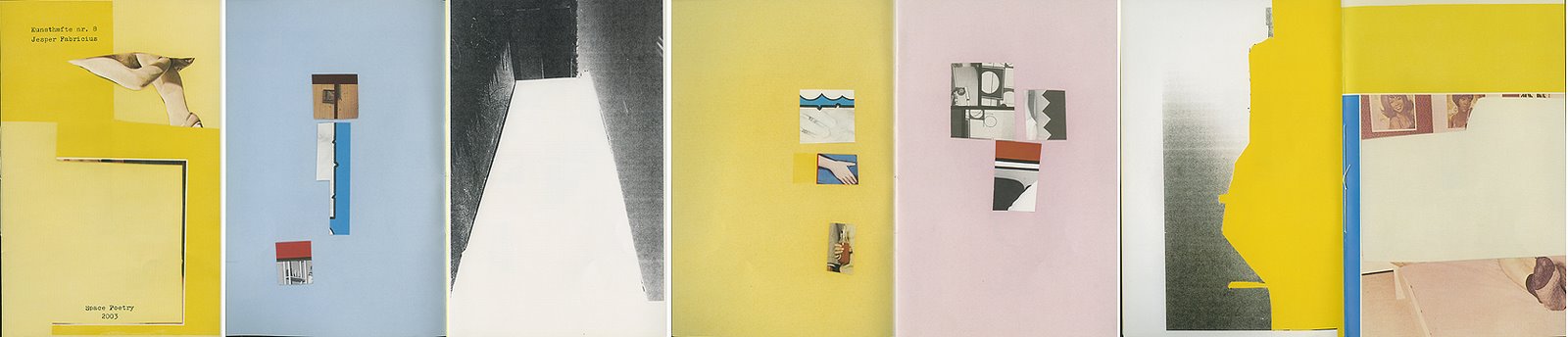
Around the time of the Printed Matter Art Book Fair this past summer I mentioned buying a set of books from a Danish artist named Jesper Fabricius. Jesper publishes small handmade artist booklets that range from 8 pages to 20 pages in length under the imprint Space Poetry. One ongoing series of books called Kunsthaefte is currently 14 books strong and counting (I assume there will be more).

Using snippets from existing printed images from magazines he emphasizes relationships of color and texture while giving hints to the original image’s content. For instance, many of the crudely cut snippets seem to have derived from porn magazines or books published in the late 1970’s and 1980’s so after Jesper’s scissors are through, an image might draw your attention incidental details like to part of someone’s face and a painting hanging on the wall behind them instead of the act of sex.

Kunsthaefte nr. 1 was published in 1998 is the largest in trim size of all of the Kunsthaefte series at 8 by 11 ½ inches and contains 8 pages of images in stapled folios. The images use multiple pieces of cutouts placed on the page to create more of a sense of collage than most of the other books have.

Kunsthaefte nr. 2 was published two years later in 2000 and here the trim size has been dramatically reduced to a petite 4 by 5 inches which is the smallest of the entire series. Here the content is abstracted to the point of being a kin to abstract painting. Only rarely does the viewer have enough information of the object the patterns and color were taken from to identify what it is. This is the first of the books that is several folios sewn together in a simple figure 8 stitch as a binding.

Kunsthaefte nr. 3 was published in 2002 is slightly larger in size at 4 by 5 ½ inches and this seems to be the standard for the rest of the series with only a couple exceptions. The content is arrangements of cutout speech balloons. I wish I knew what they say.

Kunsthaefte nr. 4 published in 2002 is one of the shortest at only 8 pages and four images. The content is close up cutouts of a woman or a couple women alternated with two images of a girls hair parted with blue ribbons.


Kunsthaefte nr. 5 published in 2002 is also a short one of 8 pages of women’s breasts.


Kunsthaefte nr. 6 published in 2006 is 12 pages drawing our attention to flower arrangements and plants.

Kunsthaefte nr. 7 published in 2002 is 12 pages of abstracted background patterns some with printed flowers.


Kunsthaefte nr. 8 published in 2003 is a larger booklet of 16 pages at a trim size of 5 ½ by 8 ½ inches. The content is more like nr. 1 with its multiple image collage. Each page has a different background color so the emphasis seems to be on the entire composition of the page rather than on the individual image like in numbers 2 - 7.

Kunsthaefte nr. 9 published in 2004 reverts back to the 4 by 5 ½ inch trim size and it is the first of a few that are sexually explicit in subject matter. Here we are bombarded with creative image grids of close ups of genitalia and intertwined bodies that are bizarre, surreal and often very grotesque.


Kunsthaefte nr. 10 published in 2004 draws our attention to the paintings hanging on the walls just above the faces and tops of heads of people presumably having sex.

Kunsthaefte nr. 11 published in 2007 is 12 pages of photos of vaginas arranged in grids.


Kunsthaefte nr. 12 published in 2007 is 16 pages of photos of penises arranged in grids.


Kunsthaefte nr. 13 published in 2007 is 20 pages of people’s heads. This is an interesting one as the individual pictures are common daily expressions except you notice that some (maybe all) are taken from images of people’s faces while engaged in sex.


Kunsthaefte nr. 14 is 12 pages of individual images of women’s breasts and torsos bound by different configurations of rope.

I like these books for their ready-made and casual look. They probably are labored over by Jesper in their creation but they have an un-precious and disposable feel that suits the imagery. Jesper is one of many artists that uses material at his disposal to re-contexualize the image and divert our attention away from the original intention. As we look, he may be challenging us to pull our mind away from its primal instinct of voyeurism and push our thoughts elsewhere. As we try to evaluate each photo as a new work of art that is complete in its own way, our imaginations and instinct try to expand those boundaries far past what he has presented. This tug and pull is what makes many of these booklets interesting.

The books are occasionally available through Printed Matter in New York City or through the website. Space Poetry. Printed Matter sells most of the recent booklets for around $4.00 US.

www.spacepoetry.dk

www.printedmatter.org

Friday, November 30, 2007

The Hyena & Other Men by Pieter Hugo


Last night I bought a book on an impulse that I feared would lead to a shameful one night stand. It was a situation where there is an opening for the artist, the gallery has the new book for sale and they are already signed… OK here is my credit card.

Pieter Hugo’s The Hyena & Other Men published by Prestel is a book that I was keeping an eye out for even though the images I had seen previously left me wondering if they were mostly all content and little or no interesting form.

Frankly, most all of Pieter’s work that I have seen seems so dependent on visual slaps across the face from the content with his photos of hyenas, albino Africans, people with eyesight problems that render them somewhat disturbing to look upon. To sum up, this type of work represents just about all that I dislike about contemporary trends in photography. Subject matter that pounds you over the head while it is described in the most photographically dull way and poorly edited so that all of the weak pictures are miraculously made necessary just because they are part of a series. Add in some seductive light and color palate to distract you from the repetition and you’re done. If I were to pick the best three images in this book then they would trump ALL of the other thirty.

So why did I buy this book? Or rather more importantly, why do I keep looking at it as much as I have in the past 24 hours?

What we have here are thirty-three portraits of African men from Nigeria who catch hyenas, monkeys and rock pythons use them in street performances for money. The photographs do not show the performers performing but posing with their animals. The palate of color is drained, leaving everything in chalky gray and light earth tones punctuated by stark reds found in various clothing.

When Hugo frames his subjects, the images are very center heavy. The men all hold chains that act as leases for the muzzled hyenas or tranquil looking monkeys and they pose with expressions that read as tough guy persona tinged with slight boredom. The form, if you pay attention to the basic arrangement of the elements, is the same picture being made over and over again.

So why have I been seduced?

Like a movie you dislike but can’t stop watching because you love a character, this book casts a kind of spell due to the hyenas and monkeys (the one rock python pictured I couldn’t care less about). The hyenas are monstrous yet lovable bad-asses. Their bodies seem swollen with inert power that is barely contained by the woven muzzles and thick links of chain. In fact, if I were to identify what is striking about the photos, it would have something to do with power. Both on the owner/wrangler’s part and the hyenas.

While the hyenas are exciting to look at in an alien and threatening way, the monkeys do what monkeys do best in photographs, look human. They stare into the camera with as much knowledge of photography and ‘how to pose’ as their wranglers. Thankfully, they also provide some of the small pleasures found in these photos through slight gesture that save the images after the initial interest has started to wane. In one image, a monkey delicately tugs at the sleeve of his owner while they sit posing on a motorbike. In another two monkeys sit atop stumps of concrete near a wall seemingly engaged in a conversation while the owner/wrangler stands off to the side staring at the camera. (All that is interesting is happening on the left side of the frame…why I ask, is the owner’s dull presence even necessary? Again, let’s break the mold and make a different kind of picture. Why not? Just for shits and giggles.)

So…why after all of my criticisms do I like this book? It is cleanly designed and has two interesting and well written texts but that isn't enough. The reproductions are great but that is also not enough. I guess it is because sometimes three or four fine pictures are enough to camouflage. The rest disappointingly pale in comparison but I will take the good with the bad and be happy with them. Three or four are hard enough to find after all.

Yet, that is basically the photographer’s dilemma. One can find a subject, but how do you make it more interesting than what was photographed. I just wish Hugo had made risk part of his equation.

There are more ways than one to make a picture.

www.yossimilo.com

Wednesday, November 28, 2007

Photography Exhibition at Eye Studio Gallery


The Eye Studio Gallery presents an exhibition of photographs by Jeffrey Ladd on view from December 6th until January 26th 2008. There will be an opening reception on Thursday December 6th from 6-8 pm. This show brings together 24 photographs of religious festivals and ceremony in Mexico and Nicaragua.

“For approximately three years I have been examining and describing aspects of religious faith based around Catholicism. After marrying into a family whose religious beliefs and practice are steeped in Catholic traditions, I have been balancing between my own beliefs and my criticism of the politics of such a powerful institution such as the Catholic Church.

Photography has been a way for me to examine those traditions that are new to me and see both the beauty and my personal critiques within the same moment. This photographic project has been my way of bridging the divide between personal faiths and politics and establishes, in images, a way for me to navigate this new territory aside from my biases.” Jeffrey Ladd

Drop by, have a drink, look at some photographs and introduce yourself. (If Senior Whiskets panned your book now’s your chance to get even.)

The Eye Studio Gallery is an exhibition and work space for the photographers Ed Grazda, Jason Eskenazi, Doug Sandhage, Pedro Linger-Gasiglia and Jeffrey Ladd. The exhibition schedule will alternate between presenting original works of these photographers and exhibitions dedicated to celebrating the “photobook” as a work of art.

The Eye Studio Gallery is located in Manhattan’s Chelsea gallery district at 526 West 26th Street in suite #507 on the fifth floor. Besides specific event dates or opening reception times, the gallery will be open by appointment only. Appointments can be arranged by calling (212) 242-1593.

Tuesday, November 27, 2007

The Forest by Paul Seawright


Photography is well adept at making the ordinary and mundane seem villainous and threatening. Just one well placed element in a photograph can trump all of the others, turning the meaning of the work on its head. Or it could simply be the way something is lit. In the case of the work of Paul Seawright, he has dealt with the implications of violence in obvious as well as subtle ways.

Much of Seawright’s past work has dealt with sectarianism and Northern Ireland’s ‘troubles.’ His series from 1988 called Sectarian Murder is one of the more obvious ways he has portrayed violence. The obviousness is there in the series title, so it taints all that is to follow. We are prepped for feeling and understanding. In those works Seawright gives us an image of a place that seems rather innocuous and below the image is a caption that describes the crime that was committed on that ground.

“A 17 year old boy was duck shooting on the shores of Belfast Lough. Four men approached him demanding he hand his shotgun over. They shot him in the head before leaving with the weapon.”

The words provide an easy summation of what the work is about. We may meander into thoughts about the ‘history of place’ or the ‘randomness of violence’ but mostly the work has been explained to the point of being tied up into a neat package. It provides a way for us to put it out of our minds. We understand and move on.

In 2001, the Shoreditch Biennale and the Hasselblad Center published a very small book of Seawright’s called The Forest and this work doesn’t provide an easy explanation but lets the viewer’s mind wander over the possibilities. There are no words. Here we are given 17 photographs; shot at night, lit by the amber glow of what we may assume are street lamps. The places that are described are desolate roadside lay-bys, ditches, and car parks bordering the edge of a forest. By day, these spaces might be so ordinary that they are no longer seen, but by night, they take on a sinister tone.

Because there is such a division between what we can see and what we cannot see (the fall off of the light does not allow for much penetration into the forest edge) what belongs there (the trees, underbrush and roadside curbs) and what doesn’t belong there (us), these are photographs that place the viewer into the shoes of the vulnerable.

We may feel safe for a moment being in the illumination of the street lamps but this may also mean that we are well exposed and an easy target for whatever our minds can conjure. Unlike some of his other work, these are not so obviously steeped in political violence but those thoughts do not escape us either (best practice both pronunciations of the letter ‘h’). These are landscapes that unleash our natural fear of the unknown and uncontrollable amplified by our childhood fears well-formed by ghost stories and fables.

Seawright’s photography here is very well done although we will have seen variations of these same images elsewhere by other photographers. What I enjoy the most is how it is all brought together and assembled into this little 50 page book. The trim size is 5.5 by 6.75 inches and the pages are on a heavy weight slightly peach-colored stock. A small essay by Val Williams exploring the use of forest imagery in our collective imaginations through fiction ranging from the Brothers Grimm to C.S Lewis appears after the photos. The whole package is elegant and spare; it makes me wish that more bookmakers would take the risk on doing more small books like this one. I highly recommend tracking down a copy.

Book Available Here (The Forest)

Wednesday, November 21, 2007

Dog Days Bogota by Alec Soth


Just after Alec Soth’s debut at the Santa Fe Review that started his meteoric thrust into becoming one of photography’s most popular young artists I had the chance to see an inkjet version of Sleeping By The Mississippi. My friend Gus Powell had been one of the reviewers on behalf of the New Yorker magazine and Alec had generously given him a copy of the book. After discussing what was good at the review, Gus showed me Alec‘s book and I was compelled to contact Alec just to say that I enjoyed the work and loved the way he put the book together. Soon there after, the final version was published by Steidl and after congratulating him in an email I quickly added ‘now get to work on the Dog Days book’ which seemed the next likely candidate for release. Surprisingly, his next project wasn’t to concentrate on that book but to create a whole new body of work with Niagra.

After a longer wait than I expected, Dog Days Bogota has finally been published by Steidl and the results are pleasing and surprising.

The surprising part comes with its size and square format. This is a small book and appropriately so, as it is for small hands. Originally conceived as a book for his newly adopted daughter Carmen, Dog Days Bogota is a scrapbook that is part children’s book and part introduction to reality.

Perhaps like how the stories from the Brother’s Grimm were not entirely for children, this book does not shy away from subjects that reveal the hardness of the world; lessons learned by the young who grow up too quickly in a poor country that was ravaged by drug wars for over a decade.

The book opens with one of the many stray dogs that set the tone as guide and loyal companion through this story. Quickly we establish our purpose in this story with an image of a young couple with a newborn in a stroller that serve as possible stand-ins for the photographer and his wife. (Or could this be the young couple who gave their daughter up for adoption?) What follows is a continuous flow of photos paired across facing pages that are equal parts joyous and melancholy. We are led about, looking at this world that has held still for a moment for us to contemplate and we are given hints of Soth’s inner mindset. A young woman holds an infant that possesses an all-too-wise look in her gaze, a child on a hilltop clutches a baby doll representative of a different nationality, and the stray dogs alternate between vulnerability and confidence.

Interestingly, many of the images include walls photographed in a way that they act as partial barriers to seeing far into the distance. Soth chooses vantage points that limit the sense of depth that in a funny way may seem to be an act of protection, as if seeing too much can be harmful or confusing.

Carmen’s birthmother had written for her daughter, “I hope that the hardness of the world will not hurt your sensitivity. When I think about you I hope your life is full of beautiful things.” In essence, this is what Soth has put into his photographs. He successfully turns the hardness of the world into small visions of beauty that still wound but offer a different outlook that is less threatening and more hopeful.

Buy at Steidlville

Monday, November 19, 2007

Irish Travellers by Alen MacWeeney


For some photographers, the book Gypsies by Josef Koudelka embodies a notion of romance of the intimacy one can achieve in a relationship between subject and photographer. Who, while looking through that book, hasn’t imagined themselves in those situations and wondered what other sights could have been seen and recorded onto film. The romance I refer to is closely associated with the feeling of elation one may get when they are fully accepted into a group of people and are given spoken or unspoken permission to be present and work freely. To be invisible or at least completely unselfconscious and free is my deepest desire while photographing.

In 1965, Alen MacWeeney found himself in a similar situation when his curiosity towards an encampment of Irish ‘travellers’ drew him into their lives. ‘Travellers’ are small groups of impoverished Irish that form communities of nomadic craftsmen and women. In recent past history common forms of employment for a traveller was to be a tinsmith, a chimney sweep or do seasonal work on farms.

For five years, MacWeeney would befriend, photograph and make audio recordings of their music, songs and tales. The book Irish Travellers: Tinkers No More, Photographs, Stories and Music has just been published by the New England College Press.

Like Koudelka (working with gypsies around the same time in Czechoslovakia), it isn’t that MacWeeney has become invisible, but the subjects have accepted his presence with a compliment of natural posturing and facial expressions that would be gifts for any photographer to be privy to. MacWeeney employs the use of both 35mm and square medium format cameras for his photography but for me, his talents with the square frame are what keep me coming back to open this book. If they had been seen, these pictures would seem to have served as early models for a later generation of photographers with Chris Killip and Graham Smith. All three have the gift of describing the lives of the working class or poor that shows the hardness of their subject’s lives without sliding down the dangerous slope into exploitation, pity or patronage in a condescending manner.

The 61 black and white photographs in the book are laid out with various texts of stories by some of the book’s subjects, lyrics from traveller’s songs and an account of MacWeeney’s experience over those five years. The layout is the only thing about the book that I do not like. Again we have an approach to book making that follows a long and familiar tradition that now seems stale and out of date. The designer, Yolanda Cuomo, uses design traits that include images bled to the page edge on three sides, various sized images, and frequent use of pushing photos through the gutter. All of this is functional to invigorate the eye but does sacrifice some photographs.

I had seen a show of this work at the Steven Kasher Gallery earlier this year when the book was first released and I was blown away by the prints on the wall. When I saw the book, I didn’t recognize half of the pictures due to the design. In this case, it has a way of unfortunately cheapening the quality of the images. Fortunately, the printing is very rich and provides deep blacks and sharp contrast that are faithful to MacWeeney’s prints. The book comes with a CD of traveller’s songs sleeved on the back cover which sets an interesting tone while looking through the book.

Alen MacWeeney may not be a household name but a few of these images are sure to challenge what we think of as the great photographs fleshed out of similar territory.

Book Available Here (Irish Travellers)

Steven Kasher Gallery

Saturday, November 17, 2007

The Last Photographic Heroes by Gilles Mora


The notion of ‘photography’s heroes’ was brought up indirectly in a recent lecture at the NY Public Library with the photographers Paul Graham, Tod Papageorge, Katy Grannan, Danny Lyon and Mitch Epstein attempting to discuss ‘truth’ in photography. The conversation started off with Papageorge and Graham discussing their views of the medium and stressing the importance of Winogrand and Szarkowski as attributable influences on themselves and the course of the history of the medium since the sixties. The discussion quickly sidetracked off topic and fireworks erupted when loose cannon provocateur Danny Lyon, sitting grimacing and wincing at the mention of praise towards these two legendary individuals, spewed forth with an interruption of incoherent self-congratulatory bitterness with the intent to discredit and de-mystify.

Now generally I like to hear from people who do not naturally tow the same line of thinking as everyone else as it offers at least the possibility of further enlightenment, I just wish it hadn’t come from Lyon. His views seem seated firmly in his hostility towards the New York 1960’s art world and perhaps towards those who he sees, stole his spotlight. His argument shook loose from reality when he started criticizing Lee Friedlander for taking photos of ‘boring people’ (while praising his own photos of ‘interesting’ types like black transvestites), his perception that Winogrand didn’t (or couldn’t) edit, proclamations that Stephen Shore is a horrible photographer, that Szarkowski’s contribution shouldn’t be considered so important and that Robert Frank was a photojournalist. (His opinions are as valid as anyone's but the last one made me consider that maybe Lyon doesn’t understand the work of everyone he mentioned including his own hero, Frank. Wasn’t Frank the guy who rejected the notions of photojournalism and ushered in an era of suspicion towards literal photographic truth? Didn’t his work employ a language and approach that was full of subjectivity and 180 degrees from inherent photojournalistic principles held firm by the likes of Eugene Smith? Or am I the one who doesn’t understand? Maybe the definition of photojournalism can be twisted like a pipe cleaner into many different forms.)

Anyway, this opinionated battle over these two photographic heroes proved to be the most entertaining part of the lecture. It also leads me to a new book from Harry N. Abrams called The Last Photographic Heroes: American Photographers of the Sixties and Seventies.

In this book, Gilles Mora explores the well trodden subject of how photography in America enjoyed two decades of intense creativity and birthed a new understanding to the potential the medium holds. I had seen a pre-press mock-up of this book at the NY Book Expo earlier this year and have been eagerly awaiting its publication date. Unfortunately, upon seeing the final result, it disappoints more than it excites in almost every way.

The first problem is that the history of this period has been recounted so many times that its telling in this new book may ultimately be pointless. This book’s failure is that it adds little, if anything new, to the subject. It is the same cast delivering the same lines etc…etc.

Secondly, although the design is functional, the reproductions are terrible. Terrible in a…the photographers or the estates of the photographers should sue, kind of way. It really looks like a major technical screw up took place like the pages didn’t make enough passes through the press. Very few of our heroes escape with their dignity intact. For a book that starts as a celebration, this does its best to disgrace and, for some viewers, may be tantamount to sacrilege.

Tina Cameron is credited as the production manager on this book. She was also the production manager on the Books of Nudes that I just featured and with that title she did a fantastic job. There she proved herself capable of taking the helm but here with The Last Photographic Heroes, something went terribly wrong. The production crew is the same, the only difference I can see is that the nudes book was printed in France and this one was printed in China. (China may not be great at keeping making pet food but they sure are great at printing art books). So I am very confused as to what happened to make this book look the way it does. Did she succumb to bad Chinese food? Lead poisoning?

The only value I could have seen in this book is for photographers or students who do not know the importance of this time period in American photography, but due to the poor production work, that seems pointless as well.

The notion of ‘hero’ is a curious one. No doubt hero-worship occurs and I have not escaped such feeling when considering those who have caused me to think in more complex ways. (When my own work is crap I often light a candle in honor of the ‘photo-gods,’ Timothy O’Sullivan and others who had to jump through hoops just to take a single photo). The biggest ‘hero’ for many was Winogrand, who probably would have shunned the title for didn’t he say that, ‘once the work exists then the artist is irrelevant’? I tend to think that Winogrand’s thought, as truthful and ego sacrificing as it may have been, is not viable for many photography enthusiasts. The separation of artist from the art is exceedingly difficult to do when the myths are reaffirmed and disseminated to the point of being equal to, or a justification of, the work itself.

Book Available Here (Last Photographic Heroes)

Friday, November 16, 2007

Books of Nudes by Alessandro Bertolotti


OK…let’s balance out this month’s war and misery and slip into something a little more comfortable…NUDITY!

For all of us who just love anthologies of books, there is a great new one from Abrams called Books of Nudes by Alessandro Bertolotti. Bertolotti, according to the flap copy, has one of the largest collections of erotic books and photographs in Europe. Who his American equivalent would be, I do not know but Bertolotti has brought together more than 160 books and divides them into thematic sections under chapter headings like: Pictorialism, Glamour, European Avant-Garde, Nazism, Gay Pride and others.

I find nudity in photography to be a fascinating subject for what it attempts to be and at times how it tries to deny what it actually is. Many a book or magazine has been sold simply because they contain nudes and thousands of those same publications would go to great lengths to deny any sexual component to their content. In the introduction to Books of Nudes, Jean-Claude Lemagny writes: “First, let us remind ourselves calmly that eroticism is not an aesthetic value. The quality of space, of the graphic line, and of light are all aesthetic values, but sexuality is not. The touch, the desire, and the warmth of the body are sexual values, not aesthetic ones. Yet these two fields, although radically separate in the world of the mind, are intimately linked in reality, a paradox that is evident in every ‘nude’ in history. Beauty and desire combine in a sensuality that belongs to both, even though for obvious reasons it should not.”

The book’s design is almost a spitting image of Martin Parr and Gerry Badger’s accomplished two-volume photo-book history but with fewer lengthy essays. Each chapter starts with a short socio-cultural essay that places the groupings into perspective with their appearance in history. The illustrations are presented as images of book covers and as interior spreads of open books. The printing was done in France and it looks great.

Since this volume is so specific to a particular subject, the examples often fall far outside of the expected and known. That being said, one criticism that I have of this collection is that it seems to be a rather narrow and timid view of the nude in photography especially in relation to recent publications. There isn’t a single title featured that was published between 1995 and 2002. The two entries that end the book are Bill Henson’s Lux Et Nox and Bettina Rheims’ Morceaux Choisis, both published in 2002. Even Parr and Badger included the likes of Terry Richardson and Hiromix as contemporary examples of interesting photo book making. I would think that no matter what you think of their photography, a Richard Kern or a Roy Stuart deserve a place somewhere in this mix. I might be criticized for calling for the inclusion of explicitness or vulgarity but it is an aspect of ‘the nude’ that is suspiciously absent from this book.

The flap copy mentions that Bertolotti has amassed his collection from over thirty years of collecting yet he is only 47. I guess that fact that he started collecting at such a young age makes him fairly typical of any other 16 year old male with an interest in nudity. I wonder if his first book acquired at that age made it into this volume.

Book Available Here (Books of Nudes)

Thursday, November 15, 2007

Bill Burke booksigning at Eye Studio Gallery


The photographer Bill Burke will be signing copies of his books at the Eye Studio Gallery on Saturday November 17th from 2 to 4pm. Burke is the author of six titles including the 1987 classic I Want To Take Picture which has just been reissued in a facsimile edition by Twin Palms.

"In 1982, years after Viet Nam, I decided to give myself my own Southeast Asia experience. I wanted to make pictures in a place where I didn't know the rules, where I'd be off balance. Friends who had been there recommended Thailand; nice people, easy transportation, good food. Another friend told me that as long as I was going to Thailand I should go see the refugees coming out of Cambodia. He set me up with The International Rescue Committee, which was working at the Thai-Cambodian border." -Bill Burke, from I Want to Take Picture

Saturday November 17th will also be the last day to see the Books of Sergio Larrain exhibition before it ends. So come over and see the show, buy a book, bring a book, get a book signed and introduce yourself.

The Eye Studio Gallery is an exhibition and work space for the photographers Ed Grazda, Jason Eskenazi, Jimmy Katz, Doug Sandhage and Jeffrey Ladd. The exhibition schedule will alternate between presenting original works of these photographers and other exhibitions dedicated to the widening awareness of the photobook as a work of art.

The Eye Studio Gallery is located in Manhattan’s Chelsea gallery district at 526 West 26th Street in suite #507 on the fifth floor. Besides specific event dates or opening reception times, the gallery will be open by appointment only. Appointments can be arranged by calling (212) 242-1593.

Wednesday, November 14, 2007

This is War : Robert Capa and Gerda Taro


As I mentioned in my post about the Revistas y Guerra 1936 - 1939 book there are fine exhibitions of Robert Capa and Gerda Taro on view at the International Center of Photography in New York. Two accompanying books called This Is War: Robert Capa at Work by Richard Whelan and Gerda Taro were published by Steidl in association with the ICP.

This Is War: Robert Capa at Work is a 250+ page examination of Capa’s career from his early beginnings to the defeat of Germany in the Second World War. This book is less a traditional photography monograph and more a journey through the mechanics of Capa’s work to the final images as they appeared in various magazines. All of the material: photographs, magazine covers, handwritten film envelopes, letters, notebooks and journals are reproduced as objects that fully illustrate Richard Whelan’s extensive text.

The book is divided into six chapters of Capa’s war coverage from the Spanish Civil War, The Japanese invasion of China, the D-Day landing and Leipzig, Germany towards the end of Europe‘s involvement in WWII. Much is given to enlighten the circumstances surrounding some of Capa’s most famous and in turn most controversial images. The controversy over the famous fallen loyalist soldier image is discussed in great detail and the evidence, in the form of Capa’s recollections of the events of the day to Whelan’s detailed analysis of the photographs and their sequence, is mulled over with almost forensic attention.

The same attention is given to attempt to recreate Capa’s movements during his accompaniment of the first wave of landings on Omaha Beach on D-Day. The story of the fate of his film is well known by now but other interesting facts crop up in the story. One of which being that Sam Fuller, the film director, was photographed by Capa sunning on the deck of the USS Henrico one or two days before the invasion. Another disturbing fact is that of the 11 frames that survived the development fiasco, the negative for the image of the GI emerging from the water was lost at some point when it was sent out for reproduction. Capa’s wasn’t the only photographer to suffer the loss of film as is told in a different, less well known, story where films from several other photographers shooting the invasion (including those of a young Walter Rosenblum) were collected and placed in a duffle bag of a colonel for transport to England. The duffle bag, balanced on his shoulder, slipped from the colonel’s grasp as he was climbing aboard the transport and was lost into the sea. Capa and a Sergeant Taylor were the only ones whose films survived as documentation of the landing. This was due to their bringing the film out of the situation by hand and not giving it to the beach master who was collecting the material for transport to England.

Whelan also does his best to deflate the image of heroic action that Ernest Hemingway projected with his coverage of the day’s events. According to Whelan, Hemingway wrote as if he was the steady hand that guided the landing craft he was riding in safely to the beach and afterwards went ashore with the troops. In truth, Hemingway never left the landing craft and immediately returned to the safety of his transport ship. Whelan goes further to emasculate Hemingway by recounting a story of Martha Gellhorn, a female correspondent who was forbidden to cover the invasion. So determined to go along, she stowed away on a hospital ship and actually went ashore to help search for un-rescued wounded soldiers.

Besides the fine narrative voice of Whelan, it is all of the ephemera reproduced in this book that make it such a great tribute and study of the medium’s most famous war photographer. This gives an insider’s look into an archive of unfamiliar images as well as the full magazine stories and the detritus of his process. The book’s design and quality of reproductions are excellent.

I am curious if the book ends prematurely due to Richard Whelan’s death earlier this year. Although what is covered in this book are the main subjects of Capa’s experiences at war, in the last nine years of his life from where this book leaves off, he did go on to photograph conflict in Israel and in Indochina just before he was killed.

Gerda Taro until recently had been but a footnote to her companion, Robert Capa’s intriguing life story. With the recent exhibition and book called Gerda Taro just published by Steidl and the ICP, her relationship to Capa and importance as a photographer in her own right has finally been given the deserved full treatment.

The two met and fell in love in Paris in 1934 and soon there after they reshaped both of their personas as photographers, often publishing under the byline: Reportage Capa and Taro. With these newly adopted names, they created the self promotional myth turning Andre Friedmann into Robert Capa, ‘the greatest war photographer.’

In his essay, Richard Whelan does his best to separate the two to give a full impression of Taro’s talents as a photographer. This separation proved to be a more complicated endeavor than one might imagine. Much of the print archive apparently paves the way for some confusion as to who’s images where who’s, as the credits were given jointly and then ‘corrected’ at a later time. Their individual contributions of the coverage of the Spanish Civil War, made into the 1938 book Death in the Making, are also not individually cited. The title page simply credits Photographs by Robert Capa and Gerda Taro. Capa took no personal credit for images of the war made even when Taro was safely in Paris.

This book covers her entire career which can be summed up to the years 1936 and 1937 while covering the Spanish Civil War. Like the Robert Capa book which could be seen as a companion piece, the design and reproductions are beautifully done. The design reproduces the original weathered and worn prints as objects.

The images reproduced in this book belie the fact that Taro was very new to the medium having only three or four years of experience with photography before she was killed in 1937. Her skill, not to mention bravery, makes us think of what might have become of her had she not been killed at 24 years old. Perhaps if she hadn’t, we would be crediting her as history’s ‘greatest war photographer.’ Unfortunately, she will always be known as the first woman photographer to be killed covering conflict.

Buy online at Steidlville (This is War)

Buy online at ICP (This is War)

Buy online at Steidlville (Gerda Taro)

Buy online at ICP (Gerda Taro)

Saturday, November 10, 2007

The Commissar Vanishes by David King


Photographs show you what a group of facts looked like at a particular moment. Actually to be specific, photographs show you what the light looked like reflecting off a group of facts at a particular moment. In historical photographs, the ‘record’ that the photograph serves is perceived to be not only factual but we tend to ‘believe’ those photos more than others because it can be compared to written history and therefore it is ‘provable.’ It is a reciprocal relationship, words prove the photograph and the photograph proves the words. A flawed but never the less, perfectly understandable conclusion drawn by many.

We tend to think of photographic prints or images in books as being static and relatively unchanging. The image on paper might be retouched to rid the image of dust particles that appeared during the enlargement or the unsightly wrinkles around a supermodels mouth may be airbrushed or photo-shopped out of existence, but generally once the final image gets published, it has become part of the public record and further change or alteration is usually minimal; mostly that may come in the form of alternate cropping. Usually the changes are made to present the material in a reduced form for easier consumption but the intended meaning is left alone.

Throughout history, people have recognized the power of persuasion that photography holds over the masses and many have exploited those effects. In trying to think of early examples of figures sculpting their cult of personality through photography, the biggest may have been Joseph Stalin. At least he was perhaps the first to use photography to constantly reinvigorate his image while at the same time using it to cover up the reality that he was one of history’s more accomplished mass murderers.

The Commissar Vanishes: The Falsification of Photographs and Art in Stalin’s Russia examines Stalin’s manipulation of images in order to not only obtain power but in his attempt at holding on to it.

It may have been Stalin’s vanity that led him to first critique and alter images. When he was appointed General Secretary of the Central Committee of the Communist Party by Lenin and his image was first drawn by Nikolai Andreyev on April 1, 1922, his reaction to the rendering of his ear led Stalin to scrawl over the image: “This ear says that the artist is not well schooled in anatomy. J.Stalin.” He later added as if his temper was mounting: “The ear screams and shouts against anatomy. J.S.” Hundreds of images of Stalin’s pockmarked face were probably enough to keep retouchers busy, let alone the doctoring of photos that held ghosts of victims from the Great Purges.

As David King, the book’s author describes: "At the same time, a parallel industry came into full swing, glorifying Stalin as the “great leader and teacher of the Soviet people” through socialist realist paintings, monumental sculpture, and falsified photographs representing him as the only true friend, comrade, and successor to Lenin, the leader of the Bolshevik Revolution and founder of the USSR. The whole country was subjected to this charade of Stalin-worship.”

“Soviet citizens, fearful of the consequences of being caught in possession of material considered “anti-Soviet” or “counter-revolutionary,” were forced to deface their own copies of books and photographs, often savagely attacking them with scissors or disfiguring them with India ink. There is hardly a publication from the Stalinist period that does not bear the scars of this political vandalism…”

One humorous application of photography towards a portrait of Lenin and his sister-in-law relaxing in Gorki unintentionally reveals an apropos moment of foreshadowing for the fate of hundreds of other Party loyalists. Lenin’s sister, Maria Ulyanova, was an aspiring photographer and she made a portrait of her brother and sister-in-law in late 1922. What Ulyanova failed to see through her viewfinder was that the end of a telescope was pointing directly at the sister-in-law’s head; looking eerily like a rifle barrel. Stalin’s ‘when in doubt, have them arrested and shot’ approach to holding power casts a long shadow over this photo. The photo exists in four versions where the telescope/gun barrel is retouched to the point of nonexistence. Oddly the second version after retouching looks even more like a gun and even more threatening than the original version.

Although this book concentrates on the most egregious period of photographic falsification, after Stalin’s death in 1953, the post Stalin leadership prepared a secret instruction to outlaw future falsification. This apparently didn’t last long (if at all) as examples of further falsification appear up until the collapse of the Soviet Union.

This is a fascinating subject and this book includes hundreds of examples of how to rewrite photographic history. There is one problem though that is hard to overlook. The design and presentation of the material is just short of awful. The Commissar Vanishes has a Time-Life Books approach and feel to its making that turns this wonderful material into book that is cheap and soulless. I had seen this book back in 1997 when it was initially released and for the life of me I could not remember why I hadn’t picked it up. With my renewed interest in Russian photography and design I recently ordered a copy. As soon as I unwrapped it from its envelope, I remembered why I didn’t buy it ten years ago. The quality of paper is cheap. The reproductions are mediocre at best. The more frustrating aspect is that copies are becoming more expensive so I would recommend staying away except for the fact that the information and material are so rich. It was published by Metropolitan Books which is an imprint of Henry Holt.

Someone really needs to rework this subject but with care. This book should not be the final say; this is an important part of photographic history that needs to be re-written.

Book Available Here (The Commissar Vanishes)

Friday, November 9, 2007

Two books by Paul Kranzler


Paul Kranzler’s book Land of Milk and Honey is very difficult to get through. (This is only a book of photographs of Kranzler’s two neighbors in Linz, Austria…how difficult could that be?)

Enter into the lives of Toni and Aloise, two aging alcoholics that spend their waking hours drinking, watching TV and shuffling around in an apartment where order and cleanliness have given over to chaos and filth. They have created an environment where things are kept within arm’s length to economize movement and the result is the line between garbage and where one sleeps is horribly blurred.

In only one image early on in the book are we provided a clear look at the layout of the room. In the rest of the photos, it is difficult to get your bearings and this adds to the sense of chaos. The piles of belongings strewn about the place seem to shift around like icebergs and appear unfamiliar from one photo to the next. Both Toni and Aloise don’t seem to engage with the outside world further than the hallway or to venture out for necessary groceries. Most days do not require much more preparation than slipping on a housecoat after getting out of bed.

There is a valid comparison to be made with Richard Bilingham’s book Ray’s a Laugh when approaching the subject of exploitation. Mind you I do not think either book is full exploitation but Richard’s book has an underlying tone of humor aimed by Richard towards and at the expense of his father Ray which edges it into dangerous territory. I am speaking of the images where a tennis ball is bounced off of Ray’s face or when a cat is thrown at him. Ray’s a Laugh has a slight absurdist situation comedy steeped in harsh reality tone that is not present in Land of Milk and Honey. Kranzler’s Toni and Aloise are lovable characters whose company (aside from the apartment’s squalor) we might also enjoy.

With Kranzler, he seems to be at home with Toni and Aloisa as much as Billingham is with his immediate family. It is this lack of pretence and directness that is most difficult to deal with when looking at these pictures. Toni sits around the house in his stained underwear and Kranzler is not shy about making pictures that could easily be misconstrued not only by viewer after the fact but by the subject during the making. This is one hang up that I have as a photographer that people like Kranzler or Billingham do not have and I admire this ability in their work. When Toni spits up a foamy gob of sputum and it hangs like a disgusting stalactite from his mouth, Kranzler has the ability to move right in for a close-up. (The photo is truly nauseating. Enjoy it in my composite above.)

The afterward and last photos in the book provide the ending in which Toni collapses and is briefly hospitalized. He now lives in an assisted living home and seems to enjoy a healthy existence. The room in which Toni and Aloise spent their time drinking is emptied and scrubbed clean. All of this happens in the span of nine pictures. Within this ending sequence are two photographs, one a self portrait of Kranzler and the other a portrait of his own chaotic studio and work table. At first this seems to be one more image from Toni and Aloise’s existence until we feel a more contemporary feel to the strewn belongings.

Shot mostly in 35mm black and white, Kranzler’s palette of chalky grays suit the squalor and claustrophobia of the environment. It accentuates the drab light that filters into the apartment. When the sunlight disappears, Kranzler’s direct on camera flash highlights some detail that we may have wished remained in the shadows. It is employing these techniques of photography that lends a quality of honesty to the work. Occasionally, Kranzler drops some color photographs into the sequence and truthfully, it is the small reprieve that I am allowed from these photos that enables me to get through the honesty of this book. It might suit logic to think that the color images would be more real and thus more disturbing but here this is not the case.

Land of Milk and Honey was published in 2005 by Fotohof edition in cooperation with the Lentos Museum of Modern Art in Linz. Its design is functional but rather lackluster. In fact, the design is probably the only thing that I do not really like with the book.

This subject depends on the sensibilities of the viewer for your reaction. For me, an obsessive neat freak who has a deep fear of wasting away my life, this book’s power is in its being an affront to my personal character and a confirmation of my worst nightmares. Regardless of your personal make-up, this is a book that opens the door for conflicted feelings.


Krazler’s second book called Tom, recently published by Fotohof edition, has seemingly uncontrollable and unintentional parallels to his first work on Land of Milk and Honey. In this book, Kranzler befriends a young man named Tom whose family lives in an old house along the River Krems. Theirs is a life set apart from the encroaching prefab homes that are littering the landscape with promises of cleaner and more modern middle class life.

For two years, Kranzler visits and, like in his first project, ingratiates himself into the flow of their lives to the point of being another member of the family. Unlike his first book, his choice of description is now in color, medium format and a softer gentler quality of artificial light.

Tom’s father who is described in the accompanying afterward by Kranzler is a ‘foul mouthed but particularly genial man and the most loving of fathers,’ is portrayed as blue collar provider with an ever present lit cigarette smoldering between his fingers. For us, he may provide a glimpse into the future for Tom if he follows a familiar path. As is the case with portraits of youth in quiet environs, it is the tension between the familial bond and the need to escape to a more promising life that is at play here. Tom may be too young but through the course of this book we do not have a strong impression that he will stray far from his current life.

The uncontrollable parallel I mentioned to his first book comes with Kranzler going to visit the family on New Year’s Eve and finding the house empty and abandoned. He tracked them down that same evening living a short distance away in a new apartment. Their old home on the River Krems was eventually torn down to make way for the new phase of prefab housing. In both projects, during the course of his photographing, his subjects move from where they had for a long time settled and grown roots to a new atmosphere that on the surface seems better but ultimately lacks an underlying charm that has become familiar to us over the course of both books.

I am torn with which book I appreciate more. The new book has a much better design that seems clean and well thought out. The plain wood grained covers and typography are far better than the ‘photo book’ cover of Land of Milk and Honey. That being said, the photography has a much different tone even though it is similar material. The harshness of the first book is in both subject and approach is a strength that the newer book lacks. Although in most regard the photography in Tom is ‘better,’ it does seem to be less original by feeling so current with contemporary trends. In Land of Milk and Honey, Kranzler tested the edges of his frames and his curiosity as to the potential of photographs seems deeper. In Tom, I fear a loss of photographic innocence that detracts from the imagery and slides it into too familiar territory to other work by other photographers.

This feels like an odd criticism to come from me as I do not think that photographers need to reinvent the wheel. I just feel this change in approach places a photographer who seemed to be anything but commonplace into the safe arena of mainstream acceptability. Change is necessary; I just wish he chose a path that was less foot-worn.

Book Available Here (Land of Milk and Honey)

Book Available Here (Tom)

www.fotohof.at