Friday, August 31, 2007

Present Tense: Photographs by JoAnn Verburg


The photographer JoAnn Verburg is enjoying a mid-career survey currently on display at New York’s Museum of Modern Art. Accompanying the exhibition is a handsome catalog called Present Tense: Photographs by JoAnn Verburg that spans her career since the early nineteen-eighties.

Verburg is an artist that came of age when most post-modernists were “using” photography as simply the final vehicle for their art to reach an audience. Interested in time and the translation of time in photography, much of her earlier work, explores portraiture through a series of images rather than by a single definitive one. By using the camera to describe a lateral panorama of images, she captures elements from each frame that bleed over into the next, giving the sense of a continuum of action and gesture. Many of these early images feature active members of the early eighties art world. This is an interesting fact as their presence when seen today, as well known artists, tends to introduce a different dynamic to the pieces as perhaps originally sought.

In her next project, she pursued a series of images made of people suspended in pools of water. Shot from a vantage point akin to hovering over her subjects, they defy gravity in an upended world that disorients viewers with their vertiginousness. They often refer to classic images common throughout art history of floating cherubs and images of grace but they do not simply mimic but offer a modern image, classic in form, to current emotional states.

The work that excites me the most is the work Verburg has done describing the domestic life with her husband, the poet, Jim Moore. Photographed in the 1990’s, she utilizes single image as well as diptych and triptychs to describe aspects of her home life. Made often while Mr. Moore is reading the newspaper or sleeping if we were to gauge his life based solely on her pictures we should all be gifted to live a poet’s life. His is one waiting for the muse to appear. Moore however is Verburg’s muse and Verburg’s love of his image is apparent to us in the care in which she looks upon him.

Though do not mistake these for pictures devoid of the issues of the “real” world. The domestic tranquility is confronted by the newspaper headlines and article headers that are sharply focused upon by Verburg’s large format camera. In essence, these are perfect descriptions of how most of us confront world problems and global tremors, through a newspaper or other isolating device. To carry that thought a bit further, to me the comfort at which the headlines in these pictures is experienced somewhat lances liberal political approach with an image of inaction. The headlines are read after we have enjoyed a cafĂ© latte while sitting in perfect sunlight on our picture perfect garden terrace. It has the same feel as is common with characters from Woody Allen’s image of what Manhattan liberalism represents.

The draw of the show at the MoMA for me was a wall of these images displayed in an ordered but chaotic way whose sum created the most interesting dynamic. After seeing that arrangement of images to go back to looking at one image at a time was a difficult task.

Her latest work is a series of multi panel images of olive trees in Italy. By using the focus control of the large format camera, she isolates fields of clarity that playfully focuses on different planes within the frame. Though interesting and definitely seductive in technique, I was left a bit disappointed by my ability to see anything more than their beauty. (That seems like a sentence that would come from someone working something out with their shrink). Though there is nothing wrong with beauty per se, these images seemed more decorative than the rest of the show (and work in the catalog). Verburg has conditioned me to “read” more into her images, so for these, I haven’t figured my approach. The very latest work of handmade pyramids escapes me as well, but given that time is such a subject for Verburg, I figure I have mine as well.

The catalog, Present Tense is very nicely put together and fairly well printed. I find there is a very subtle cyan or green cast to many of Verburg’s actual images that is a bit more apparent here in this catalog. Present Tense: Photographs by JoAnn Verburg also includes a fine essay by Susan Kismaric, the show’s curator.

Book Available Here (Present Tense)

Buy online at MoMA

Jesus and the Cherries by Jessica Backhaus


When Jessica Backhaus’s family purchased a farmhouse in Northern Poland, she started to spend her summers and winters there photographing the rural community of Netno. The results of three years worth of work was published in 2006 by Kehrer in a book called Jesus and the Cherries.

This is a land that is in transition. This is Poland after the break up of the Soviet Union, where the creeping influence of the west is doing its best to wash over history and tradition with new commercial enterprise. In this seemingly tight-knit rural community of Netno, the traditions, although starting to fade, are still apparent in the decoration and arrangement of homes. In a few generations, this may all be memory.

It is through the interiors of homes that Backhaus first started describing the lives of her friends and neighbors in Netno. Her approach to photographing the interiors is through repetition. All are formally similar vertical images either made square to the wall or of corners of rooms with the actual corner slightly shifted to either side of the photo’s frame. With the first few readings, the formal rigor of these images was a bother to me but once the repetition sinks in, it feels more like a “type” is being established in similar ways that the Bechers’ had done with their work.

This is a world that has order and cleanliness. The order of the interiors is precise and calculated to be seen as a sign of status. They are interiors that maybe more for the eyes of others than for the occupants.

The community, or at least the way Backhaus has photographed and edited her version of the community seems very homogenous. The people seem warm and friendly; their homes inviting and accommodating. There does not seem to be any sense of danger. Even the streets are spotless. The only piece of litter that can be seen in any of the 96 images is a discarded soda bottle that has gotten entrapped by ice on a frozen lake. Because of this cleanliness and attention to order, the world Backhaus has created seems optimistic and idyllic. One of the pleasures of this book is that view into a Backhaus’s world that is so infectiously pure in its description.

After pursuing her project for a while, Backhaus soon found the need to start a series of portraits of the locals of Netno. Mostly concentrating on the youth, the portraits are well done and a nice compliment to the interiors and still lifes. In these portraits, I like Backhaus best when she seems more like an unseen observer than when the viewer seems wrapped up in having their picture taken. The people are less stiff and more interesting. The images that achieve that relaxed approach are more revelatory and give a sense that all may not right here. Appearances can be deceiving.

The book has a nice and quirky design with its use of actual doily tablecloth material common to Poland used as book-cloth. A belly band provides the title and author as there is nothing printed on the cover material. The page layouts provide wide margins for the pictures to breathe. The margins also accent the sense of cleanliness that is apparent in the images. Backhaus has sequenced the book so that facing page images often share small doses of the same color. For instance, the cherry juice on a plate in one photo is the same tone as a t-shirt that is in an image on the facing page. The exact sameness of these colors at times is an added joy to discover.

One thing that is additionally impressive is that this is a book of 96 images that does in no way feel long or burdened with superfluous images. I was surprised to find that there were so many. It feels like a book of 50. I haven’t had many book viewing experiences where more felt like less.

There is a limited edition of this title that has an almost over the top design feature with the addition of an actual teacup, saucer and spoon affixed to the slipcase cover.

Book Available Here (Jesus and the Cherries)

Go To Kehrer Verlag Here

Wednesday, August 29, 2007

Interregna by John Pilson


John Pilson’s book title Interregna means “between the kings” or “between the reigns”, a moment when authority releases its hold. For 6 years between 1994 and 2000 John Pilson worked weekend and night shifts in an investment bank. It was during these hours of work when the building was operating as if on half power and half staff that Pilson brought along his camera.

The way the book is sequenced gives us the impression of sluggishness and distraction right from the start of our shift. From the moment we hang our coat (with its stitched logo that features an image of the corporate world we have just entered) we seem to treasure the freedom which is about to dissolve into 8 hours or more of work. We sit at our computer terminal but cannot focus on the monitor and instead stare out the window at the sea of other buildings (repetitions of our current workspace) and realize that there is no where to escape to even in day dreaming. We then make excuses to avoid starting the day (or night) of work. Trips to the bathroom, repairing the wrist rest of our keyboard with a series of staples or even falling asleep because there is no one around this “downtime” work environment to tell you to get back to work.

These are not photos of the clichĂ© alienated worker in a passionless environment. Yes, the surroundings may be cool and calculating but the few people we meet on John’s night shift look rather out of place for their contentedness and strength. They defy the norm of what we would expect from such an overwhelming work-driving environment. What office building does not constantly remind you of its authoritative power over you? In one image a woman pauses to look down at the curvature of her pregnant stomach. Another falls asleep on a window’s ledge. In fact, for such a corporate environment bent on function and efficiency there seems to be little work getting accomplished other than by Pilson and his camera. Between the reigns.

The attention to detail and the attempt on the part of the workers to influence their environment is one of Pilson’s preoccupations. A leaf of a plant pinned to a message board is seen either as something to admire or perhaps as an act of cruelty. Knots and coils of computer cables ensnare objects that drop from the desktop. A disembodied arm hangs lifelessly over the top of our cubicle. A picture of Dubrovnik, Croatia is displayed potentially as an image of escape until we realize that that landscape is as densely packed with buildings as the one we are currently in. A piece of origami placed atop a cardboard box almost goes unseen as it is just another series of angles in this angular world.

Pilson is the kind of photographer that other photographers will admire. His subject screams boredom and languishment so who would want to be subjected to this world if it wasn’t for Pilson’s invigorating formal sophistication and commentary. His images do not show you all of their cards at once but quietly ask you to tease out their meanings.

For all of the naysayers who complain about the detachment and disconnect of contemporary art to convey real daily life and experience, here is a project that does just that. This is a project that speaks to those caught up in a work environment that (at least in these pictures) stifles passion and frustrates. The disconnect could be in the publishing of this book, for will enjoy pulling this title off the shelf who but other artists and photographers? Most of the people who spend the time whiling away days and years in that world would probably be the last ones to spend their coveted leisure hours looking upon these pages. For me though, it is one of the better (but perhaps overlooked) books published last year.

The book is published by Hatje Cantz and it is cleanly designed as is common with most of their titles. The printing is good and reflects the vast amount of grays in both Pilson’s photos and the office spaces he described. His choice of working in black and white over color perfectly expresses the lack of personal passion and energy drain of his experience in that corporate world. An interesting contrast would be to Lars Tunbjork’s vibrant color photos that are completely energizing to the viewer. Those photographs work in completely different ways. Tunbjork lets us off the hook through his use of color and seductive lighting. He gives us more to “enjoy” but in turn, less to experience. Interregna has a whole different hold over us.

Interregna enjoyably tires me out. Like the workers on the last page staring out on the oncoming day after a night of “work”, we too feel worn out and rub our eyes whilst looking forward to getting some sleep.

The computer terminals will slip into “sleep” mode too and their monitors will show fractal images of crunching numbers while waiting for our return.

Book Available Here (Interregna)

Buy online at Hatje Cantz

Tuesday, August 28, 2007

The Pentagram Papers


Since 1975, the Pentagram design firm has been publishing a small series of booklets that are sent out exclusively to clients and colleagues. Called The Pentagram Papers, they explore different topics that caught the interest of the Pentagram partners. They cover a wide array of subjects from Cuban cigar bands and crop circle designs to Chairman Mao paraphernalia and slide rules. Although graphic design is always at the forefront of these booklets, the subjects are described alongside reproductions of the articles under discussion.

Aside from the often wonderfully obscure and interesting topics, it is the design of these booklets that is useful for anyone interested in putting together small books on one subject. Usually under 40 pages in length, they all follow a consistent format and look. Almost all are 5 ¾ by 8 ¼ in trim size and feature a black heavy weight matte cover stock that has a white ruled border following the outline of the booklet. The cover is French folded and acts as a jacket for the staple bound interior booklet.

There are 36 Pentagram Papers booklets published as of 2006 and they are often hard to find. A friend introduced me to them earlier this year and in searching for other have only found a few titles which were prohibitively expensive. One substitute for searching out each individual booklet is a book published last year by Chronicle books called appropriately, The Pentagram Papers. In over 200 pages, it features all 35 booklets that have been published since 1975. Nesting in the back cover of this book is Pentagram Paper #36 (which is on the subject of African pictographic markings).

The Pentagram Papers is broken into four sections: Cultural Phenomenon, Personal Passions, Collections, and Retrospection. Because of these delineations, this book does not describe each booklet in chronological order of publication. By reproducing photographs of the actual booklets open to spreads, you get a sense of each topic and the approach to the design interior but the entire booklet is not reproduced. Understandable but disappointing as I want to see the entire series complete.

Since The Pentagram Papers book is designed by Pentagram it looks and feels good from cover to cover. I didn’t know a lot about Pentagram before but after reading the introduction to this book, it sounds a hell of a lot like the design world’s version of Magnum Photos.

“Merging a group of creative and successful designers into a coequal partnership has its drawbacks, however. The nonhierarchical organization of Pentagram causes inevitable collisions among strong-willed individuals. But what makes the Pentagram model work are core beliefs held by all the partners…”

I also discovered through the intro that the designer Alan Fletcher was a founding member of Pentagram and was with the firm until 1992. Fletcher’s book The Art of Looking Sideways is one of my favorites for its 500+ pages of visual intelligence and playful design.

My reference to Magnum Photos isn’t the only thing in this post that has to do with photography. These books do feature many photographs (mostly catalog style shots of objects) but two seem interesting for the photos. One is on the underground French presses that worked during the Nazi occupation and one other booklet is on a series of photos taken in a sculpture garden in Bomarzo, Italy by the photographer Enzo Ragazzini.


The only Pentagram Paper I have found (except for #36 which comes with the book) is # 33 which is called The Slide Rule Vanishes. This is a small memorial to what was a common tool used by most everyone in the 1960’s and before but has become a rare sight today. Written by Lance Knobel, it features photographs of many examples from his slide rule collection.

Sounds like the perfect subject to lull you off to sleep on one of those restless nights? Guess again (stick with Swann’s Way to cure that insomnia). I doubt many of these booklets could be considered dull. Even one the one with the title: The Australian Rural Mailbox

Book Available Here (Pentagram Papers)


Book Available Here (Art of Looking Sideways)

Saturday, August 25, 2007

Some Afrikaners Revisited by David Goldblatt


David Goldblatt has been one of the more exciting discoveries for me in the past few years so when I hear of a new title of his being published I tend to feel a touch of panic in the scramble to acquire a copy. This from a man who, when first introduced to his work in 1991 through his book The Transported of Kwandebele (Aperture/CDS 1989), originally dismissed it. I was completely ignorant of not only the importance of what he was describing but also the artistry of those descriptions. As embarrassing as it seems to me now, due to that dismissal, I almost failed in paying further attention to an artist who has, in my mind, produced some of the finest examples of documentary work since Walker Evans.

“I realized I was neither a missionary with a camera nor a political activist. Nor was I, as a photographer, much interested in unfolding events and the kind of photographs of them that newspaper and magazine editors wanted. Physically I am a coward; if violence erupts I run away from it. But more fundamentally, I realized that what I really wanted to engage with through the camera was people’s values and how they were expressed. Headline events were the underlying conditions. I wanted to probe these conditions by going to their roots in people’s lives. The camera enabled me to be there and it demanded that I see with understanding and coherence.”

To date, David Goldblatt has 14 books of his work published. The stories behind how and why certain books get published are often fascinating if not frustrating in the telling. Goldblatt’s first ventures into getting his work out in the world in book form are no exception.

In September of 1971 Goldblatt had traveled to London with two of his book dummies, Some Afrikaners (working title of Some Afrikaners Photographed) and On the Mines to see Barney Blackley the publisher of his friend, the photographer Sam Haskins. Blackley had liked the work in Some Afrikaners and had offered to publish it back as far as 1968 if Goldblatt could find an American co-publisher. That experience of seeking out an American publisher fell flat with little interest or understanding. Blackley took both of Goldblatt’s book dummies to the 1971 Frankfurt Book Fair where he would find strong interest but no real commitments towards a publishing collaboration. In 1973 the publisher Struik in Cape Town decided to release the other of Goldblatt’s projects, On the Mines and that would become Goldblatt's first published book. That title is also thought to be the first duotone book printed in South Africa. His dummy for Some Afrikaners however, would prove to be a more difficult prospect to get on or even near a printing press.

After a dummy of tightly cropped and juxtaposing images was created by Sam Haskins and reworked by a marketing friend of Goldblatt’s, Russell Stevens, it was thought that the book could actually be a success and sell as much as 10,000 copies. And although Goldblatt saw how his photographs in Haskins design spoke to him in ways that he did not originally see as possible, he didn’t want to give up creative control of the book for a design that he felt didn’t “embrace my intentions” of the original project.

Almost to the point of giving up the prospect of publishing what would be a costly and financially risky venture such as Some Afrikaners, what would amount to a publishing miracle came through in the form of a man named Murray Crawford. Crawford was financially secure and thought the book was important enough to risk losing his money on the project. In 1975, one thousand copies of Some Afrikaners Photographed were printed, signed and numbered. Originally priced at 25 Rand (about $4.00 in today’s exchange), the book did not sell and was eventually remaindered for a measly 2.50 Rand (about 35 cents).

When the book appeared in 1975 it was met with outward hostility, condemnation and for the most part, seeming misunderstanding. It holds a familiar parallel to Robert Frank’s The Americans in that way. When a portfolio of Goldblatt’s Afrikaner work was published in a 1969 issue of Camera magazine, one reviewer started his article by declaring “Blood Will Boil” over the photos. The title of the Camera magazine essay ‘The Afrikaners’ ran against Goldblatt’s wishes as it seemed presumptuous and provocative with its implication of a definitive portrait. I think this was also a bit of the uproar over Frank’s book with its implication because of the title. When the final book Some Afrikaners Photographed was published, newspapers either refused reviews of the book or the discussions of it were sidetracked with tepid descriptions rather than critical evaluation. In his essay that is included in Some Afrikaners Revisited, Ivor Powell discusses why this book had such a hold over the imaginations of Afrikaners even though, in reality, it was not as damning a look at the culture as it was believed to be.

This new version of Some Afrikaners Photographed, Some Afrikaners Revisited is different from the original in several ways. Many of the images in the original 1975 edition were cropped down to the picture’s “essentials” where as in this edition, they mostly appear in their full framing. Goldblatt also omitted one image and added twenty others to this new mix. This book, Goldblatt states, is less of a second edition and more of an expanded look at his original essay.

Published by Umuzi which is an imprint of Random House in South Africa, it is nicely printed and keeps to Goldblatt’s wish for a clean design of one picture to the right hand page with captions appearing on the facing page. It is softbound with French folded covers.

Unfortunately, even with it being an imprint of Random House, there does not seem to be distribution of this book outside of South Africa. It is listed as available on ABE through some other bookshops in South Africa.

Tuesday, August 21, 2007

The Silence by Gilles Peress


After Gilles Peress published his ground breaking book Telex Iran: In the Name of the Revolution in 1984 it would be a decade before his work was encapsulated into another book. Farewell to Bosnia, his brutal portrayal of the war that would fracture Yugoslavia, was published in 1994 at a time when the Balkans were still raging out of control. Unfortunately the nineteen nineties were a busy time for a photographer who has made a point of chasing conflict and his next book, released only one year after Farewell to Bosnia, would turn out to be one of his most powerful documents to date.

The Silence is about the genocide that took place in Rwanda in spring and summer of 1994. Like in Bosnia, understanding the impetus for tribal conflict and wars of “brother against brother” was at the root of Gilles interest. In Rwanda, the Hutus and Tutsis were essentially the same people segmented in their society by the colonial Belgians in the 1930’s. The mistaken belief by the Belgians that the Tutsis were superior to the Hutus, led them to issue identity cards to indicate group affiliation. Higher education and positions of power were only granted to the Tutsi (roughly 15% of the population) and systematically denied to the majority of the population which was Hutu. Obviously this system of privilege and denial led to deep rooted resentment among Hutus towards the Tutsis.

Unfortunately, the conflict that would erupt in April of 1994 had precedent in the 1960’s when, over a four year period, 20,000 Tutsi lives were claimed in violence. The difference in 1994 was, this new conflict would have a toll of over three quarters of a million Tutsis killed within a time period of roughly four months while the international community argued pointlessly as to how to define what was taking place.

How could a book ever encompass this complicated situation with the murder and mass displacement of fleeing refugees? The power of Peress's book lies not only in its images but equally in its concept. The Silence opens with the words: Rwanda, Kabuga 27, May 1994, 16h:15.

A prisoner, a killer is presented to us,
It is a moment of confusion, of fear,
Of prepared stories.
He has a moment to himself.

Upon turning the page we see the first image of the book of a man, the presumed prisoner, arms crossed and staring straight ahead ignoring the camera. What follows in the body of this book is meant to represent three minutes of memories by this prisoner reflecting on his crimes and what he witnessed during his participation in the genocide. Upon coming to the last page of the book we again see a photo of this same man, a slight variant from the first image, but the indication of time is different: Rwanda, Kabuga, 27 May 1994, 16h:18.

As I look at him he looks at me.

Three minutes also happens to be the approximate amount of time it takes a viewer of this book to work their way from cover to cover. If you will allow the indulgence, the three minutes may also be a very veiled metaphor for the amount of time the average person, not swept up in the events and a world away, would have given their attention to this conflict.

The book is divided into three chapters with heavy biblical references in the chapter titles and imagery. The Sin, introduces us to the weapons on war in its first few pages of images. This was a war not of guns but of machetes and primitive looking clubs. The next several pages visit the scenes of some of the massacre sites and Peress’s camera is unflinching; the photographs do not aestheticize the brutality. The second chapter called Purgatory follows the mass exodus of refugees as they flee Rwanda into neighboring Zaire and Tanzania. The last chapter, The Judgment, follows the mass cholera epidemic that spread through the refugee camps in Zaire. The images in this sequence describe the process of moving the dead to mass graves dug with large earth moving equipment. Within this sequence there are images of bodies that again remind us of subjects found in religious painting throughout history.

The book is small in trim size with black matte pages. All of the images are laid out as spreads that cross the gutter and, with the book open, the page spread ratio follows the 35mm film frame proportions perfectly. This one book that runs the images across the gutter and it does not bother me. Because the design called for it in this case, the bisecting of the image is not problematic. Surprisingly, none of the subjects in the images are further brutalized by this dividing line. All of the images are represented with a black border to keep the pages entirely black including the page edges. Gilles designed the book and Carol Kismaric is credited as an editorial consultant. It is nicely printed by Steidl in Germany and was published by SCALO in 1995. A small booklet that is a chronology of events compiled by Alison Des Forges of Human Rights Watch is laid into the inside back cover.

Like many of books about war, this is a haunting little book that is very difficult to digest. Unlike most others, it reaches a very sophisticated level in its construction that goes far beyond traditional photojournalism in similar ways that Telex Iran achieved. One would recognize the importance of publishing such a powerful document, but I wonder, who is the audience? This is the odd dynamic of such books. They are released into the public sphere and most logically only bought by other photographers or human rights workers. And even then, I cannot imagine this is a book that gets pulled from people’s shelves very often. And when it is retrieved, are we looking again at the prowess of Peress’s images and how he packaged his essay or are we out to learn something more about what happened in those few weeks? In that case, if it is the photographer that is, in a perverse way, the center of attention, then what is the purpose of the book? I am not saying that this is the case, but when a book like this exists, one can naturally question how it functions to its audience.

One thing I know is that whenever I do look at this book, the last words are haunting.

As I look at him he looks at me.

To me these words are a look inward as much as an observation. They are haunting words because it addresses the possibility of anyone being swayed into being a participant and a killer. The evil that we guess is only present in “the other” can possibly exist in anyone. He, like us, seems to be just an average man. He doesn’t look the part of a monster and that is what is difficult for us to process. He could just as easily be a friendly neighbor and possibly was at some point even possibly to a family of Tutsis. The question of why episodes of genocide are allowed to happen in the first place is somewhat short sighted, the real question is, with human nature as complicated as it is, why doesn’t this happen more often?


One interesting side note to Gilles Peress’s book, The Silence, has to do with a catalog that was published in 1997 on the occasion of an exhibition called Guerras Fratricidas by the Foudacion “La Caixa” in Barcelona, Spain. This is a catalog of images of conflict by Magnum photographers compiled by Agnes Sire and Marta Gill. What is interesting about it is that it is basically a design rip-off of Peress's book The Silence. Guerras Fratricidas features a much larger trim size but the matte paper, black pages and page ratio are straight from the design of The Silence. The cover image wraps around from the front cover to the back just like in Gilles’s design, but to add insult to injury, it is a James Nachtwey Rwanda photo featured and not one of Gilles’s. After an appropriate dispute over the lifting of Gilles’s design, the catalog was issued with a sticker added to the back cover that acknowledges that The Silence was the design influence for the book.

Book Available Here (The Silence)

Saturday, August 18, 2007

Worldview by Leonard Freed


Leonard Freed’s last words to his wife before succumbing to cancer on November 30, 2006 were “No more pictures.”

Freed, who was 77 when he died, was organizing an exhibition and book for the Musee de l’Elysee in Laussanne of his life’s work. Worldview, both in book and show is the most comprehensive retrospective of this accomplished photographer to date.

Leonard Freed was a mix of many different types of photographers. There was Freed who could work a news event as fluidly and professionally as any other spot news photographer. There was also the Freed whose interest could be sparked to a subject so strongly that he wouldn’t stop his in depth exploration until there was a full “story” under his belt. “You can recognize everything from then on is redundant and there is no need to do any more.” And then, most interesting to me, there was the Leonard Freed who was a wanderer, fascinated with everyday occurrence and happenstance.

The book Worldview published by Steidl in association with the Musee de l’Elysee is a 300+ page, 200 image compilation of Freed’s best work. Designed with the work presented chronologically, the book reveals a surprising consistency from Freed’s earliest pictures to his last. Freed once said, “Good photographers are born not made.” I know a few that weren’t, but Freed seems to be a fine example of talent from the start.

The edit of Worldview is a wonderful mix of known and unknown images. Even for those familiar with his work, the variety of the edit is a refreshing and enlightening walk through the 50 plus years of Freed’s career.

Worldview isn’t without slight flaws in design and printing but they are not enough to detract strongly from the overall enjoyment of the work. The design aspect is my usual criticism of some images getting dissected by the gutter of the book (this doesn’t seem to be problematic for most people only me). Luckily, the book is bound in a way that opens very flat; surprising because this is a very thick book.

The printing is another matter. You have heard me say (and I continue to like a bleating sheep) that Steidl is the best printer (and possibly publisher) of current photo and art books. So it was a surprise to see that this book in my opinion has some printing problems in several of the images. In those images the tonalities reminded me of the grayness that one can experience while making gelatin silver prints from copy negatives. It was after I read the production credits in the back of the book that I found a curious one for “Original prints photographed by Nicholas Lieber.” So the original prints were rephotographed and then those (digital?) images were prepared for the press? This is distinctly different from scanning prints or negatives which is the usual process. I think this ‘rephotographing’ accounts for the lack of shadow detail in many of the images and the grayness I referred to before. Usually Steidl is capable of very smooth transitions between tones and the achievement of an extended tonal range but here the scale is compressed; especially in the lower darker tonalities. I wonder if it was a question of time that led to this mode of production, since after all, it is a companion to the exhibition so there probably was a matter of strict deadlines.

Worldview includes an essay by Wim van Sinderen called ‘An American in Amsterdam’ and an interview with between Leonard Freed and Nathalie Herschdorfer that reveals in Freed’s own eloquent words, his approach to photography and his subjects.

This is the finest book of Freed’s work available and it trumps the last retrospective book Leonard Freed: Photographs 1954 – 1990 that was published in 1991 by Editions Nathan in Paris and by WW Norton in 1992. That title, although fairly nicely printed, is dull in comparison to this design and selection of images. It also features one of Freed’s lesser interesting images on its cover of a policeman holding a policeman puppet. That particular image, in my opinion, is less indicative of Freed’s usual sensibility and its choice of high placement for the cover seems confused. The cover image of Worldview is of a crowd in Cologne jostling for a clear view of a parade during carnival. This serves a much more fitting and appropriate image for a book from a photographer who spent his life fighting for the best place to stand and see.

Freed always struck this viewer as a European photographer posing as an American. His approach seemed to rest somewhere between a European sensibility and an American one. Favoring the lyric over the hard fact, his images even in the grittiest of images, celebrate grace. And while looking through Worldview, grace seems ever present.

“Photography is not entertaining, this is not decoration, this is not advertising. Photography is an emotional thing, a graceful thing. Photography allows me to wander with a purpose.” -Leonard Freed

Buy online at Steidlville

Wednesday, August 15, 2007

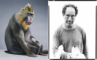
The missing link between Jill Greenberg and Richard Avedon


I had an odd experience recently while browsing through Monkey Portraits, a book by the photographer Jill Greenberg. Now, this is a book that normally wouldn’t appeal to me. You all know by now that I am an extremely serious guy who has little time for cuteness. I like my art serious and depressing. Give me the horrors of the world and psychological strain over kittens and sad eyed puppies any day. Art is meant to torture and I’m a masochist.

So when a copy of Monkey Portraits showed up on my doorstep, I was ready to write it off as a cute, commercially-minded venture that will have much success as a stocking stuffer around holiday time. That is when the odd experience happened.

I had seen these exact photos before, but then again, I had never seen these photos before. I had such a strong memory of these images (that I had never seen before), that I couldn’t shake it or figure out where this false memory originated.

It took me a while but I realized that this sense of deja-vu was because Richard Avedon had made these same images consistently throughout his long career. Not that Avedon photographed many monkeys and chimpanzees (elephants yes…but monkeys?), the connection was the expressions, especially what is being said through the eyes of the subject.

Two-thirds of the way through the book, I came across the image that sparked that recollection. In the image Persecuted, a celebese macaque named Josh, wears the same expression of fear that Avedon’s father expresses in Avedon’s series of him as he was aging and close to dying.

I then pulled my copy of Avedon Portraits off my shelf and started to rapidly make connections between these two bodies of work.

Robert Frank’s expression of bored impatience and sense of not really wanting to spur a lot of attention towards himself is felt in Greenberg’s image Monkey Suit.

Marilyn Monroe’s far away gaze of self-awareness or realization is also felt in Greenberg’s portrait called Distant.

The internal sense of madness expressed openly by Oscar Levant and the macaque Sally.

The wise, yet ever so slight sense of comedy that comes from Avedon’s portrait of Groucho Marx and the portrait of Kenuzy from Greenberg.

The slumped body language and expression of slight embarrassment from Avedon’s drifter is mirrored in Greenberg’s image entitled Yellow.

Beyond these comparisons I discovered, the game of how similar to humans these animals can seem is the note that this book hits repeatedly. And although they express a wide range of emotions, ultimately there really is nothing truly at stake for us while looking at these images. Their power is, in my opinion, robbed by the slick photographic style and presentation within this book. I know it is comparing apples to oranges but I much prefer the raw power of someone like Garry Winogrand. As far as animals emoting and seeming “human,” who can forget his intensely sad picture of one monkey urinating into the mouth of its cell-mate who accepts it cheerfully?

The book, published by Bulfinch in September 2006 has been recently issued in softcover. All of the portraits were done in what look like studio settings with plain nondescript backdrops of mostly grey seamless. Greenberg’s style favors tack sharp description and beautiful studio lighting. The descriptions are so sharp that they seem unreal; often coming across like airbrushed subjects that the Pixar animation studio would conjure.

The book is very design heavy and I find this type of approach typically annoying. The designer seems worried about keeping the reader’s interest through the design rather than just letting the images be and trusting them to carry the weight of the book. Greenberg does exhibit this work as large prints at the Paul Kopeikin gallery in Los Angeles and from the installation photo in the beginning of the book, it probably looks more interesting in person than this form can relate.

This book tries its best to lighten me up (it is entirely meant to be cheerful and fun obviously) but unfortunately, the old curmudgeon primate in me just continues to be a glutton for punishment.

Book Available Here (Monkey Portraits - Hardcover)

Book Available Here (Monkey Portraits - Softcover)

Monday, August 13, 2007

Four books on Roger Ballen


When I had first seen Roger Ballen’s work in the 2001 Phaidon publication Outland, I found the work to be cruel. His portraits of the poor in rural South Africa did not just describe them impassively but recruited them into playing often disturbing roles within Ballen’s twisted tableaus.

The few “straight” seemingly unconstructed portraits were of the alarmingly odd. They feature people who seem distorted and genetically feeble through years of inbreeding. In one image, it isn’t enough that the twin brothers Dresie and Casie possess wildly protruding ears and tree trunk like necks but Ballen photographs them with gossamer like drool dripping from their thick pouting lips.

Originally born in New York, Ballen moved to South Africa where he has lived for the past 30 years. Employed as a mining consultant, he started photographing South Africa’s “Dorps” or rural villages and quickly moved on to photographing the inhabitants as well. Upon seeing the results, which fall into the realm of documentary traditions, one may begin to think about exploitation. For years I thought these images were a bit mean spirited. I am still torn but perhaps through the process of the participants acting out and claiming their roles, they are empowered by his presence.

As illustrated throughout his book Outland, Ballen creates his sculptural tableaus and photographs them at a moment of heightened strangeness. The often surreal visions are set against the plain industrial walls that serve as a kind of ready made studio seamless.

Outland, published by Phaidon in 2001 was designed by Stuart Smith who I have spoken highly of before in my posts on the John Davies and Tony Ray Jones books published by Chris Boot. Here Smith is most playful with the cover design and use of typography. Minimalist in approach, he leaves the stark white cover almost bare but for the title and author names in extra small type. Just too small to read comfortably it has the same effect of trying to look at something too far away. Outland is far away from both our modern world and our modern society.

The book opens with a section of 16 photos positioned one to a page with large one inch borders all around (the first image is of a door). These are followed by a one page essay by Peter Weiemair called Portraits as Sill Lifes and then the images get pushed up in size to almost filling each page. The beginning section is, considering Ballen, rather straight forward portraits without much perceived direction or construction. After the essay, Ballen holds reality hostage and unleashes his cast of characters to do as they feel. It is within this second section that presents most of what we have come to recognize from Ballen; a mix of disturbed games and surreal juxtapositions. Illustrated with 61 photos the book is well printed and handles Ballen’s often chalky grays well.


The Photo Poche Societe series by Nathan published "Cette Afrique La” in 1997. This title is worth searching out even though these books are really, in my opinion, only good for reference. Even though I like the Photo Poche series in general, I find them too small and sometimes filled with sketchy reproductions. This one happens to be very nicely done with clear and open reproductions.

It reproduces several of Ballen’s known images but also has a variation of images that appeared in Ballen’s earliest books Boyhood, Dorps and Platteland; all of which are well out of print and very costly when found. The early portraits have a kinship to another photographer working in South Africa, David Goldblatt. This also includes many of his architectural photos, most of which concentrate their attention to doors and entranceways of buildings.

Fact or Fiction: Roger Ballen is a decent sized hardcover catalog from Edition Kamel Mennour and contains 38 images. The show was in March 2003 at the Gallerie Mennour in Paris and exhibited a range of work dating from 1983 through 2002. Although this is a nice, well printed book, all of the images appear in Shadow Chamber and Outland.


Shadow Chamber is the latest book, just released in softcover by Phaidon. Shadow Chamber is the wildest of his books as it includes most of his recent work that is descending deeper into surreal territory. Instead of the surroundings being identifiable rooms, he seems to be constructing his visions in a cement box.

As Robert Sobieszek writes in his introduction, “The world has been reduced to a closed series of hermetic cells in some global psychiatric facility without wardens or caretakers.”

The book is again well designed, this time by Lucy Newall and it keeps to a minimalist feel. The page material has a nice feel as the paper stock isn’t as coated as it was with Outland thus giving it a more matte feel. The reproductions are well done and the trim size of 11x12 inches gives the photos a lot of room to spread out on the page.

I think these are very skillfully made photographs of worlds that I hope to never fall into. These are worlds where sanity is held at bay and complete unpredictability reigns. If these speak to me beyond their artistic forms it is to the fragile hold that I have over my mind. Several of these images seem bent on wrestling that away from me.

I despair in both needing to see, and not wanting to see, what Ballen comes up with next.

Book Available Here (Cette Afrique la)

Book Available Here (Outland)

Book Available Here (Shadow Chamber)

Friday, August 10, 2007

Circus by Bruce Davidson


I’m of two minds when it comes to the work of Bruce Davidson. There is the Davidson capable of great social commentary with books like East 100th Street and Brooklyn Gang and then there is the Bruce Davidson who seems less political and more commercially minded with books like Central Park or perhaps Subway. His new book Circus sits comfortably somewhere in the middle.

In 1958 Davidson traveled out to New Jersey to photograph the Clyde Beatty Circus in Palisades Park. It was during this first encounter within the circus atmosphere that he met the subject of one of his well known photo essays, Jimmy “Little Man” Armstrong. It is this essay in its complete form that opens the book Circus.

Published this year by Steidl, the book is broken into three separate sections of pictures for each circus Davidson photographed. The first, the Clyde Beatty Circus, was approached out of self motivation and at the suggestion from a Magnum photo agency employee. The images from the other two occasions in 1965 and 1967 were made on assignments for magazines. Although the results photographically, with a few exceptions, seem to be made from the same state of curiosity (as oppose to fulfilling magazine assignments) it is the earliest work with the Clyde Beatty circus that wins out.

It is in those early photos that the sense of circus life for the performers and animals is described most effectively. Davidson ingratiated himself into and the lives of the performers and circus workers without any official permission. In these pictures, the circus may be enjoyable to watch for the audience but the atmosphere behind the scenes seems exhausting with little space for comfort and long work hours. The crew seems to be a collection of outsiders whose dreams are fading and the reality of the constant life on the road has replaced them. Aside from the wonderful essay on Jimmy the dwarf (21 images), Davidson works from subject to subject staying well within our preconceptions of what circuses are. Elephants, an animal that proves to be an attraction for any photographer, get their fair share of attention before Davidson’s lens; more so than even the lion tamer or the actual performers themselves.

With the second section of the book, that was made on assignment photographing the Ringling Brothers Circus in North Carolina in 1965, the atmosphere is much cleaner and seems less claustrophobic. Again, Davidson covers the scene well but with little variation of subject from the set of pictures from the previous section.

The last section of photographs, also made on assignment, is of the James Duffy and Sons Circus in Ireland in 1967. This section of only 13 images has a completely different tone to the pictures. Mostly this is because Davidson has switched to the 4X5 camera whose descriptive power is so compelling, even the final staged portrait of the entire circus becomes infused with added interest. Like in East 100th Street, Davidson handles the larger format well while working on the fly. These images concentrate a bit more on the actual performances and their craftsmanship with the larger format makes the viewer wish that he was off assignment and could spend more time creating an entire portrait of the surroundings like he attempted in the earlier series.

The descriptive differences apparent in this book made me think about a conversation I had with an older photographer who challenged me to name a great contemporary artist working in 35mm today. Admittedly I was stumped for an answer as most working artists today are utilizing at least medium format if not large format cameras.

Apart from Davidson which most people would regard as a photojournalist and may not afford him the grand title of being an artist, this book illustrates my thinking towards both types of description. I am so seduced by the clarity and extension of tonal range that is a characteristic of the larger negative that at first I think that is my preference. Then looking back at the first series of images, it is the fluidity and seeming speed at which the camera can be operated to describe fleeting moments that wins out.

The book is beautifully printed and the design is clean and straightforward. The tan color of the bookcloth and dirt colored endpapers foreshadow the darker tone that the book has in its content. A reproduction of the famous image of Jimmy Armstrong smoking in the rain is tipped into the cover. The quality of paper and material matches some of the other fine Davidson titles seen published in the past few years.

Bruce opens the book with an essay entitled 'The Dwarf and The Elephant Girl' in which he gives his recollections in an eloquent fifteen hundred words. To finish, there is an essay from Sam Holmes titled 'Remarkable Feats – Some Notes on the Circus and Bruce Davidson’s Photographs.' Sam Holmes was in charge of the picture library at Magnum Photos and was the person who suggested that Davidson go check out the circus in Palisades Park, New Jersey. His lengthy essay is full of information on circuses and the lives of the performers featured in Davidson’s photos. It is an interesting read until one odd moment in his essay where he defends the practice of circuses like Ringling Brothers and their use of animals in the acts. Here he writes at length about the good deeds for elephant well-being accomplished by Ringling Brothers, and the essay seems to deteriorate into a press release from their PR department.

Holmes writes: Joining other conservation groups, Ringling backed passage of the Asian Elephant Conservation Reauthorization Act of 2002. This act was to provide a total of four million dollars of public and privately donated funds for conservation projects in twelve countries through the year 2007. This was good news for the millions of Americans who learned to love elephants at circuses and zoos, but conservation needs to be a long-term effort, and will need continuing political support by the American public. I fear that if elephants are banned from American circuses, as animal extremists are urging, the next generation would forget about them, and the preservation effort would falter and fail.

So with these passages from Sam Holmes, this seemingly non political book becomes momentarily but unnecessarily infused with the politics of today.

That aside is not enough to detract; the main detriment to this title is that the content seems to have been stretched a bit to make a full book. It would have been a much less commercially successful project, but I could image a wonderful but very small book containing only the 21 images from the Jimmy Armstrong material. Those are the images that Davidson made while he lived with the circus for several weeks. In this book, those are the images that will continue to compel me to bring this title down off the shelf.

Buy online at Steidlville

Tuesday, August 7, 2007

Modern Photographs: The Machine, The Body and The City


Since my last post was about how much care and quality goes into the Lodima Press books I thought I should mention a recent catalog that is the exact opposite. And although it may seem pointless to take up energy describing how bad a book can be, in this case, I can’t step away from this one. Consider this a buyer beware warning.

Modern Photographs: The Machine, The Body and The City is a catalog prepared for the Miami Art Museum from its exhibition in November of 2006. The show (and in theory the catalog) celebrates selections from the collection of the New York-based collector, art dealer and curator Charles Cowles. The photographs range from the classic to contemporary and the experimental to the traditional. Approximately 170 artists are represented including: Atget, Arbus, Baltz, Cartier-Bresson, Eggleston, Evans, Hockney, Frank, Mapplethorpe, Ruscha, Schorr, Sherman, Sugimoto, Warhol, Weegee and Winogrand, among many others. Andy Grundberg provides an analysis of the collection in an introduction.

Sounds good so far…I was enticed to the tune of $26.00 (retail $34.95) but things get rather ugly quickly. Mostly, it is the reproductions that are offensive. Not many of the artists whose work is reproduced escape without their work being tarnished in one way or another. In an attempt to reproduce the variety of color tones different papers and processes naturally possess, most of the photos take on odd color casts. One of Lewis Baltz’s industrial park photos is cast in purple and cyan. A Danny Lyon image from Conversations with the Dead is now in full brown tone. Bruce Davidson’s Kathy Reflected in Cigarette Machine is not only poorly reproduced much too dark; it is reddish brown.

I know what you're saying, 'OK…Mr Whiskets…it’s just a catalog. Relax. Catalogs are often poorly printed; happens all the time.'

But the fun doesn’t end with poor printing. Page 83, Andre Kertesz, Underwater Swimmer 1917, 6 7/8 x 9 5/8 inches. Classic image, we have seen many times but, you have not lived until you’ve seen it…entirely pixilated. And I don’t mean pixilated in an ‘Oh…I can notice it if I look really closely’ way. It’s more of a ‘Sherrie Levine rephotographed Kertesz’s swimmer with an extremely low resolution digital camera and then let Vik Muniz print it’ kind of way.

By far the worst offense has to be the treatment of David Hilliard’s Norm’s Birthday 2001, which appears on page 106. This is one of Hilliard’s four panel panoramic images that understandably gets reproduced very small on the page due to its format, but why does the image look like a fiftieth generation color Xerox? It is entirely out of focus and the image looks like it was grabbed off a TV screen.

If you can look past the production disaster, the collection is really good. It includes two of the more perverse Henri Cartier Bresson pictures. The first, Matigues France 1932 is the fairly common image in which a statue seems to have a horse's head poking from its fly. The other is of the surrealist poet Charles Henry Ford (no relation to Henry Ford) emerging from a French pissior while zipping the fly of his pants. The perversity is Bresson’s inclusion of a poster at fly level that reads Krema and is illustrated with a reptilian tongue that stretches towards Ford’s zipper.

Those few images that escape with their dignity are not enough to justify the purchase price. In the end, this book makes it very difficult to enjoy the works other than as basic references.

Save your money. The only brightside may be that I have one more title for my winter book sale. Perhaps by then you will have forgotten this review and I can develop a good sales pitch.

Book Available Here